


Brand Guidelines

About OutSystems ONE
A conference for everyone
OutSystems ONE is the conference where we’ll be gathering all OutSystems customers, prospects and partners under a single roof, eager for product announcements, networking and evolving their AI & Agentic development strategies & skillsets.
Every customer, prospect or partner should feel at home in OutSystems ONE.


The acronym
A name with history, an acronym with future
ONE (OutSystems NextStep Exprienc) should always be written like an acronym. All Caps, at all times.
This way, OutSystems ONE reads better, while still nodding to both our original customer conference, NextStep, and the ONE brand developed for our Developer Conference in 2024.
The full name is not to be used unless requested explicitly.

Brand System
Logo Cluster
The OutSystems ONE logo cluster is a collection of our core brand logo, and the 1 Click Publish inspired ONE logo.
They act as a combo to clearly signify OutSystems as the host of ONE.
The logo can be applied by itself, with the word Conference or, if necessary, in its adjusted icon format for smaller applications.


Ground rules


At any point, there should be a Minimum clear space around logo:
- The same width as 1/4 of the OutSystems’ Ring icon.
Size


Smallest dimensions for logo application should be led by the OutSystems ring height:
- Ring height or ONE Icon:16px/ 4 mm/ 0.15”
Logo + Label should never be applied small.
Colors


OutSystems ONE’s logo can be used in either color or monochrome, in light or dark versions.
Logo versions
Main application
It’s the default option to communicate OutSystems ONE. Should be used the most.


Block - vertical
Most compact version. Should be the second most used.


Shorthand - horizontal
Great for application on small digital banners or website navigations. Also good for signature.


ONE Icon
To be used as either a graphic decoration element or small icon.

Correct usage


Do
Apply the provided logos as they’re provided
Do


Apply logo/icon version on correct background
Do
Apply the logo w/ correct color & dimensions


Do not
Alter the logo shape or current dimensions


Do not
Apply logo/icon on low-contrast backgrounds


Do not
Apply the logo w/ edited color or dimensions

Typography
As a brand heavily inspired by Swiss editorial type layouts, OutSystems and all sub-brands including OutSystems ONE, are heavily defined by its typography.
Most of our layouts and UIs are defined by typography first, creating readable documents and flowing spaces between information blocks.
To enforce simplicity and brand scalability, we use a single font from Google fonts called DM Sans. It’s modern, has variable controls, and reads well in both small and big formats.
DM Sans
Unleash innovation at OutSystems ONE—where OutSystems experts, industry leaders, and customers showcase how AI-powered low-code creates extraordinary apps. Join us for 2 amazing days at the ultimate tech conference of 2025.
Get inspired
Discover fresh ideas from low-code visionaries and get up to speed on the latest AI advancements.
Type application
Innovate without limits
Unleash innovation at OutSystems ONE—where experts, industry leaders, and customers showcase how AI-powered low-code creates extraordinary apps.
Get Your Ticket
By default all type applicationis aligned to the left
This way, the OutSystems ONE brand works more clearly as an extension of the OutSystems brand, with the editorial styled typography application.
Innovate without limits
Unleash innovation at OutSystems ONE—where experts, industry leaders, and customers showcase how AI-powered low-code creates extraordinary apps.
Get Your Ticket
If benefitial to the layout we can use centered text
This way, the OutSystems ONE brand can still adjust to the needs of the final layout, without making things unbalanced.
This is a Title
This is a SubTitle
These are section headers
This is some great content placeholder to showcase how type scales work.
These are section headers
This is some great content placeholder to showcase how type scales work
Well established hierarchy is essential for proper legibility
Clear messaging is key to properly establish & promote the benefits of our event. Nothing else should take relevance over messaging when possible.
Type scale
Default type scale for digital assets. Use it proportionally for other applications.
Title XXL
font-family
DM Sans
font-weight
540
optical-size
40
font-size
6.00 rem
line-height
100%
letter-spacing
2%
Title
font-family
DM Sans
font-weight
540
optical-size
40
font-size
4.00 rem
line-height
100%
letter-spacing
2%
SubTitle
font-family
DM Sans
font-weight
540
optical-size
40
font-size
2.00 rem
line-height
100%
letter-spacing
2%
Header
font-family
DM Sans
font-weight
540
optical-size
40
font-size
1.50 rem
line-height
110%
letter-spacing
2%
Highlight/Quote
font-family
DM Sans
font-weight
360
optical-size
40
font-size
1.25 rem
line-height
135%
letter-spacing
3%
Paragraph
font-family
DM Sans
font-weight
360
optical-size
40
font-size
1.00 rem
line-height
135%
letter-spacing
2%
Note
font-family
DM Sans
font-weight
360
optical-size
40
font-size
0.75 rem
line-height
120%
letter-spacing
5%
Navigation - Level 01
font-family
DM Sans
font-weight
540
optical-size
40
font-size
1.125 rem
line-height
100%
letter-spacing
2%
Navigation - Level 02
font-family
DM Sans
font-weight
540
optical-size
40
font-size
0.875 rem
line-height
100%
letter-spacing
2%

Color
OutSystems ONE is a place for crossover, with realities that mix the most technical of tech person and the most innovative of their business partners.
Our color applications invoke the energy of those shared spaces, in a constant state of transformation between energetic reds to enlightened blues, from technical black to glowing indigo, from space greys to a controlled brightness of our main off-white backgrounds.
This means our color application should be a well distributed representation of color, balanced with our new off-white backgrounds and clean, deep dark blue typography.

Gradients & color significance
Brand
os-red // space-blue //marine-blue

General brand color application. Can be used for anything more broad brand promotion and general audience materials.
Space
black // grey-900 //marine-blue

Complementary color application meant as a counter-part to brand. Allows for contrast and highlight of elements and messages.
Glow
grey-900 // space-blue //aqua-blue // soft-community-green

Terciary color application meant as a counter-part to brand. Allows for contrast and highlight of elements and messages.
Color application
Most backgrounds should be light or gradient
This way, the information stand out more and better represents the strong brand energy.
Exceptions can be made, but the focus should be on making assets clean, impactful and readable.
Color should always be framed by our off-white backgrounds
Using negative application of colored 3D meshes & grids under dark containers we can develop a more punchy look for some of the promotional and printed materials.
Clear, readbale, contrasting text color for all applications
This way, all the messaging and information stands out more than anything else on frame.
Gradients can be smooth or step-based


Smooth gradients on line work is the easiest way of brand application, but using a sequence of solid colors for certain print or visual elements can create a similar effect.
Color distribution


65%
neutrals
A majority of the elements should be black or dark background, with white or light-grey text on top.
20%
gradients
Gradients should be used mostly on the outline of visual elements and containers. We can occasionally be used as background for important text or CTA highlight.
15%
brand
Solid colors can be used for tags, navigation and printed signage, with bigger presence of the OutSystems red as the default brand color on most elements if needed.
Colors codes
Brand

token-name
one-brand-os-red
hex
#F32D35
rgb
243
045
053
cmyk
000
100
095
000

token-name
one-brand-space-blue
hex
#2530A9
rgb
037
048
169
cmyk
100
085
000
002

token-name
one-brand-deep-blue
hex
#5C73E7
rgb
092
115
231
cmyk
075
060
000
000

token-name
one-brand-marine-blue
hex
#79CBEC
rgb
121
203
236
cmyk
048
003
003
000

token-name
one-brand-aqua-blue
hex
#30CDE9
rgb
048
205
233
cmyk
062
000
009
000

token-name
one_brand-community-green
hex
#00FF75
rgb
000
255
117
cmyk
065
000
065
000
Soft tones

token-name
one-soft-deep-red
hex
#F5C0C1
rgb
245
192
193
cmyk
000
029
014
000

token-name
one-soft-space-blue
hex
#C1C1DE
rgb
193
193
222
cmyk
023
021
002
000

token-name
one-soft-indigo-blue
hex
#CFD1EE
rgb
207
209
238
cmyk
016
014
000
000

token-name
one-soft-marine-blue
hex
#D6E7EF
rgb
214
231
239
cmyk
015
003
003
000

token-name
one-soft-shiny-blue
hex
#C4E8EE
rgb
196
232
238
cmyk
022
000
006
000

token-name
one-soft-community-green
hex
#B8F5D1
rgb
184
245
209
cmyk
025
000
025
000
Greyscale

token-name
one-white
hex
#FFFFFF
rgb
255
255
255
cmyk
000
000
000
000

token-name
one-grey-050
hex
#F5F1F0
rgb
245
241
240
cmyk
003
004
003
000

token-name
one-grey-100
hex
#DDD9D9
rgb
221
217
217
cmyk
012
011
010
000

token-name
one-grey-200
hex
#C2BFC1
rgb
194
191
193
cmyk
024
010
019
000

token-name
one-grey-300
hex
#A7A5A8
rgb
167
165
168
cmyk
036
031
029
000

token-name
one-grey-400
hex
#8C8B90
rgb
140
139
144
cmyk
048
040
036
003

token-name
one-grey-500
hex
#727278
rgb
114
114
120
cmyk
057
049
043
012

token-name
one-grey-600
hex
#575860
rgb
087
088
096
cmyk
066
058
049
025

token-name
one-grey-700
hex
#3D3E48
rgb
061
062
072
cmyk
073
066
052
043

token-name
one-grey-800
hex
#23242F
rgb
035
036
047
cmyk
079
072
055
064

token-name
one-grey-900
hex
#0A0C18
rgb
010
012
024
cmyk
080
073
059
079

token-name
one-black
hex
#000000
rgb
000
000
000
cmyk
060
040
040
100

Key visuals & image treatment
A set of key visuals & standard image treatment is essential to connect the visual language application across board.
In the case of OutSystems ONE. we use a set of 3D meshes, grids and icons intertwined with stage, audience and location photography to build an immersive digital but human universe, and then our photos and key visuals stand on top of it, contrasting with the dark and glowy artwork.
The logo can be applied by itself, with the word Conference or, if necessary, in its adjusted icon format for smaller applications.
Available graphic assets
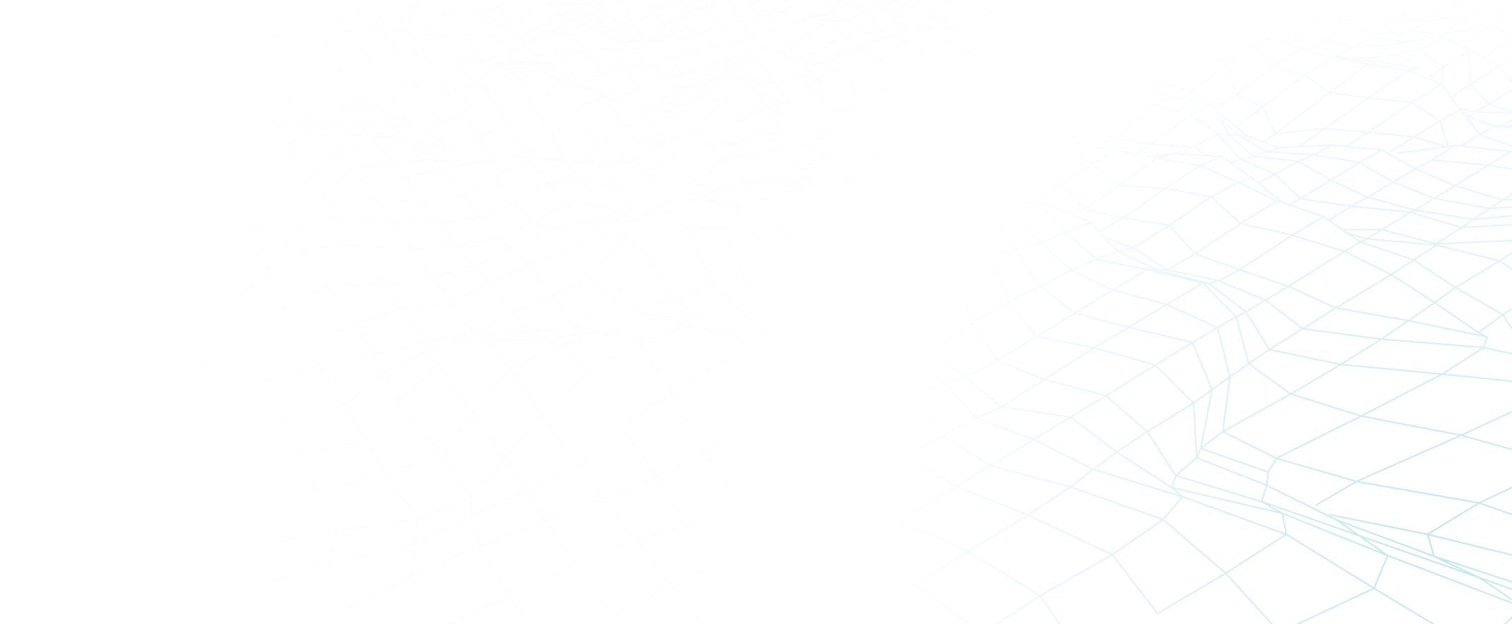
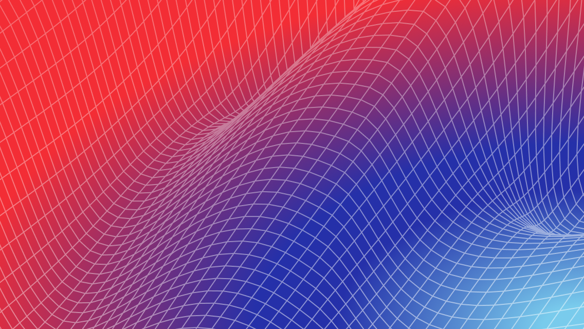
Gradient 3D meshes
Main visual element


This is the main key visual for OutSystems ONE. These can be applied in most of the assets and are easy to use for both static and motion assets.
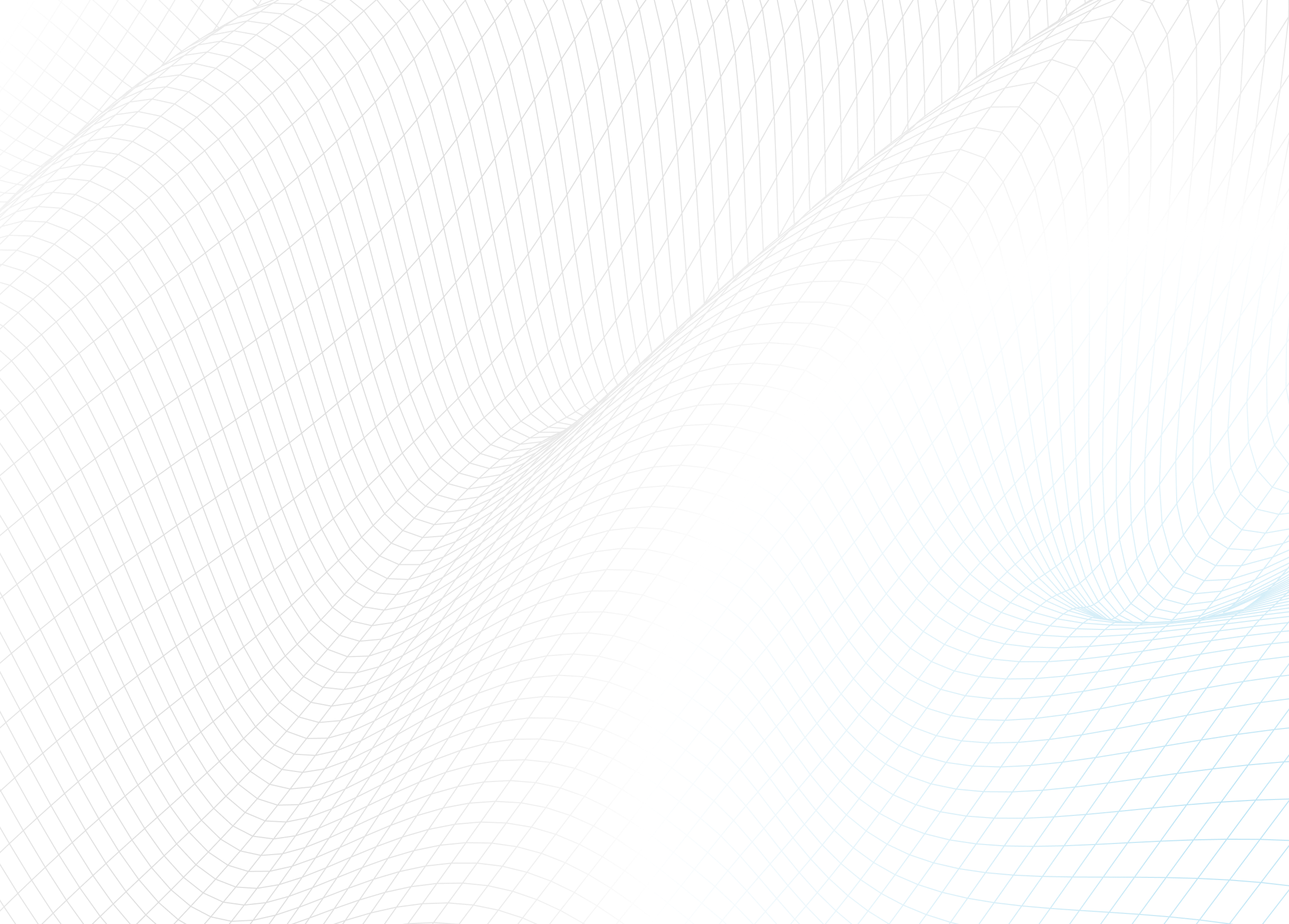
Gradient 3D grids
Complementary visual element


This is the complementary key visual for OutSystems ONE. These can be applied in a variety of assets, ideally in motion as a starting point to our 3d meshes/waves.
Isometric iconography
Detail/bullet visual element

Have you met Neo


These icons are softer brand elements. made to help better communicate certain themes and audience specific content. They should be seamlessly mixed up with content in a 2D plane.
Neo & Agents
Iconographic representation
Simple, note worthy


When we need Neo or the Agents to be there, but not scream out loud, we can then use their icons to convey teh fun, whymsical
Real Neo
The real deal, he’ll be there

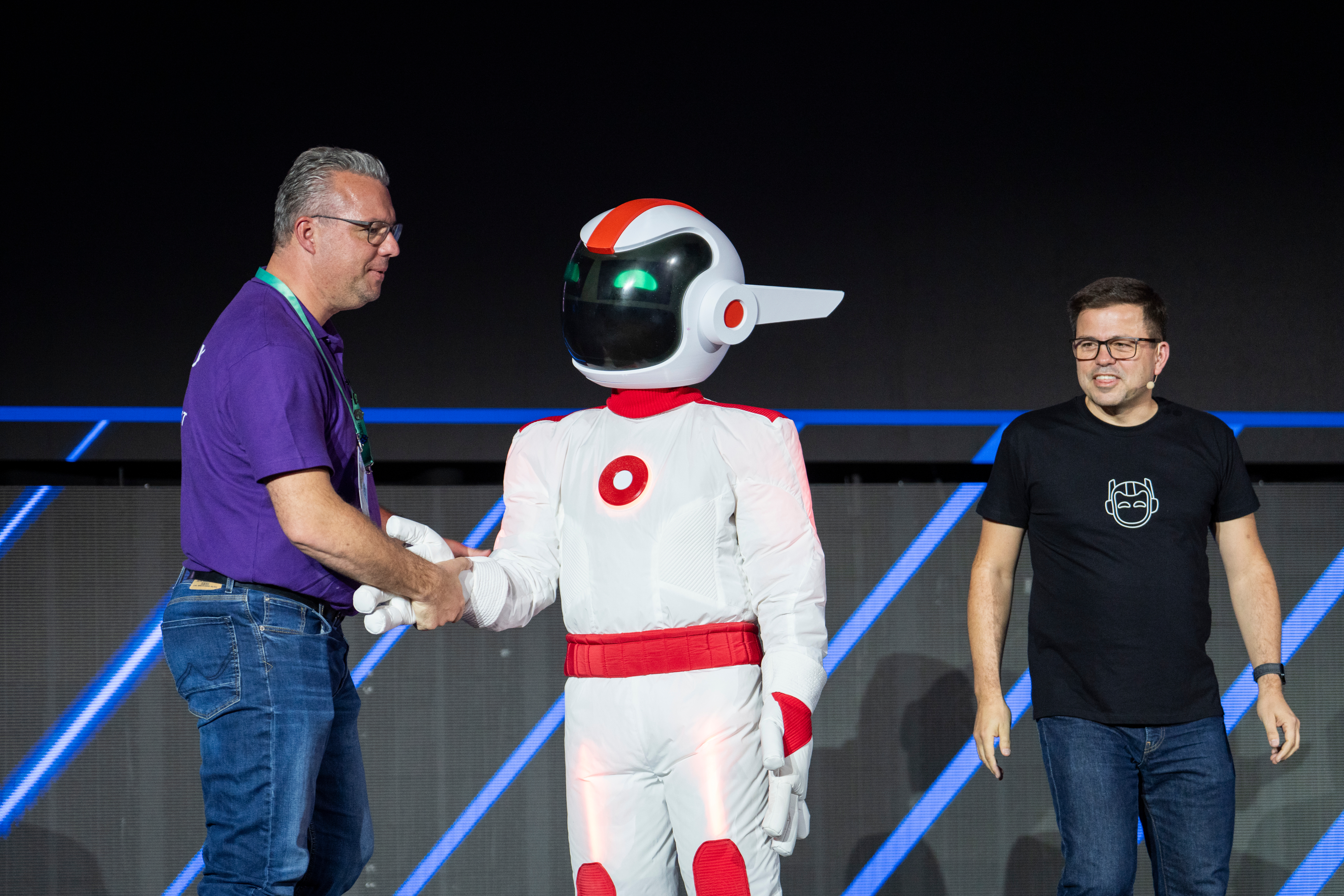
Neo is the host, the face and therefore, the more real we can get and use Neo’s face on photos and comps, the better.
Photography
Image types (also applied to video)
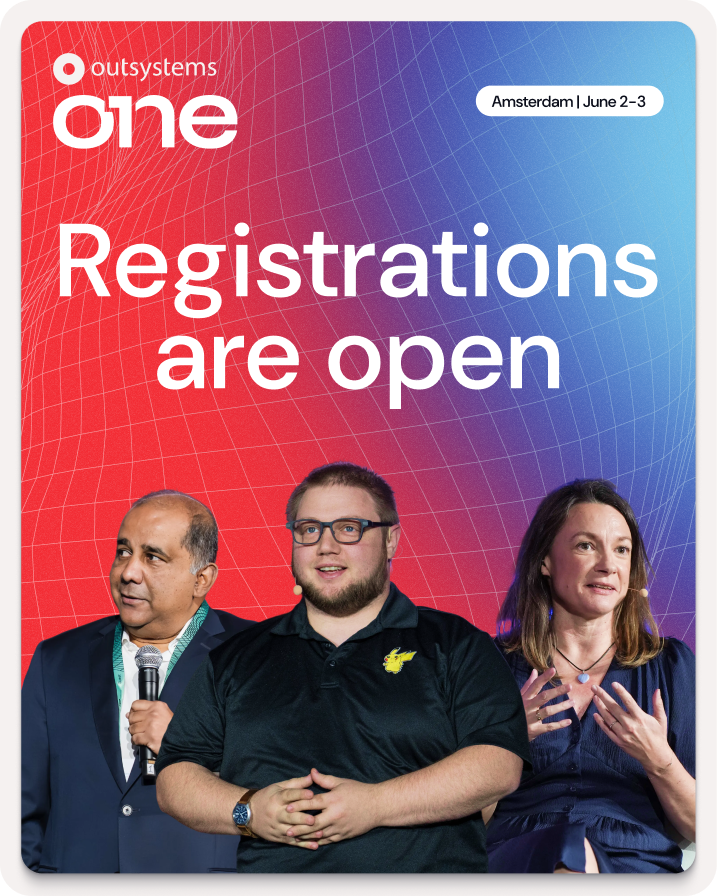
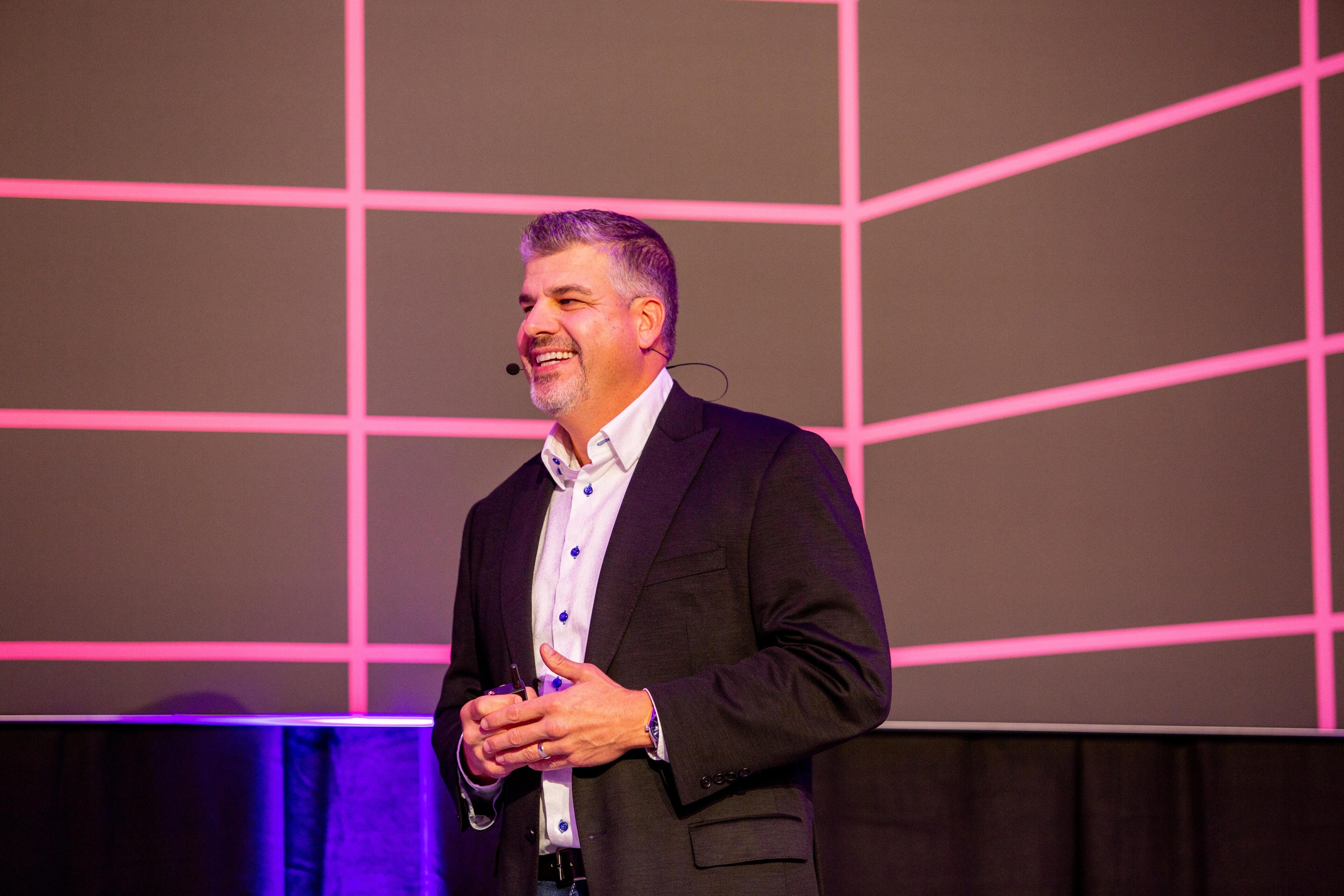
Active speakers on stage
Showcase the value
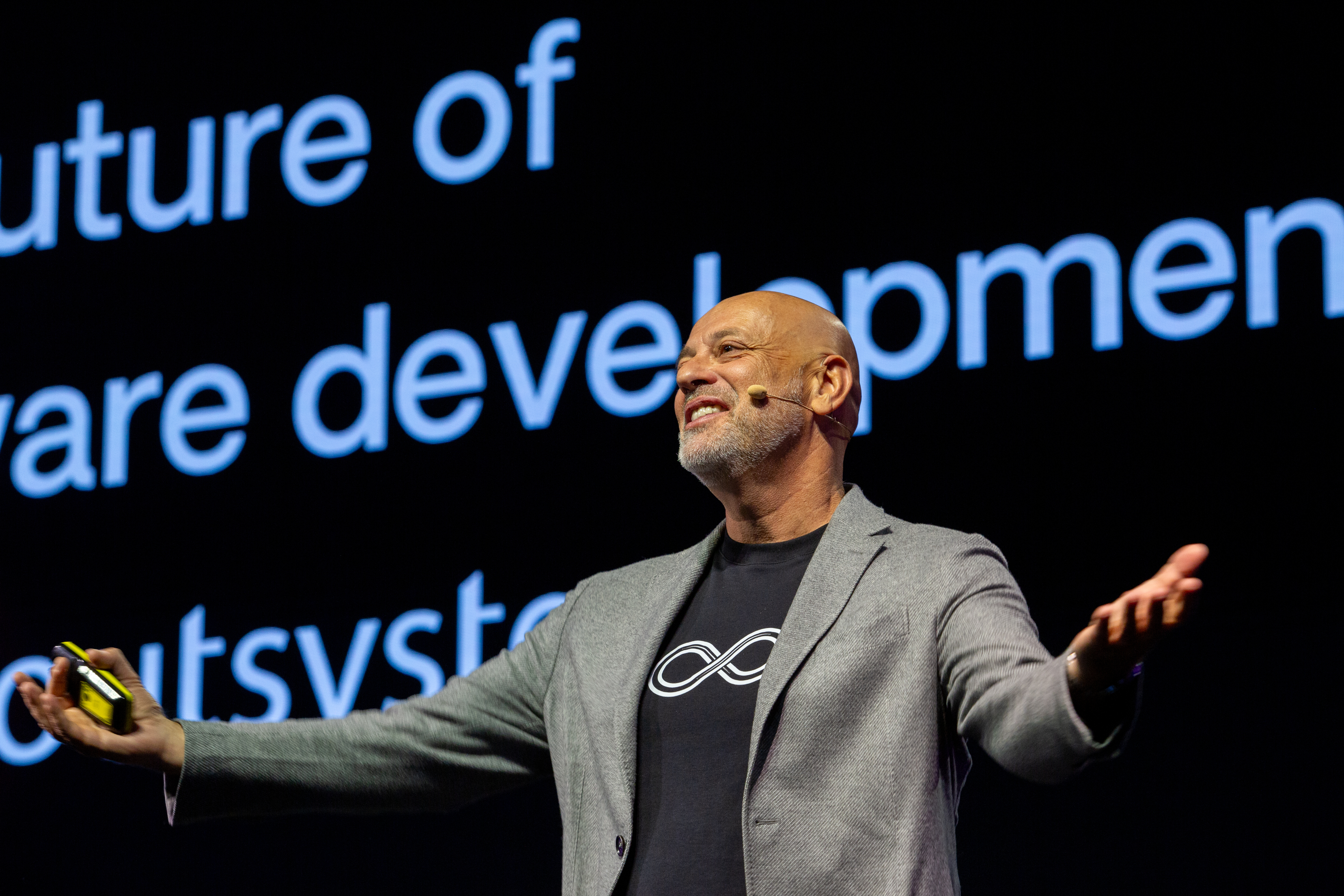
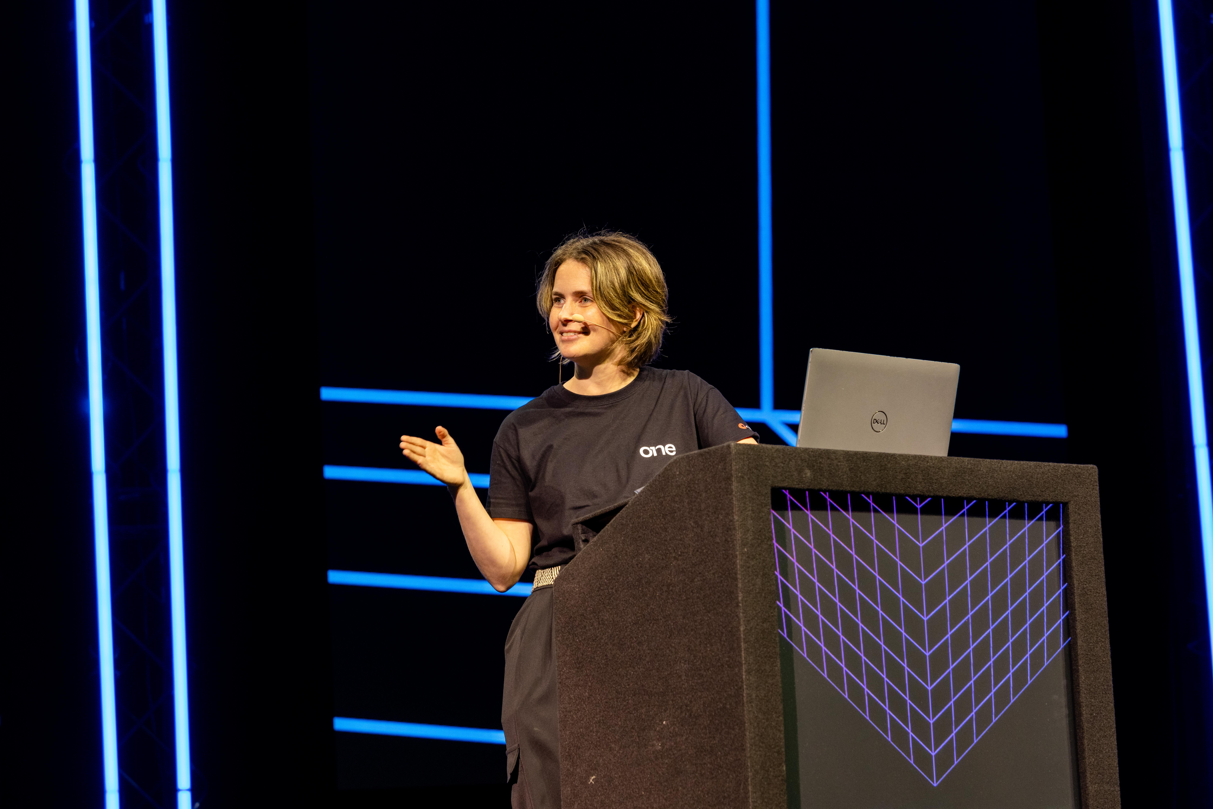
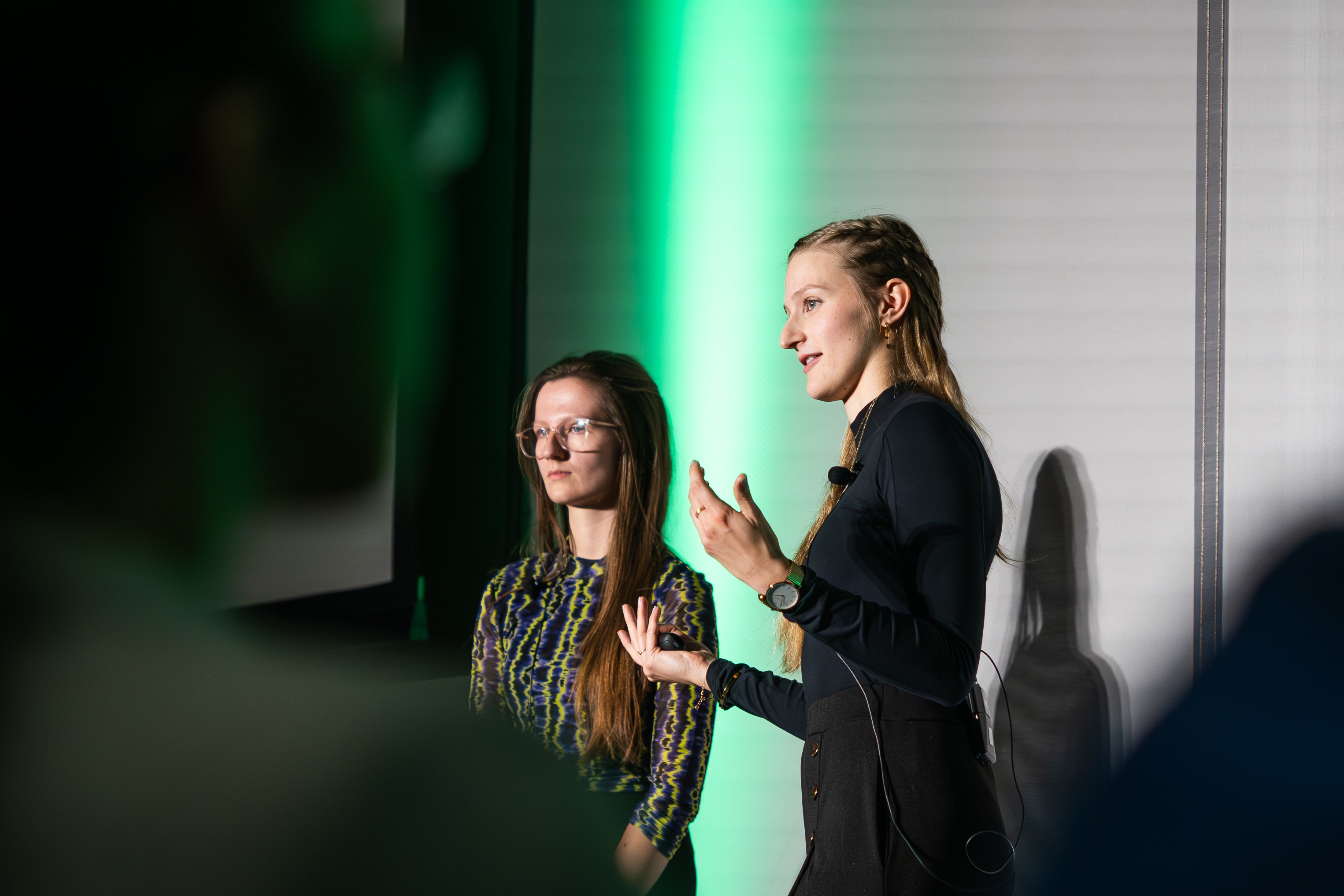
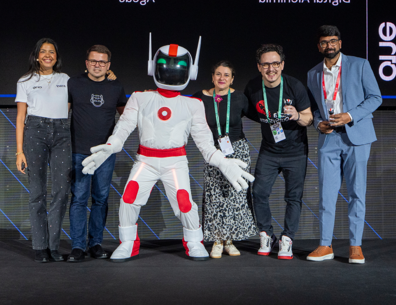
Our greatest asset is the great content, and these are the faces of that value. Our community of speakers, customers and leaders showcase what OutSystems ONE had to offer, and that makes them the face of the event (side by side with Neo).
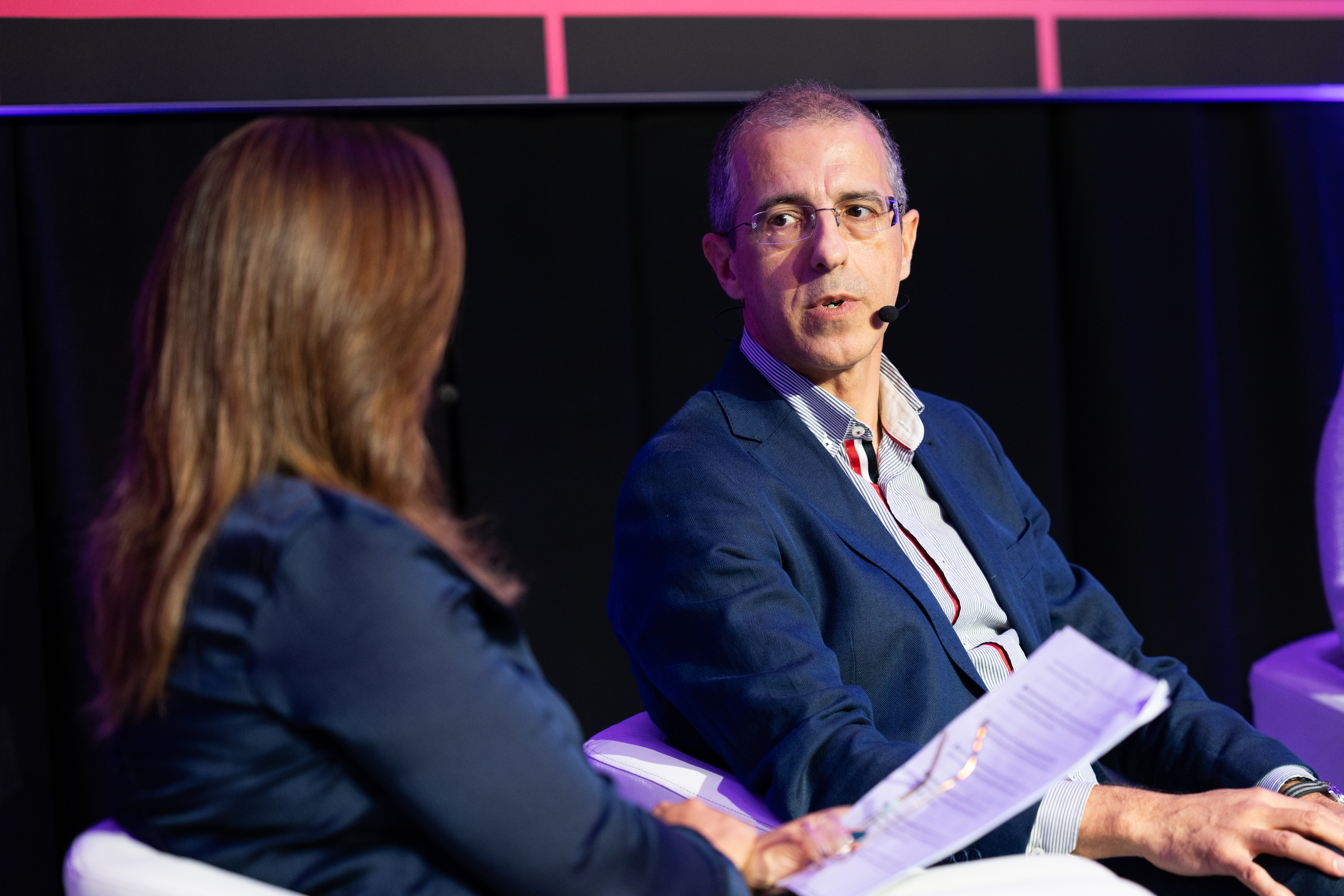
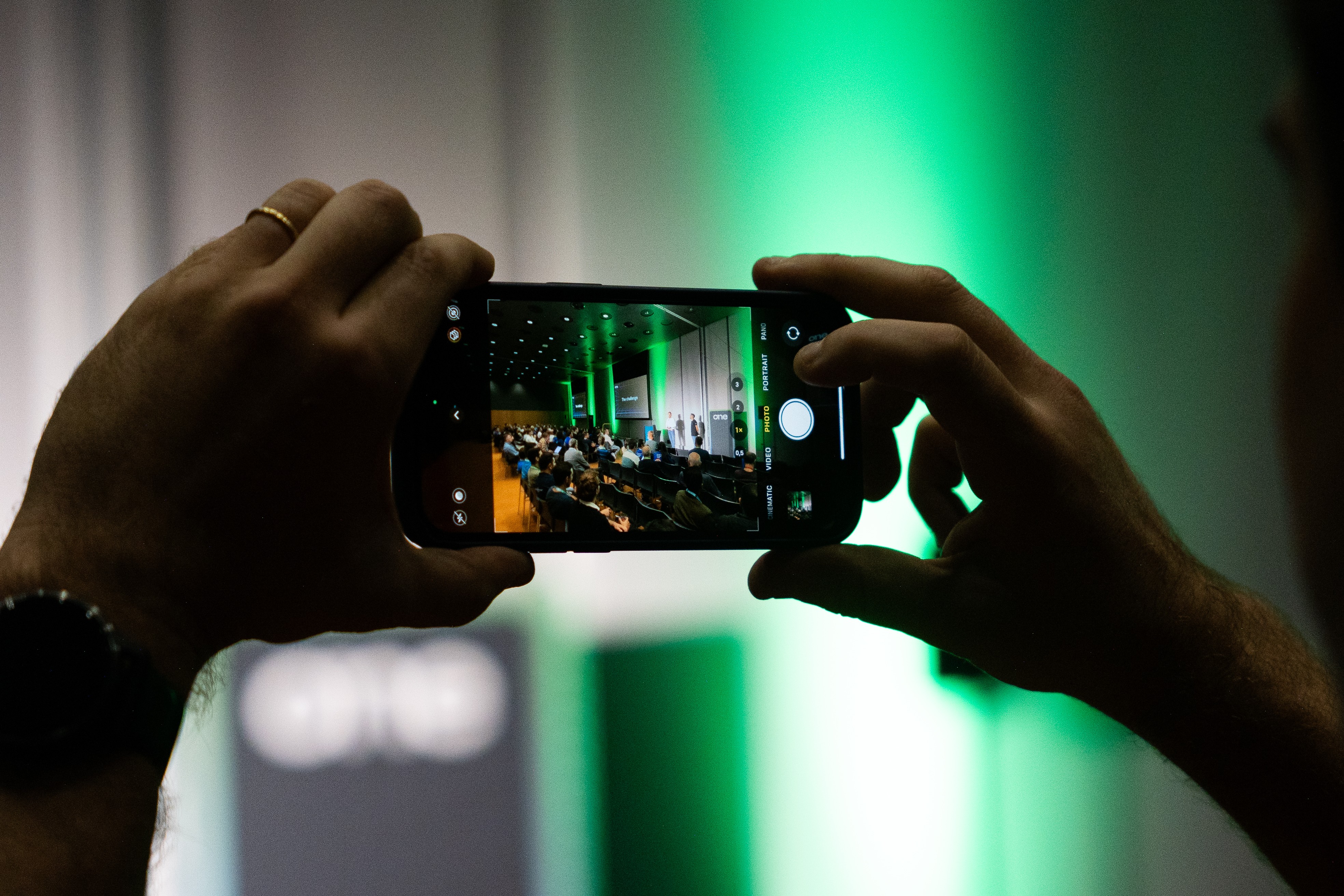
Community engaged
Help them feel the energy
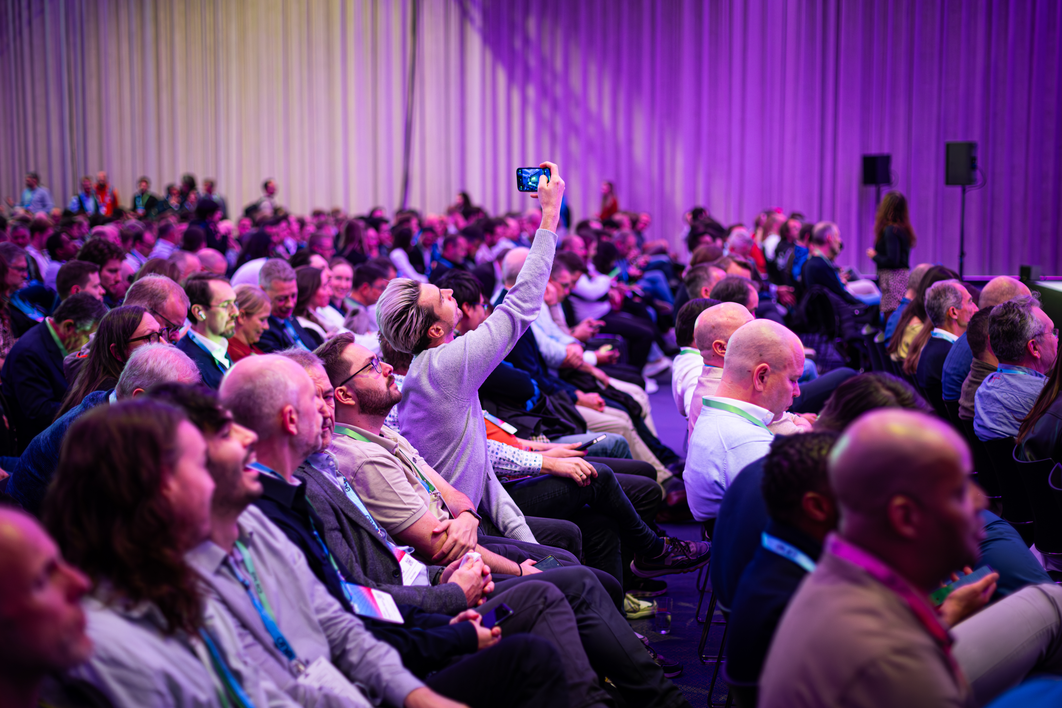
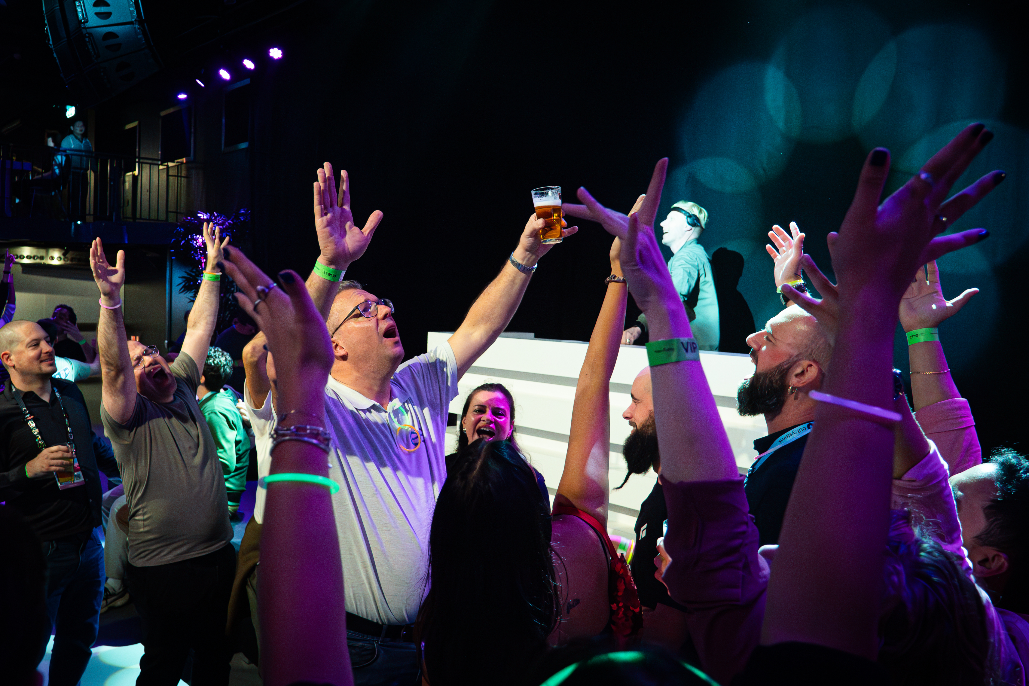
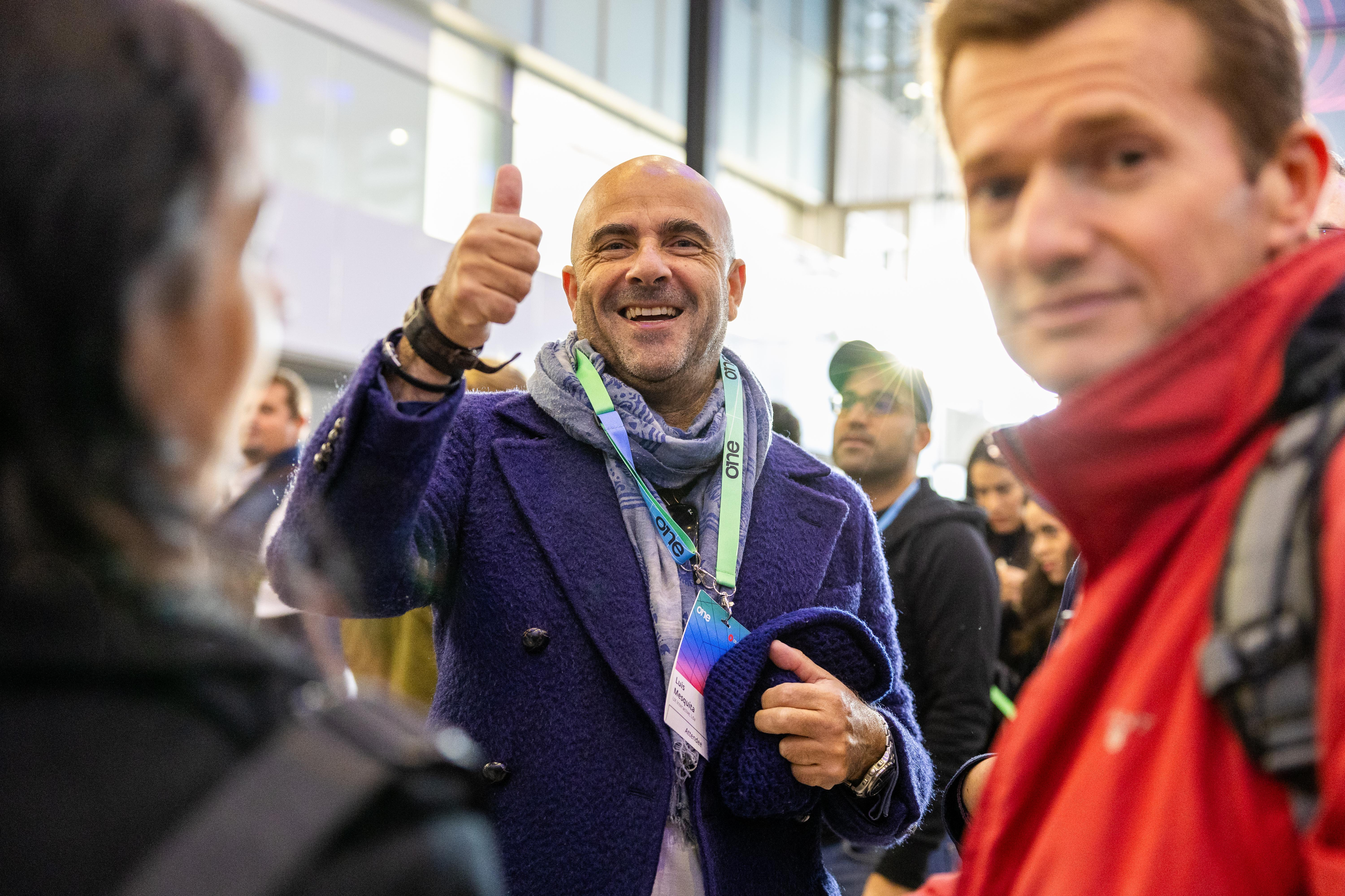
In between the talks a universe of relationship building, interesting chats and new business connections happen. Those moments make it clear we are a lively and energetic community, one that a prospect might want to join.
Venue & Experience
Guide and convince
ONE is a global conference, and we make that clear by valueing our venues and host cities, by showcasing it
Photography treatment
Contained
Give context, keep it clean
Cutouts are highlight elements, but all images deserve proper placement, hence containing visuals in rounded corner boxes is the default treatment for everything else.
Cutout
Highlight the key element
The speaker, the moment, the gesture, the item or the action. All of these are things we can make fit a composition easily with cutout treatment.
Vibrant
Color that pops
Ideally we need images with vibrant colros to contrast with the dark backgrounds,
Ideally we need images with vibrant colros to contrast with the dark backgrounds,

Layouts
Information setup is key to the way we communicate as OutSystems, so we focus a lot on a clean, clear and editorial style content layout for all our assets.
There are a few different treatments we do as default and those should be treated as priority within the brand application.
The logo can be applied by itself, with the word Conference or, if necessary, in its adjusted icon format for smaller applications.


Amsterdam | June 2-3
Layout application
Text left, image right for most applications
For most applications
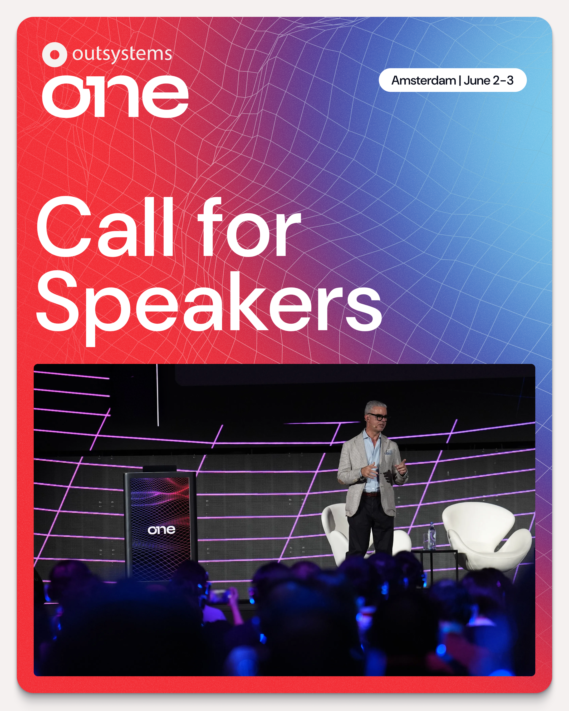
Clear message focused layouts, taking people through their experience
Use corners (mostly top)
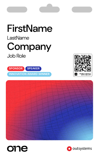
Labels & logos as visual guides
Using notes like Date, Location, website, hashtags and other complementary information, you help better frame the content.
Alignment follows medium
Let the frame define the art
Even though our default is left aligned, center alignment or right alignement of elements can
Big Keywords deserve space
Message & cutout combos
This is an optional stylistic approach, but one we encourage whenever possible. It helps empower brand application.
Single words take control
Message & cutout combos
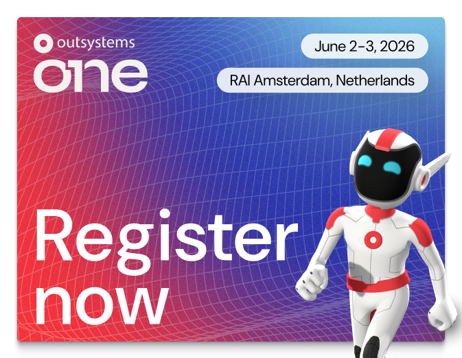
When using single keywords or really short sentences, it can be fully centered and take over the available space.
Labels & icons for details
Simple messages improved
June 2-3, 2026
RAI Amsterdam, Netherlands
June 2-3, 2026

RAI Amsterdam, Netherlands

Dates, hashtags, locations, promo codes and many more details that might need to be communicated, would be better served with a contained label treatment.


Brand Guidelines
About OutSystems ONE
A conference for everyone
OutSystems ONE is the conference where we’ll be gathering all OutSystems customers, prospects and partners under a single roof, eager for product announcements, networking and evolving their AI & Agentic development strategies & skillsets.
Every customer, prospect or partner should feel at home in OutSystems ONE.


The acronym
ONE (OutSystems NextStep Exprienc) should always be written like an acronym. All Caps, at all times.
This way, OutSystems ONE reads better, while still nodding to both our original customer conference, NextStep, and the ONE brand developed for our Developer Conference in 2024.
The full name is not to be used unless requested explicitly.
Brand System
Logo Cluster
The OutSystems ONE logo cluster is a collection of our core brand logo, and the 1 Click Publish inspired ONE logo.
They act as a combo to clearly signify OutSystems as the host of ONE.
The logo can be applied by itself, with the word Conference or, if necessary, in its adjusted icon format for smaller applications.


Ground rules
Spacing
At any point, there should be a Minimum clear space around logo:
- The same width as 1/4 of the OutSystems’ Ring icon.
Size
Smallest dimensions for logo application should be led by the OutSystems ring height:
- Ring height or ONE Icon:16px/ 4 mm/ 0.15”
Logo + Label should never be applied small.
Colors
OutSystems ONE’s logo can be used in either color or monochrome, in light or dark versions.
Logo versions
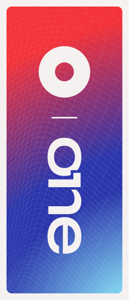
Main application
It’s the default option to communicate OutSystems ONE. Should be used the most.


Block - vertical
Most compact version. Should be the second most used.


Shorthand - horizontal
Great for application on small digital banners or website navigations. Also good for signature.


ONE Icon
To be used as either a graphic decoration element or small icon.
Correct usage
Do
Apply the provided logos as they’re provided
Do


Apply logo/icon version on correct background
Do
Apply the logo w/ correct color & dimensions


Do not
Alter the logo shape or current dimensions
Do not
Apply logo/icon on low-contrast backgrounds
Do not
Apply the logo w/ edited color or dimensions
Typography
As a brand heavily inspired by Swiss editorial type layouts, OutSystems and all sub-brands including OutSystems ONE, are heavily defined by its typography.
Most of our layouts and UIs are defined by typography first, creating readable documents and flowing spaces between information blocks.
To enforce simplicity and brand scalability, we use a single font from Google fonts called DM Sans. It’s modern, has variable controls, and reads well in both small and big formats.
DM Sans
Unleash innovation at OutSystems ONE—where OutSystems experts, industry leaders, and customers showcase how AI-powered low-code creates extraordinary apps. Join us for 2 amazing days at the ultimate tech conference of 2025.
Get inspired
Discover fresh ideas from low-code visionaries and get up to speed on the latest AI advancements.
Type application
Innovate without limits
Unleash innovation at OutSystems ONE—where experts, industry leaders, and customers showcase how AI-powered low-code creates extraordinary apps.
Get Your Ticket
By default all type applicationis aligned to the left
This way, the OutSystems ONE brand works more clearly as an extension of the OutSystems brand, with the editorial styled typography application.
Innovate without limits
Unleash innovation at OutSystems ONE—where experts, industry leaders, and customers showcase how AI-powered low-code creates extraordinary apps.
Get Your Ticket
If benefitial to the layout we can use centered text
This way, the OutSystems ONE brand can still adjust to the needs of the final layout, without making things unbalanced.
This is a Title
This is a SubTitle
These are section headers
This is some great content placeholder to showcase how type scales work.
These are section headers
This is some great content placeholder to showcase how type scales work
Well established hierarchy is essential for proper legibility
Clear messaging is key to properly establish & promote the benefits of our event. Nothing else should take relevance over messaging when possible.
Type scale
Default type scale for digital assets. Use it proportionally for other applications.
Title XXL
font-family
DM Sans
font-weight
540
optical-size
40
font-size
6.00 rem
line-height
100%
letter-spacing
2%
Title
font-family
DM Sans
font-weight
540
optical-size
40
font-size
4.00 rem
line-height
100%
letter-spacing
2%
SubTitle
font-family
DM Sans
font-weight
540
optical-size
40
font-size
2.00 rem
line-height
100%
letter-spacing
2%
Header
font-family
DM Sans
font-weight
540
optical-size
40
font-size
1.50 rem
line-height
110%
letter-spacing
2%
Highlight/Quote
font-family
DM Sans
font-weight
360
optical-size
40
font-size
1.25 rem
line-height
135%
letter-spacing
3%
Paragraph
font-family
DM Sans
font-weight
360
optical-size
40
font-size
1.00 rem
line-height
135%
letter-spacing
5%
Note
font-family
DM Sans
font-weight
360
optical-size
40
font-size
0.75 rem
line-height
120%
letter-spacing
5%
Navigation - Level 01
font-family
DM Sans
font-weight
540
optical-size
40
font-size
1.125 rem
line-height
100%
letter-spacing
2%
Navigation - Level 02
font-family
DM Sans
font-weight
540
optical-size
40
font-size
0.875 rem
line-height
100%
letter-spacing
2%
Color
OutSystems ONE is a place for crossover, with realities that mix the most technical of tech person and the most innovative of their business partners.
Our color applications invoke the energy of those shared spaces, in a constant state of transformation between energetic reds to enlightened blues, from technical black to glowing indigo, from space greys to a controlled brightness of our main off-white backgrounds.
This means our color application should be a well distributed representation of color, balanced with our new off-white backgrounds and clean, deep dark blue typography.
Gradients & color significance
Brand
os-red // space-blue //marine-blue
General brand color application. Can be used for anything more broad brand promotion and general audience materials.
Space
black // grey-900 //marine-blue
Complementary color application meant as a counter-part to brand. Allows for contrast and highlight of elements and messages.
Glow
grey-900 // space-blue //aqua-blue // soft-community-green

Terciary color application meant as a counter-part to brand. Allows for contrast and highlight of elements and messages.
Color application
Most backgrounds should be light or gradient
This way, the information stand out more and better represents the strong brand energy.
Exceptions can be made, but the focus should be on making assets clean, impactful and readable.
Color should always be framed by our off-white backgrounds
Using negative application of colored 3D meshes & grids under dark containers we can develop a more punchy look for some of the promotional and printed materials.
Clear, readbale, contrasting text color for all applications
This way, all the messaging and information stands out more than anything else on frame.
Gradients can be smooth or step-based
Smooth gradients on line work is the easiest way of brand application, but using a sequence of solid colors for certain print or visual elements can create a similar effect.
Color distribution


65%
neutrals
A majority of the elements should be black or dark background, with white or light-grey text on top.
20%
gradients
Gradients should be used mostly on the outline of visual elements and containers. We can occasionally be used as background for important text or CTA highlight.
15%
brand
Solid colors can be used for tags, navigation and printed signage, with bigger presence of the OutSystems red as the default brand color on most elements if needed.
Colors codes
Brand
token-name
one-brand-os-red
hex
#F32D35
rgb
243
045
053
cmyk
000
100
095
000
token-name
one-brand-space-blue
hex
#2530A9
rgb
037
048
169
cmyk
100
085
000
002
token-name
one-brand-deep-blue
hex
#5C73E7
rgb
092
115
231
cmyk
075
060
000
000
token-name
one-brand-marine-blue
hex
#79CBEC
rgb
121
203
236
cmyk
048
003
003
000
token-name
one-brand-aqua-blue
hex
#30CDE9
rgb
048
205
233
cmyk
062
000
009
000
token-name
one_brand-community-green
hex
#00FF75
rgb
000
255
117
cmyk
065
000
065
000
Soft tones
token-name
one-soft-deep-red
hex
#F5C0C1
rgb
245
192
193
cmyk
000
029
014
000
token-name
one-soft-space-blue
hex
#C1C1DE
rgb
193
193
222
cmyk
023
021
002
000
token-name
one-soft-indigo-blue
hex
#CFD1EE
rgb
207
209
238
cmyk
016
014
000
000
token-name
one-soft-marine-blue
hex
#D6E7EF
rgb
214
231
239
cmyk
015
003
003
000
token-name
one-soft-shiny-blue
hex
#C4E8EE
rgb
196
232
238
cmyk
022
000
006
000
token-name
one-soft-community-green
hex
#B8F5D1
rgb
184
245
209
cmyk
025
000
025
000
Greyscale
token-name
one-white
hex
#FFFFFF
rgb
255
255
255
cmyk
000
000
000
000
token-name
one-grey-050
hex
#F5F1F0
rgb
245
241
240
cmyk
003
004
003
000
token-name
one-grey-100
hex
#DDD9D9
rgb
221
217
217
cmyk
012
011
010
000
token-name
one-grey-200
hex
#C2BFC1
rgb
194
191
193
cmyk
024
010
019
000
token-name
one-grey-300
hex
#A7A5A8
rgb
167
165
168
cmyk
036
031
029
000
token-name
one-grey-400
hex
#8C8B90
rgb
140
139
144
cmyk
048
040
036
003
token-name
one-grey-500
hex
#727278
rgb
114
114
120
cmyk
057
049
043
012
token-name
one-grey-600
hex
#575860
rgb
087
088
096
cmyk
066
058
049
025
token-name
one-grey-700
hex
#3D3E48
rgb
061
062
072
cmyk
073
066
052
043
token-name
one-grey-800
hex
#23242F
rgb
035
036
047
cmyk
079
072
055
064
token-name
one-grey-900
hex
#0A0C18
rgb
010
012
024
cmyk
080
073
059
079
token-name
one-black
hex
#000000
rgb
000
000
000
cmyk
060
040
040
100
Key visuals & image treatment
A set of key visuals & standard image treatment is essential to connect the visual language application across board.
In the case of OutSystems ONE. we use a set of 3D meshes, grids and icons intertwined with stage, audience and location photography to build an immersive digital but human universe, and then our photos and key visuals stand on top of it, contrasting with the dark and glowy artwork.
The logo can be applied by itself, with the word Conference or, if necessary, in its adjusted icon format for smaller applications.
Available graphic assets
Gradient 3D meshes
Main visual element
This is the main key visual for OutSystems ONE. These can be applied in most of the assets and are easy to use for both static and motion assets.
Gradient 3D grids
Complementary visual element

This is the complementary key visual for OutSystems ONE. These can be applied in a variety of assets, ideally in motion as a starting point to our 3d meshes/waves.
Isometric iconography
Detail/bullet visual element
Have you met Neo
These icons are softer brand elements. made to help better communicate certain themes and audience specific content. They should be seamlessly mixed up with content in a 2D plane.
Neo & Agents
Iconographic representation
Simple, note worthy
When we need Neo or the Agents to be there, but not scream out loud, we can then use their icons to convey teh fun, whymsical
Real Neo
The real deal, he’ll be there
Neo is the host, the face and therefore, the more real we can get and use Neo’s face on photos and comps, the better.
Photography
Image types (also applied to video)
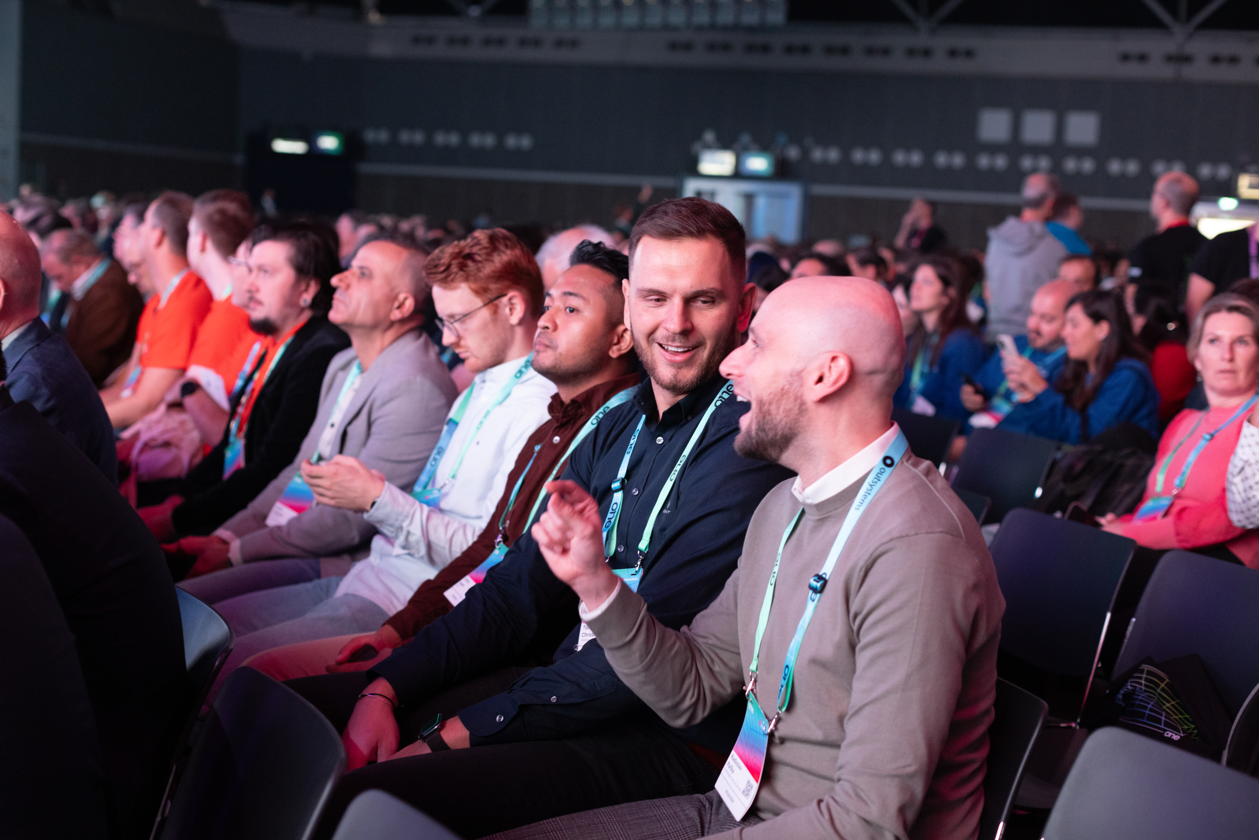
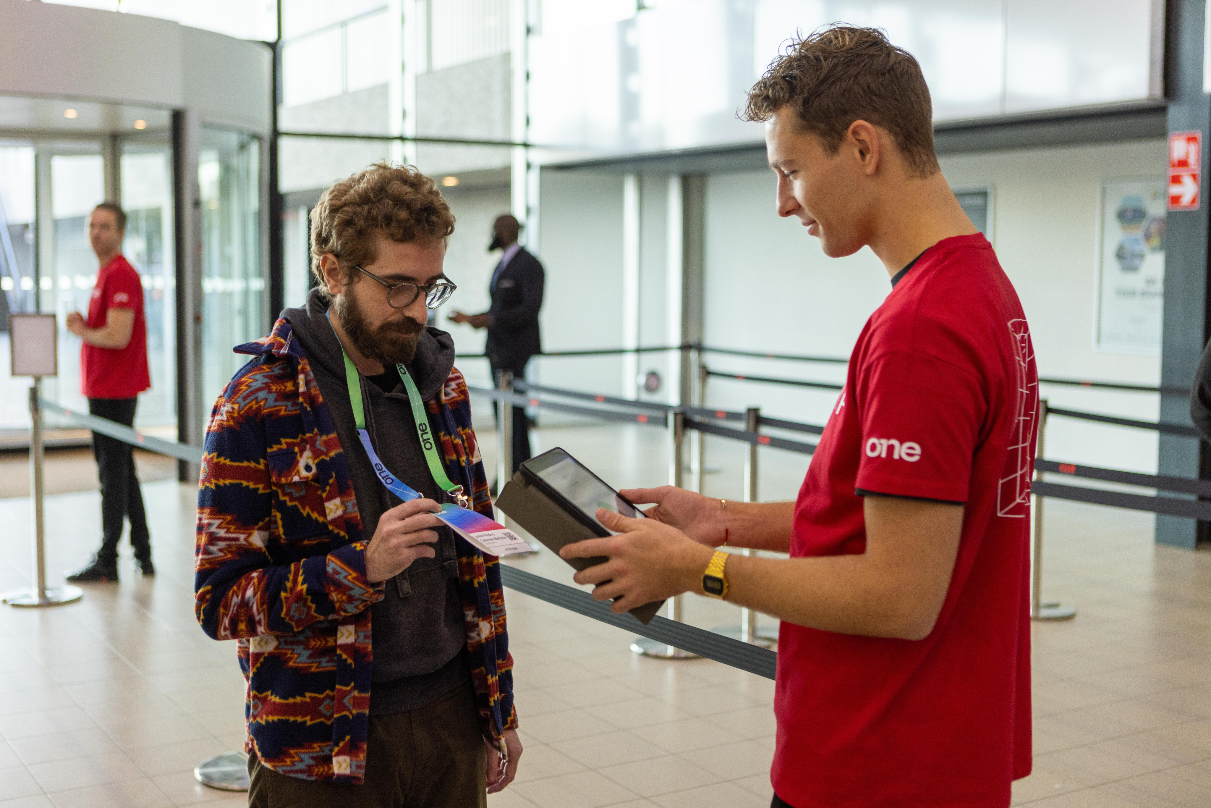
Active speakers on stage
Showcase the value
Our greatest asset is the great content, and these are the faces of that value. Our community of speakers, customers and leaders showcase what OutSystems ONE had to offer, and that makes them the face of the event (side by side with Neo).
Community engaged
Help them feel the energy
In between the talks a universe of relationship building, interesting chats and new business connections happen. Those moments make it clear we are a lively and energetic community, one that a prospect might want to join.
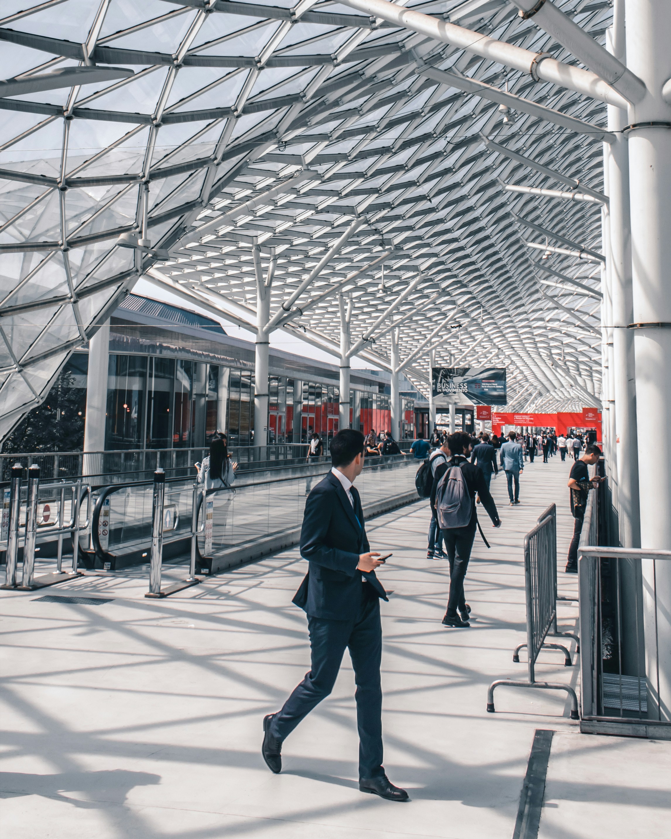
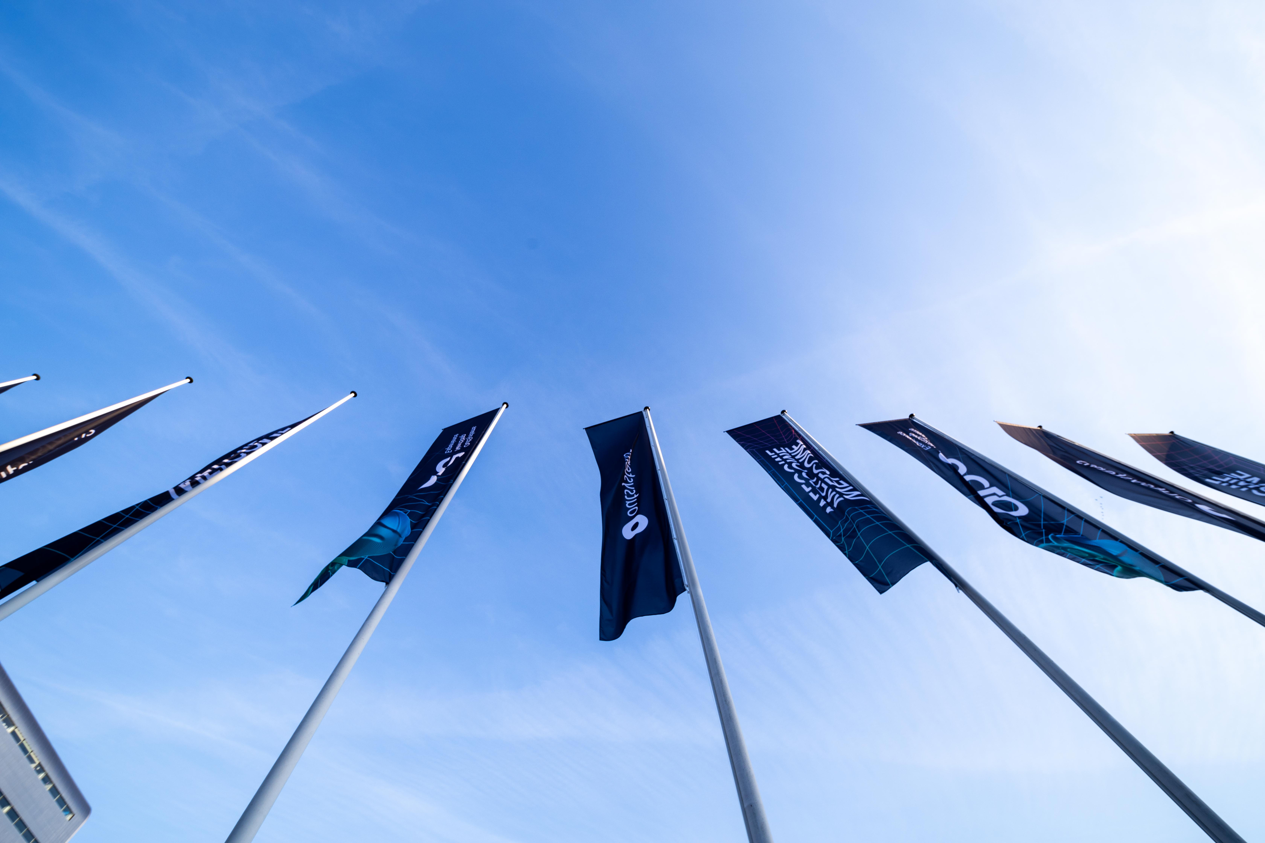
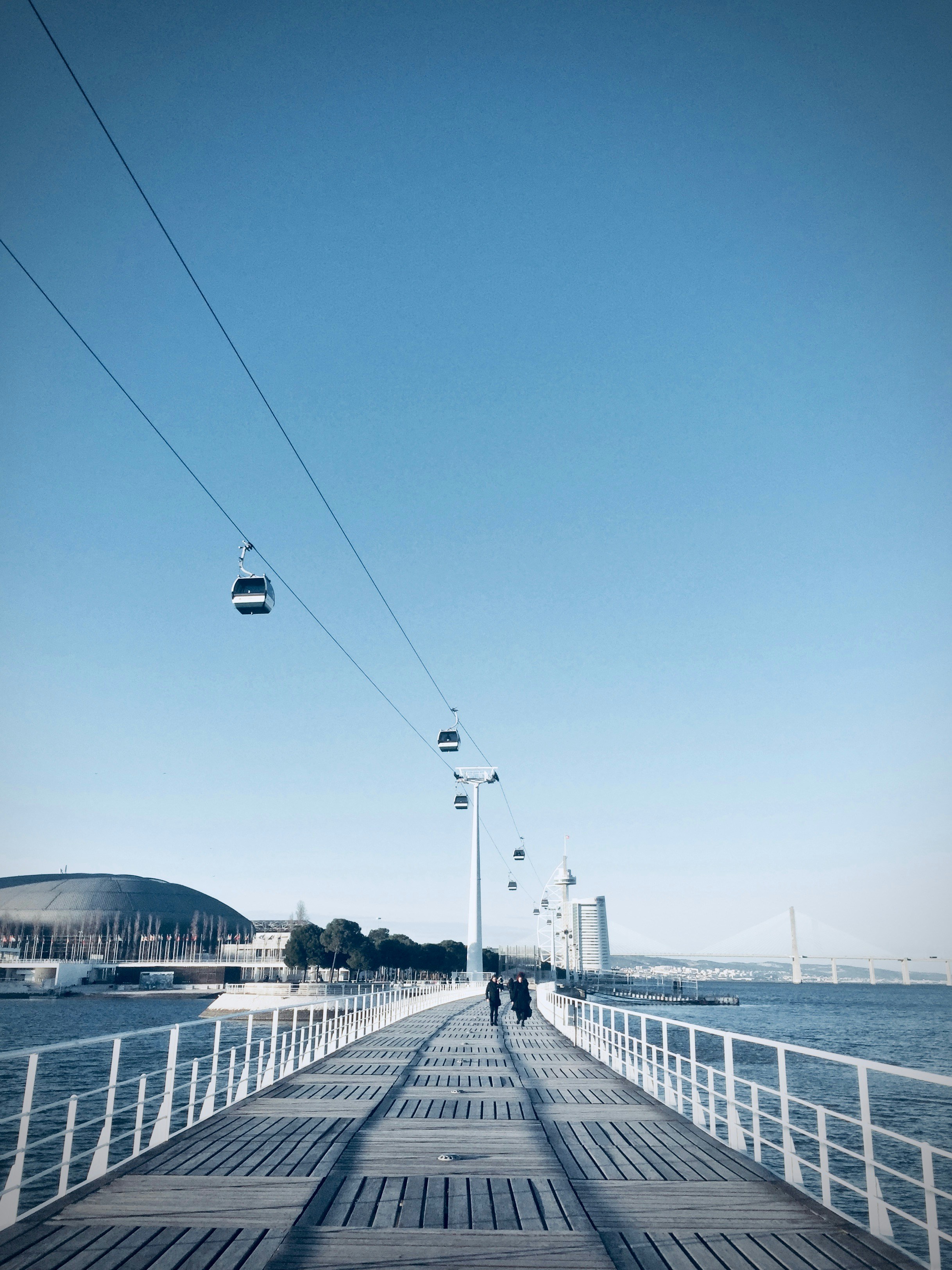
Venue & Experience
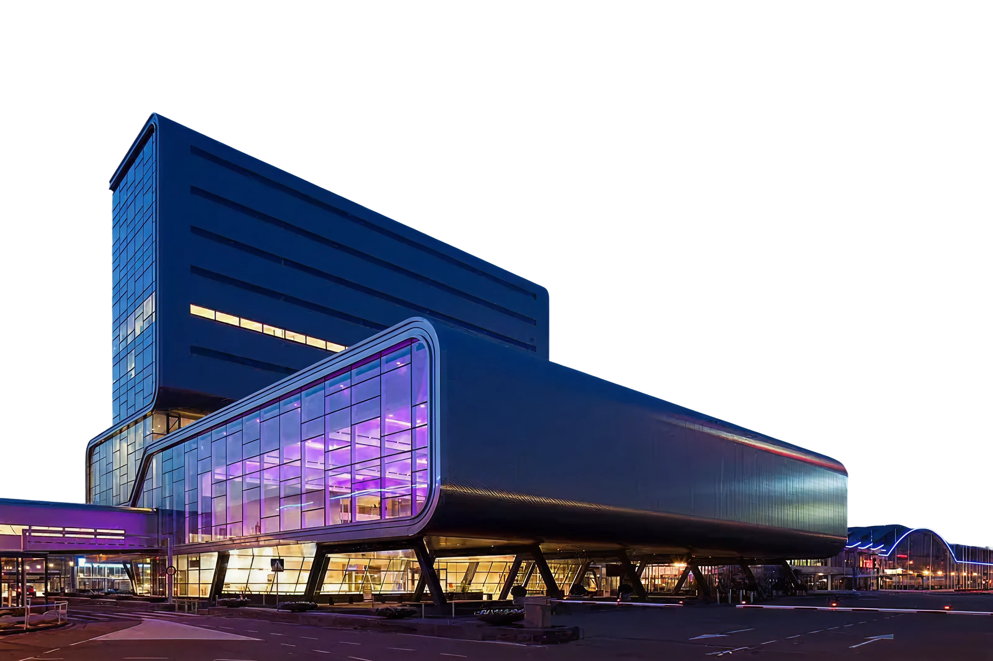
Guide and convince
ONE is a global conference, and we make that clear by valueing our venues and host cities, by showcasing it
Photography treatment
Contained
Give context, keep it clean
Cutouts are highlight elements, but all images deserve proper placement, hence containing visuals in rounded corner boxes is the default treatment for everything else.
Cutout
Highlight the key element
The speaker, the moment, the gesture, the item or the action. All of these are things we can make fit a composition easily with cutout treatment.
Vibrant
Color that pops
Ideally we need images with vibrant colros to contrast with the dark backgrounds,
Ideally we need images with vibrant colros to contrast with the dark backgrounds,
Layouts
Information setup is key to the way we communicate as OutSystems, so we focus a lot on a clean, clear and editorial style content layout for all our assets.
There are a few different treatments we do as default and those should be treated as priority within the brand application.
The logo can be applied by itself, with the word Conference or, if necessary, in its adjusted icon format for smaller applications.
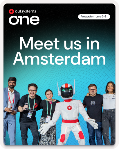
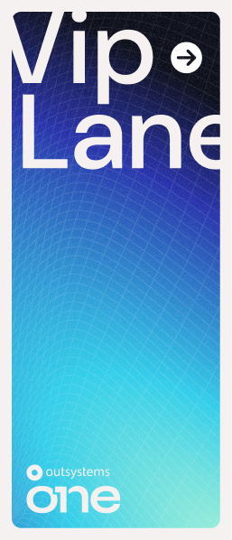
Amsterdam | June 2-3
Layout application
Text left, image right for most applications
For most applications
Clear message focused layouts, taking people through their experience
Use corners (mostly top)
Labels & logos as visual guides
Using notes like Date, Location, website, hashtags and other complementary information, you help better frame the content.
Alignment follows medium
Let the frame define the art
Even though our default is left aligned, center alignment or right alignement of elements can
Big Keywords deserve space
Message & cutout combos
This is an optional stylistic approach, but one we encourage whenever possible. It helps empower brand application.
Single words take control
Message & cutout combos
When using single keywords or really short sentences, it can be fully centered and take over the available space.
Labels & icons for details
Simple messages improved
June 2-3, 2026
RAI Amsterdam, Netherlands
June 2-3, 2026

RAI Amsterdam, Netherlands
Dates, hashtags, locations, promo codes and many more details that might need to be communicated, would be better served with a contained label treatment.
Brand Guidelines
About OutSystems ONE
A conference for everyone
OutSystems ONE is the conference where we’ll be gathering all OutSystems customers, prospects and partners under a single roof, eager for product announcements, networking and evolving their AI & Agentic development strategies & skillsets.
Every customer, prospect or partner should feel at home in OutSystems ONE.


The acronym
A name with history, an acronym with future
ONE (OutSystems NextStep Exprienc) should always be written like an acronym. All Caps, at all times.
This way, OutSystems ONE reads better, while still nodding to both our original customer conference, NextStep, and the ONE brand developed for our Developer Conference in 2024.
The full name is not to be used unless requested explicitly.
Brand System
Logo Cluster
The OutSystems ONE logo cluster is a collection of our core brand logo, and the 1 Click Publish inspired ONE logo.
They act as a combo to clearly signify OutSystems as the host of ONE.
The cluster should be applied consistently and according to the pre-established versions of the cluster, adjusting formatting to the available space. Although each logo can be applied individually, they should always share a layout when talking about the event.


Ground rules
Spacing
At any point, there should be a Minimum clear space around logo:
- The same width as 1/4 of the OutSystems’ Ring icon.
Size
Smallest dimensions for logo application should be led by the OutSystems ring height:
- Ring height or ONE Icon:16px/ 4 mm/ 0.15”
Logo + Label should never be applied small.
Colors
OutSystems ONE’s logo can be used in either color or monochrome, in light or dark versions.
Logo versions
Main application
It’s the default option to communicate OutSystems ONE. Should be used the most.


Block - vertical
Most compact version. Should be the second most used.
Shorthand - horizontal
Great for application on small digital banners or website navigations. Also good for signature.
ONE Icon
To be used as either a graphic decoration element or small icon.
Correct usage
Do
Apply the provided logos as they’re provided
Do
Apply logo/icon version on correct background
Do
Apply the logo w/ correct color & dimensions


Do not
Alter the logo shape or current dimensions


Do not
Apply logo/icon on low-contrast backgrounds


Do not
Apply the logo w/ edited color or dimensions
Typography
As a brand heavily inspired by Swiss editorial type layouts, OutSystems and all sub-brands including OutSystems ONE, are heavily defined by its typography.
Most of our layouts and UIs are defined by typography first, creating readable documents and flowing spaces between information blocks.
To enforce simplicity and brand scalability, we use a single font from Google fonts called DM Sans. It’s modern, has variable controls, and reads well in both small and big formats.
DM Sans
Unleash innovation at OutSystems ONE—where OutSystems experts, industry leaders, and customers showcase how AI-powered low-code creates extraordinary apps. Join us for 2 amazing days at the ultimate tech conference of 2025.
Get inspired
Discover fresh ideas from low-code visionaries and get up to speed on the latest AI advancements.
Type application
Innovate without limits
Unleash innovation at OutSystems ONE—where experts, industry leaders, and customers showcase how AI-powered low-code creates extraordinary apps.
Get Your Ticket
By default all type applicationis aligned to the left
This way, the OutSystems ONE brand works more clearly as an extension of the OutSystems brand, with the editorial styled typography application.
Innovate without limits
Unleash innovation at OutSystems ONE—where experts, industry leaders, and customers showcase how AI-powered low-code creates extraordinary apps.
Get Your Ticket
If benefitial to the layout we can use centered text
This way, the OutSystems ONE brand can still adjust to the needs of the final layout, without making things unbalanced.
This is a Title
This is a SubTitle
These are section headers
This is some great content placeholder to showcase how type scales work.
These are section headers
This is some great content placeholder to showcase how type scales work
Well established hierarchy is essential for proper legibility
Clear messaging is key to properly establish & promote the benefits of our event. Nothing else should take relevance over messaging when possible.
Type scale
Default type scale for digital assets. Use it proportionally for other applications.
Title XXL
font-family
DM Sans
font-weight
540
optical-size
40
font-size
6.00 rem
line-height
100%
letter-spacing
2%
Title
font-family
DM Sans
font-weight
540
optical-size
40
font-size
4.00 rem
line-height
100%
letter-spacing
2%
SubTitle
font-family
DM Sans
font-weight
540
optical-size
40
font-size
2.00 rem
line-height
100%
letter-spacing
2%
Header
font-family
DM Sans
font-weight
540
optical-size
40
font-size
1.50 rem
line-height
110%
letter-spacing
2%
Highlight/Quote
font-family
DM Sans
font-weight
360
optical-size
40
font-size
1.25 rem
line-height
135%
letter-spacing
3%
Paragraph
font-family
DM Sans
font-weight
360
optical-size
40
font-size
1.00 rem
line-height
135%
letter-spacing
5%
Note
font-family
DM Sans
font-weight
360
optical-size
40
font-size
0.75 rem
line-height
120%
letter-spacing
5%
Navigation - Level 01
font-family
DM Sans
font-weight
540
optical-size
40
font-size
1.125 rem
line-height
100%
letter-spacing
2%
Navigation - Level 02
font-family
DM Sans
font-weight
540
optical-size
40
font-size
0.875 rem
line-height
100%
letter-spacing
2%
Color
OutSystems ONE is a place for crossover, with realities that mix the most technical of tech person and the most innovative of their business partners.
Our color applications invoke the energy of those shared spaces, in a constant state of transformation between energetic reds to enlightened blues, from technical black to glowing indigo, from space greys to a controlled brightness of our main off-white backgrounds.
This means our color application should be a well distributed representation of color, balanced with our new off-white backgrounds and clean, deep dark blue typography.
Gradients & color significance
Brand
os-red // space-blue //marine-blue
General brand color application. Can be used for anything more broad brand promotion and general audience materials.
Space
black // grey-900 //marine-blue
Complementary color application meant as a counter-part to brand. Allows for contrast and highlight of elements and messages.
Glow
grey-900 // space-blue //aqua-blue // soft-community-green
Tertiary color application meant as an highlighter. Allows for bright callouts and more varied colourful patches.
Color application
Most backgrounds should be light or gradient
This way, the information stand out more and better represents the strong brand energy.
Exceptions can be made, but the focus should be on making assets clean, impactful and readable.
Color should always be framed by our off-white backgrounds
Using negative application of colored 3D meshes & grids under dark containers we can develop a more punchy look for some of the promotional and printed materials.
Clear, readable, contrasting text color for all applications
This way, all the messaging and information stands out more than anything else on frame.
Gradients can be smooth or step-based
Smooth gradients on line work is the easiest way of brand application, but using a sequence of solid colors for certain print or visual elements can create a similar effect.
Color distribution


65%
neutrals
A majority of the elements should be black or dark background, with white or light-grey text on top.
20%
gradients
Gradients should be used mostly on the outline of visual elements and containers. We can occasionally be used as background for important text or CTA highlight.
15%
brand
Solid colors can be used for tags, navigation and printed signage, with bigger presence of the OutSystems red as the default brand color on most elements if needed.
Colors codes
Brand
token-name
one-brand-os-red
hex
#F32D35
rgb
243
045
053
cmyk
000
100
095
000
token-name
one-brand-space-blue
hex
#2530A9
rgb
037
048
169
cmyk
100
085
000
002
token-name
one-brand-deep-blue
hex
#5C73E7
rgb
092
115
231
cmyk
075
060
000
000
token-name
one-brand-marine-blue
hex
#79CBEC
rgb
121
203
236
cmyk
048
003
003
000
token-name
one-brand-aqua-blue
hex
#30CDE9
rgb
048
205
233
cmyk
062
000
009
000
token-name
one_brand-community-green
hex
#00FF75
rgb
000
255
117
cmyk
065
000
065
000
Soft tones
token-name
one-soft-deep-red
hex
#F5C0C1
rgb
245
192
193
cmyk
000
029
014
000
token-name
one-soft-space-blue
hex
#C1C1DE
rgb
193
193
222
cmyk
023
021
002
000
token-name
one-soft-indigo-blue
hex
#CFD1EE
rgb
207
209
238
cmyk
016
014
000
000
token-name
one-soft-marine-blue
hex
#D6E7EF
rgb
214
231
239
cmyk
015
003
003
000
token-name
one-soft-shiny-blue
hex
#C4E8EE
rgb
196
232
238
cmyk
022
000
006
000
token-name
one-soft-community-green
hex
#B8F5D1
rgb
184
245
209
cmyk
025
000
025
000
Greyscale
token-name
one-white
hex
#FFFFFF
rgb
255
255
255
cmyk
000
000
000
000
token-name
one-grey-050
hex
#F5F1F0
rgb
245
241
240
cmyk
003
004
003
000
token-name
one-grey-100
hex
#DDD9D9
rgb
221
217
217
cmyk
012
011
010
000
token-name
one-grey-200
hex
#C2BFC1
rgb
194
191
193
cmyk
024
010
019
000
token-name
one-grey-300
hex
#A7A5A8
rgb
167
165
168
cmyk
036
031
029
000
token-name
one-grey-400
hex
#8C8B90
rgb
140
139
144
cmyk
048
040
036
003
token-name
one-grey-500
hex
#727278
rgb
114
114
120
cmyk
057
049
043
012
token-name
one-grey-600
hex
#575860
rgb
087
088
096
cmyk
066
058
049
025
token-name
one-grey-700
hex
#3D3E48
rgb
061
062
072
cmyk
073
066
052
043
token-name
one-grey-800
hex
#23242F
rgb
035
036
047
cmyk
079
072
055
064
token-name
one-grey-900
hex
#0A0C18
rgb
010
012
024
cmyk
080
073
059
079
token-name
one-black
hex
#000000
rgb
000
000
000
cmyk
060
040
040
100
Key visuals & image treatment
A set of key visuals & standard image treatment is essential to connect the visual language application across board.
In the case of OutSystems ONE. we use a set of 3D meshes, grids and icons intertwined with stage, audience and location photography to build an immersive digital but human universe, and then our photos and key visuals stand on top of it, contrasting with the dark and glowy artwork.
Our photos and key visuals stand on top of everything, contrasting with the dark background and glowy 3d line artwork.
Available graphic assets
Gradient 3D meshes
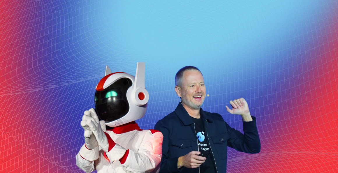
Main visual element


This is the main key visual for OutSystems ONE. These can be applied in most of the assets and are easy to use for both static and motion assets.
Gradient 3D grids
Complementary visual element


This is the complementary key visual for OutSystems ONE. These can be applied in a variety of assets, ideally in motion as a starting point to our 3d meshes/waves.
Isometric iconography
Detail/bullet visual element
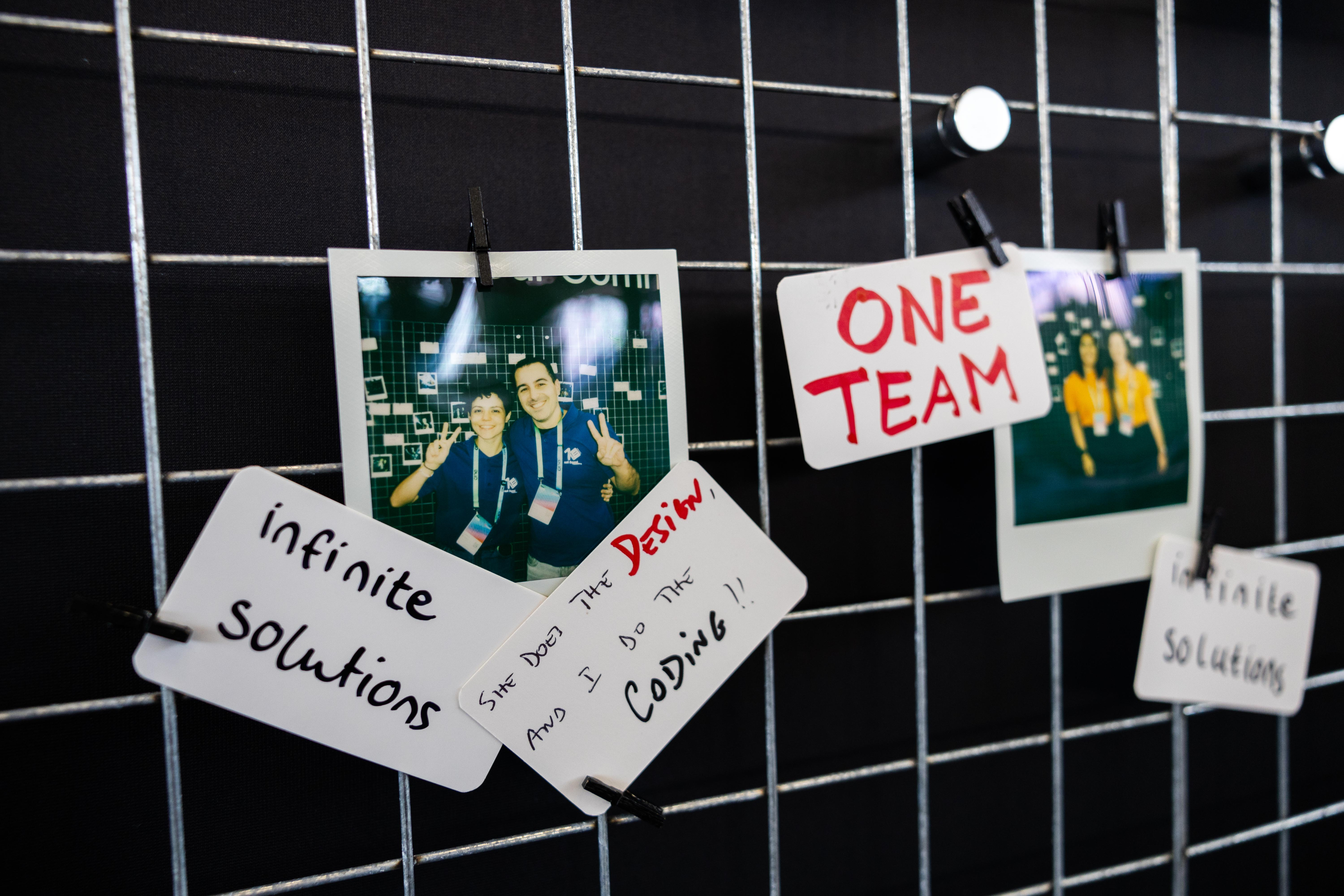
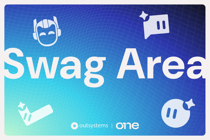
Have you met Neo
These icons are softer brand elements. made to help better communicate certain themes and audience specific content. They should be seamlessly mixed up with content in a 2D plane.
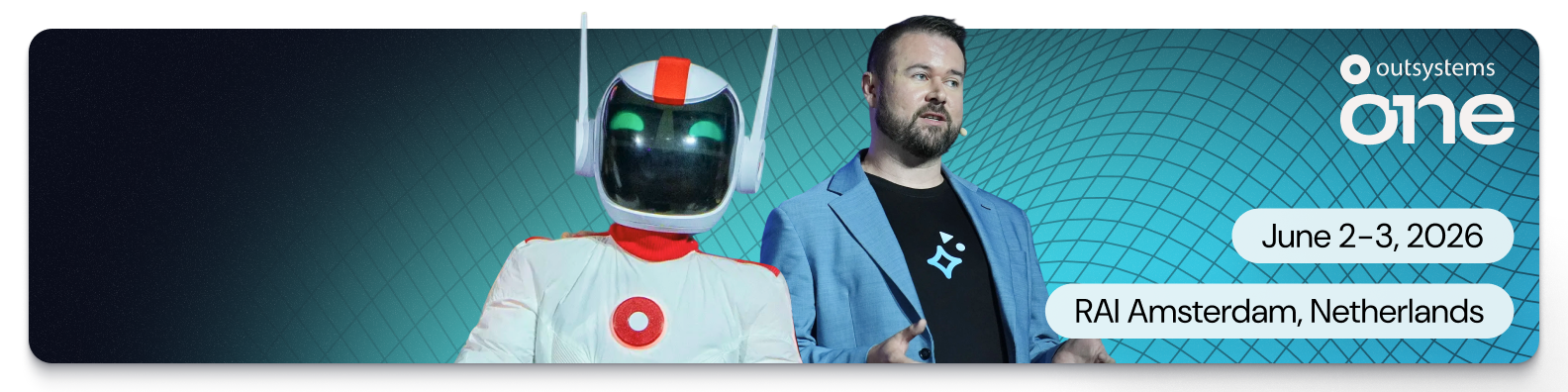
Neo & Agents
Iconographic representation
Simple, note worthy


When we need Neo or the Agents to be there, but not scream out loud, we can then use their icons to convey teh fun, whimsical nature of our brand.
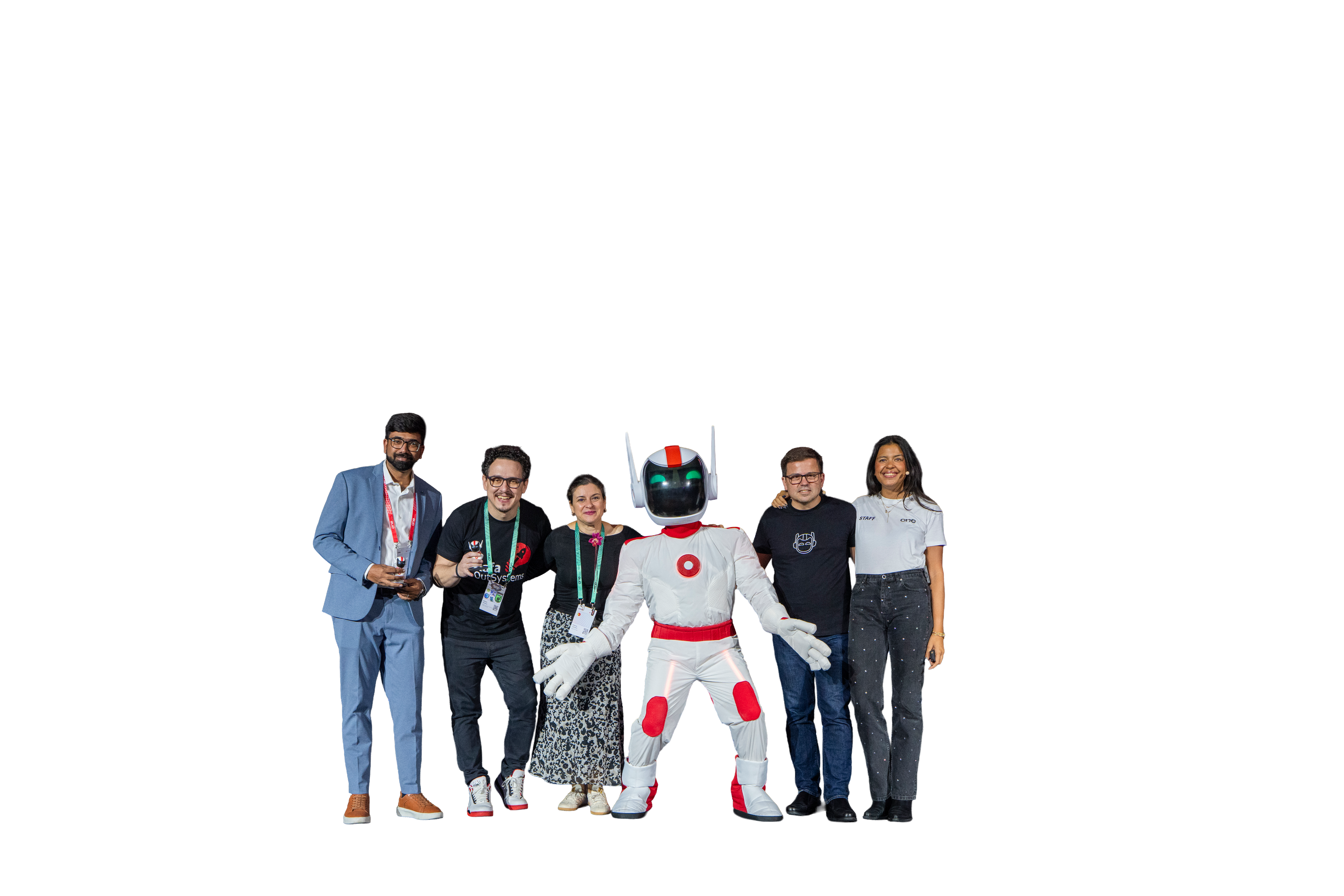
Real Neo
The real deal, he’ll be there

Neo is the host, the face and therefore, the more real we can get and use Neo’s face on photos and comps, the better.
Photography
Image types (also applied to video)
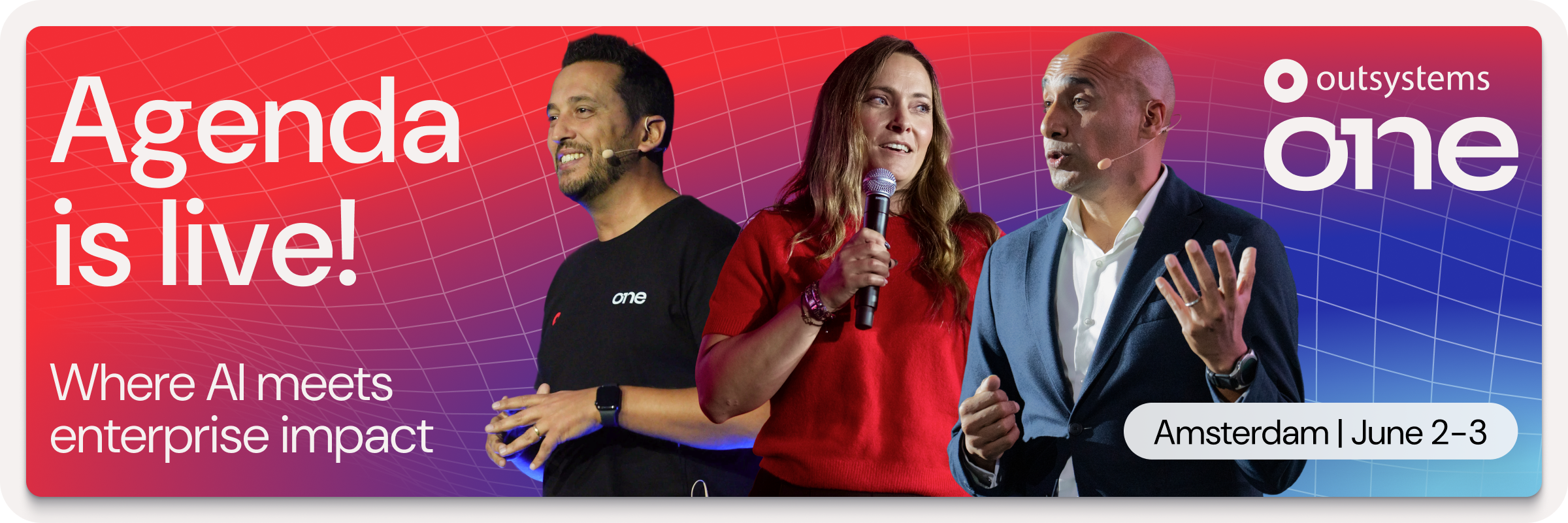
Active speakers on stage
Showcase the value
Our greatest asset is the great content, and these are the faces of that value. Our community of speakers, customers and leaders showcase what OutSystems ONE had to offer, and that makes them the face of the event (side by side with Neo).
Community engaged
Help them feel the energy
In between the talks a universe of relationship building, interesting chats and new business connections happen. Those moments make it clear we are a lively and energetic community, one that a prospect might want to join.
Venue & Experience
Guide and convince
ONE is a global conference, and we make that clear by valuing our venues and host cities throw showcase. Iconic spots, great venue photography, key experience moments, and good architectural photography make these perfectly blend with the OutSystems ONE brand.
Photography treatment
Contained
Give context, keep it clean
Cutouts are highlight elements, but all images deserve proper placement, hence containing visuals in rounded corner boxes is the default treatment for everything else.
Cutout
Highlight the key element
The speaker, the moment, the gesture, the item or the action. All of these are things we can make fit a composition easily with cutout treatment.
Vibrant
Color that pops
Ideally we need images with vibrant colors to contrast with the dark backgrounds. Venue lighting, SWAG, a branded shirt, Neo, and many more elements can be used or simply the photo editing should help colors pop.
Not saturation. Vibrancy.
Layouts
Information setup is key to the way we communicate as OutSystems, so we focus a lot on a clean, clear and editorial style content layout for all our assets.
There are a few different treatments we do as default and those should be treated as priority within the brand application.
In any case, OutSystems ONE is an expressive brand and there’s space for exploration on layouts and structure, but this is mostly reserved to more relevant assets like stage building and promo videos.


Amsterdam | June 2-3
Layout application
Text/image division
For most applications
Clear message focused layouts, taking people through their experience
Use corners (mostly top)
Labels & logos as visual guides
Using notes like Date, Location, website, hashtags and other complementary information, you help better frame the content.
Alignment follows medium
Let the frame define the art
Even though our default is left aligned, center alignment or right alignment of elements can be applied if it better serves the layout. Like how social posts and stories deserve different treatment.
Big Keywords deserve space
Message & cutout combos
This is an optional stylistic approach, but one we encourage whenever possible. It helps empower brand application.
Single words take control
Message & cutout combos
When using single keywords or really short sentences, it can be fully centered and take over the available space.
Labels & icons for details
Simple messages improved
June 2-3, 2026
RAI Amsterdam, Netherlands
June 2-3, 2026

RAI Amsterdam, Netherlands

Dates, hashtags, locations, promo codes and many more details that might need to be communicated, would be better served with a contained label treatment.