


Brand Guidelines

About ONE
A conference for everyone
ONE is the single conference where we’ll be gathering all OutSystems customers, prospects and partners under a single roof, eager for product announcements, networking and future proofing their Low-Code & GenAI development strategies.
Every customer, prospect or partner should feel at home in ONE.

The acronym
A name with history, an acronym with future
ONE should always be written like an acronym. All Caps, at all times.
This way, ONE pays homage to our original customer conference, NextStep, while keeping in the front the name and brand developed for our Developer Conference starting 2024.
The full name is to be used only when extremelly necessary to create clarity.


Brand System
Logo
The ONE logo is based on a key element of our product UI, the 1 Click Publish button.
This can be noticed where we incorporated the number 1 into the N.
The logo can be applied by itself, with the word Conference or, if necessary, in its adjusted icon format for smaller applications.
Download Logos
inspiration

Publish


Ground rules

At any point, there should be a Minimum clear space around logo:
- The same width of the stem of the 1
Size


Smallest dimensions for logo application should be:
- ONE height: 16px/ 4 mm/ 0.15”
- ONE icon height: 24px/ 6 mm/ 0.15”
Logo + Label should never be applied small.
Colors


ONE’s logo can only be used in either full white or full black
Logo versions


Correct usage


Do
Apply the provided logos as they’re provided

Do
Apply logo/icon version on correct background
Do
Apply the logo w/ correct color & dimensions


Do not
Alter the logo shape or current dimensions

Do not
Apply logo/icon on low-contrast backgrounds


Do not
Apply the logo w/ edited color or dimensions
Typography
As a brand heavily inspired by Swiss editorial type layouts, OutSystems and all sub-brands including ONE, are heavily defined by its typography.
Most of our layouts and UIs are defined by typography first, creating readable documents and flowing spaces between information blocks.
To enforce simplicity and brand scalability, we use a single font from Google fonts called DM Sans. It’s modern, has variable controls, and reads well in both small and big formats.
DM Sans
Unleash innovation at ONE—where OutSystems experts, industry leaders, and customers showcase how AI-powered low-code creates extraordinary apps. Join us for 2 amazing days at the ultimate tech conference of 2025.
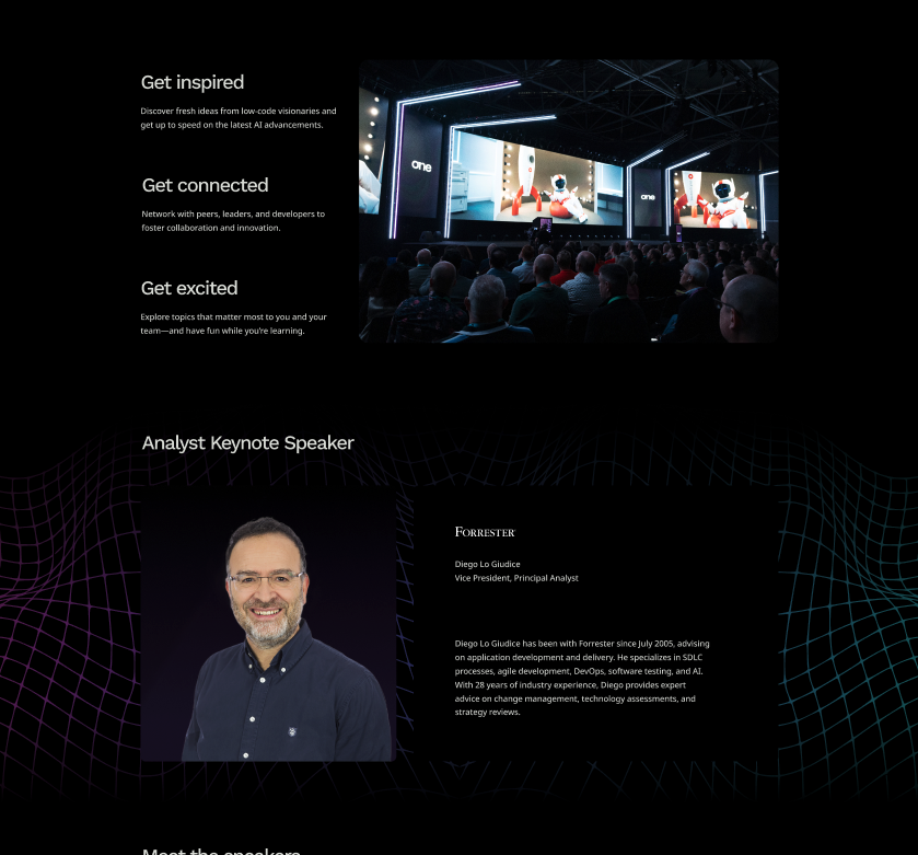
Get inspired
Discover fresh ideas from low-code visionaries and get up to speed on the latest AI advancements.
Type application
Type scale
Default type scale for digital assets. Use it proportionally for other applications.
Color
ONE is a place for crossover, with realities that mix the most technical of tech person and the most serious of business partners.
Color application refer to just that. A rainbow of realities but a single, clear and concise product they meet around.
This means our color application should be a well distributed representation of color, balanced with our classic black backgrounds and clean, white typography.

Gradients & color significance
Executive
brand-100 // brand-500

To be applied on everything that’s more focused on executive and business content.
Developer
brand-900 // brand-500

To be applied on everything that’s more focused on developer and technical content.
Global
brand-100 // brand-900

General brand color application. Can be used for anything more broad brand promotion and general audience materials.
Color application
Most backgrounds should be black or dark


Sept. 30 - Oct. 01

Lisbon
#ONEOutSystems
Agenda
is live!


Meet Neo
in Lisbon
#ONEOutSystems
This way, the colored lines and highlights stand out more and better represent the brand.
Exceptions can be made, but the focus should be on making assets clean, impactful and readable.
Color can be used to frame

Main
Stage
Keynote
Executive Mainstage
Using negative application of colored 3D meshes & grids under dark containers we can develop a more punchy look for some of the promotional and printed materials.
Clean white text for all applications


Meet us
in Lisbon


Sept. 30 - Oct. 01

Lisbon
#ONEOutSystems


Sept. 30 - Oct. 01

Lisbon
#ONEOutSystems
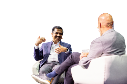
Hear from the analyst!

Diego Lo Giudice, VP, Principal Analyst


Code: MAYTHEFORCE25

Deadline: May 6, 2025
Sign up,
suit up!
Register now and
claim your exclusive
Neo t-shirt at
the event
This way, all the messaging and information stands out more than anything else on frame.
Gradients can be smooth or step-based


Smooth gradients on line work is the easiest way of brand application, but using a sequence of solid colors for certain print or visual elements can create a similar effect.
Color distribution


65%
neutrals
A majority of the elements should be black or dark background, with white or light-grey text on top.
20%
gradients
Gradients should be used mostly on the outline of visual elements and containers. We can occasionally be used as background for important text or CTA highlight.
15%
brand
Solid colors can be used for tags, navigation and printed signage, with bigger presence of the OutSystems red as teh default brand color on most elements if needed.
Colors codes
Brand-Colors


Neutral Tones


Key visuals & image treatment
A set of key visuals & standard image treatment is essential to connect the visual language application across board.
In the case of ONE. we use a set of 3D meshes, grids and icons intertwined with stage, audience and location photography to build an immersive digital but human universe, and then our photos and key visuals stand on top of it, contrasting with the dark and glowy artwork.
Our photos and key visuals stand on top of everything, contrasting with the dark background and glowy 3d line artwork.
As a brand heavily inspired by Swiss editorial type layouts, OutSystems and all sub-brands including ONE, are heavily defined by its typography.
In the case of ONE. we use a set of 3D meshes, grids and icons intertwined with stage, audience and location photography to build an immersive digital but human universe, and then our photos and key visuals stand on top of it, contrasting with the dark and glowy artwork.
Download assets

Available graphic assets
Gradient 3D meshes
Main visual element


This is the main key visual for ONE. These can be applied in most of the assets and are easy to use for both static and motion assets.
Download meshes
Gradient 3D grids
Complementary visual element


This is the complementary key visual for ONE. These can be applied in a variety of assets, ideally in motion as a starting point to our 3d meshes/waves.
Download grids
Isometric iconography
Detail/bullet visual element

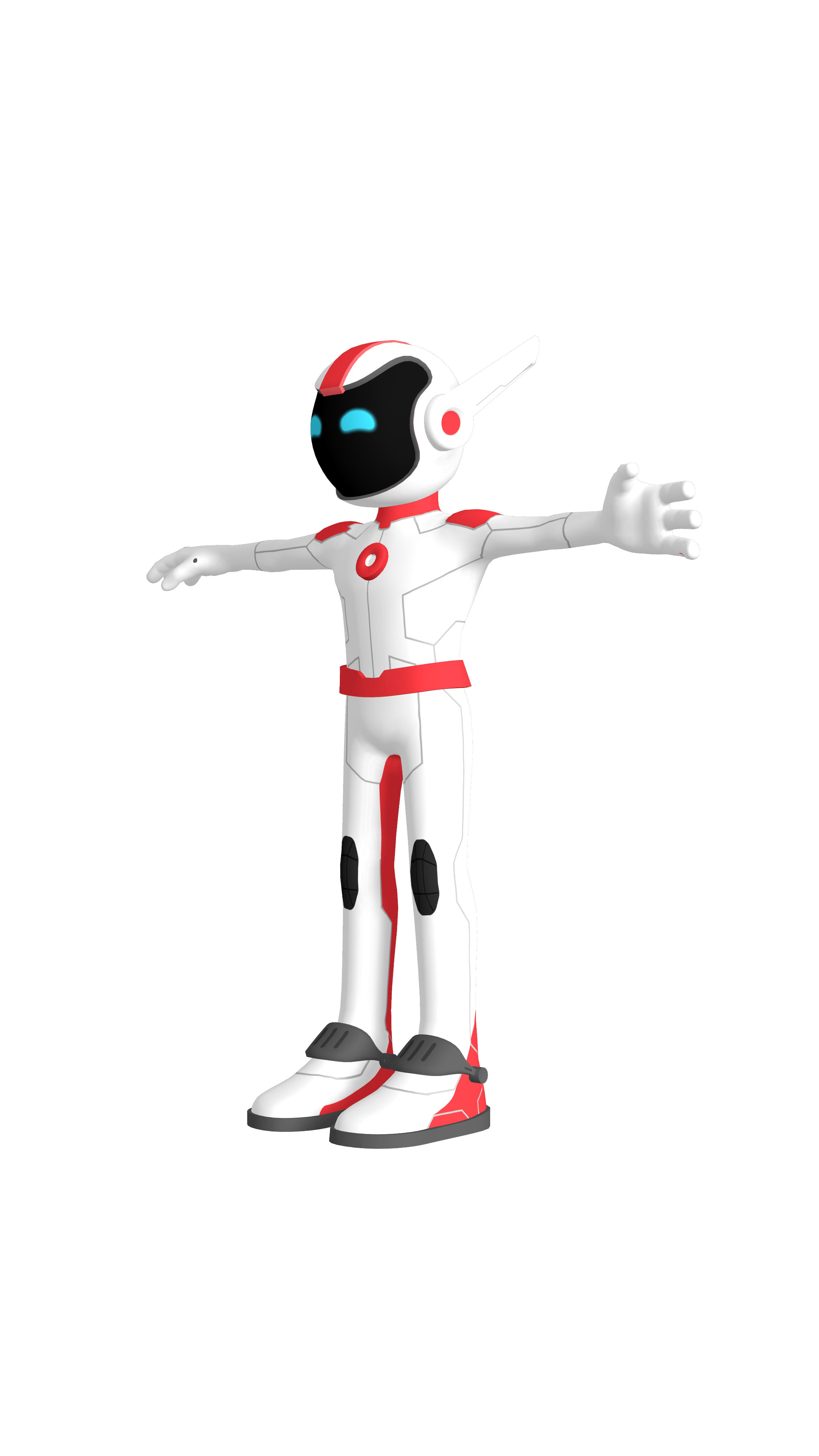
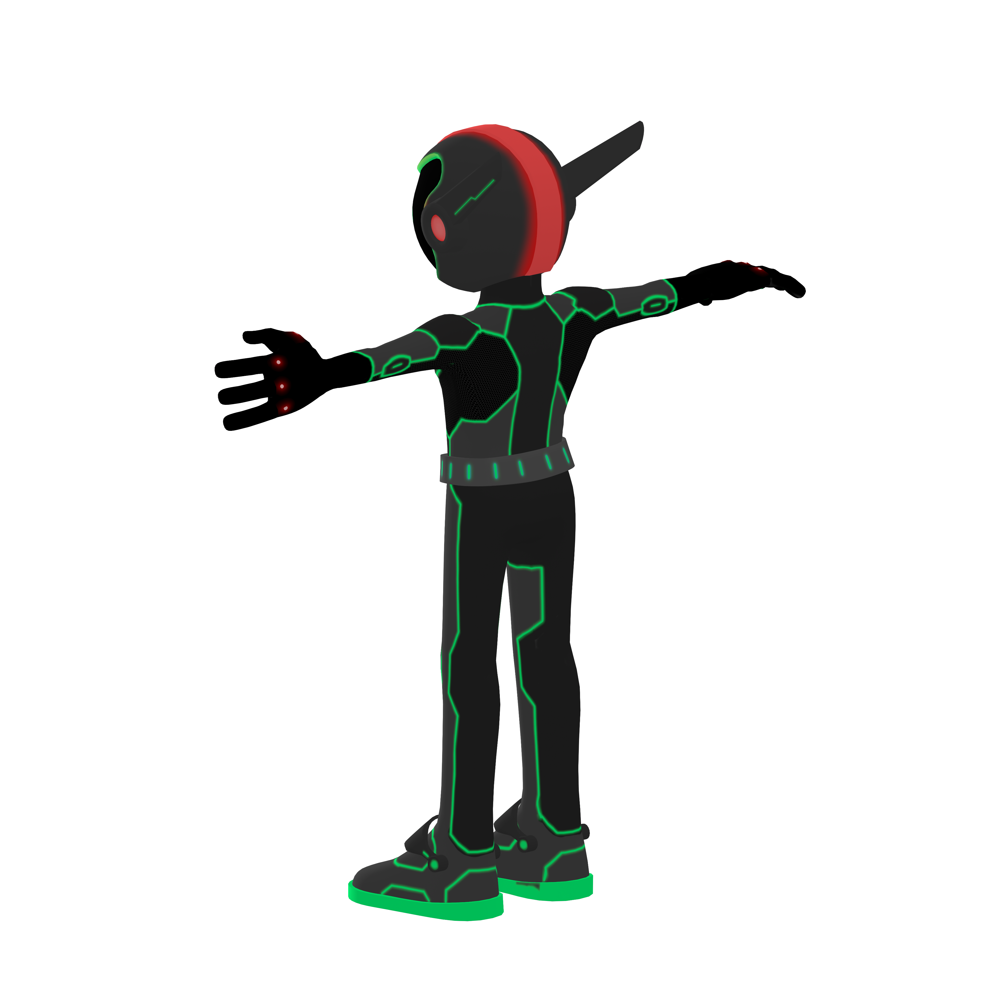
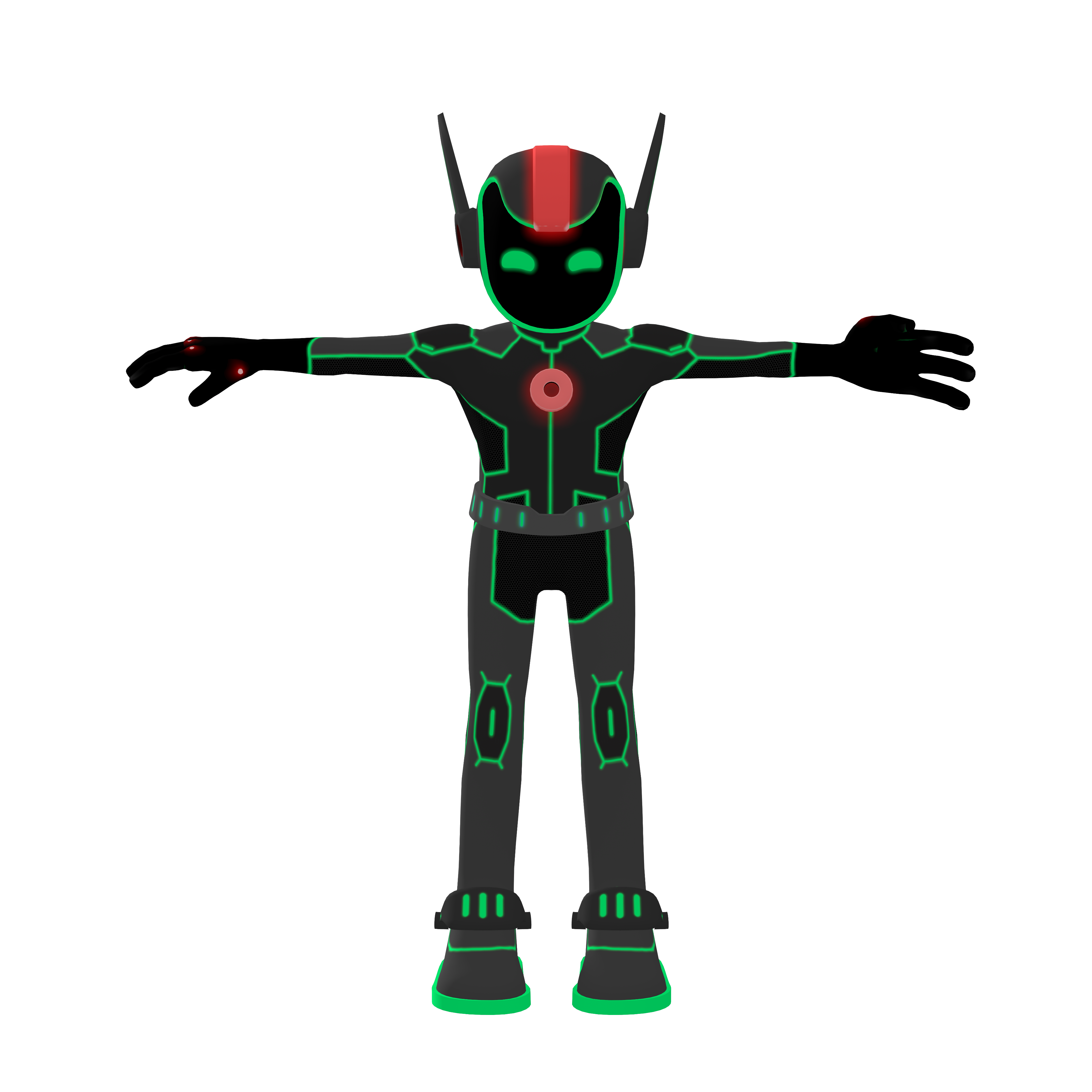
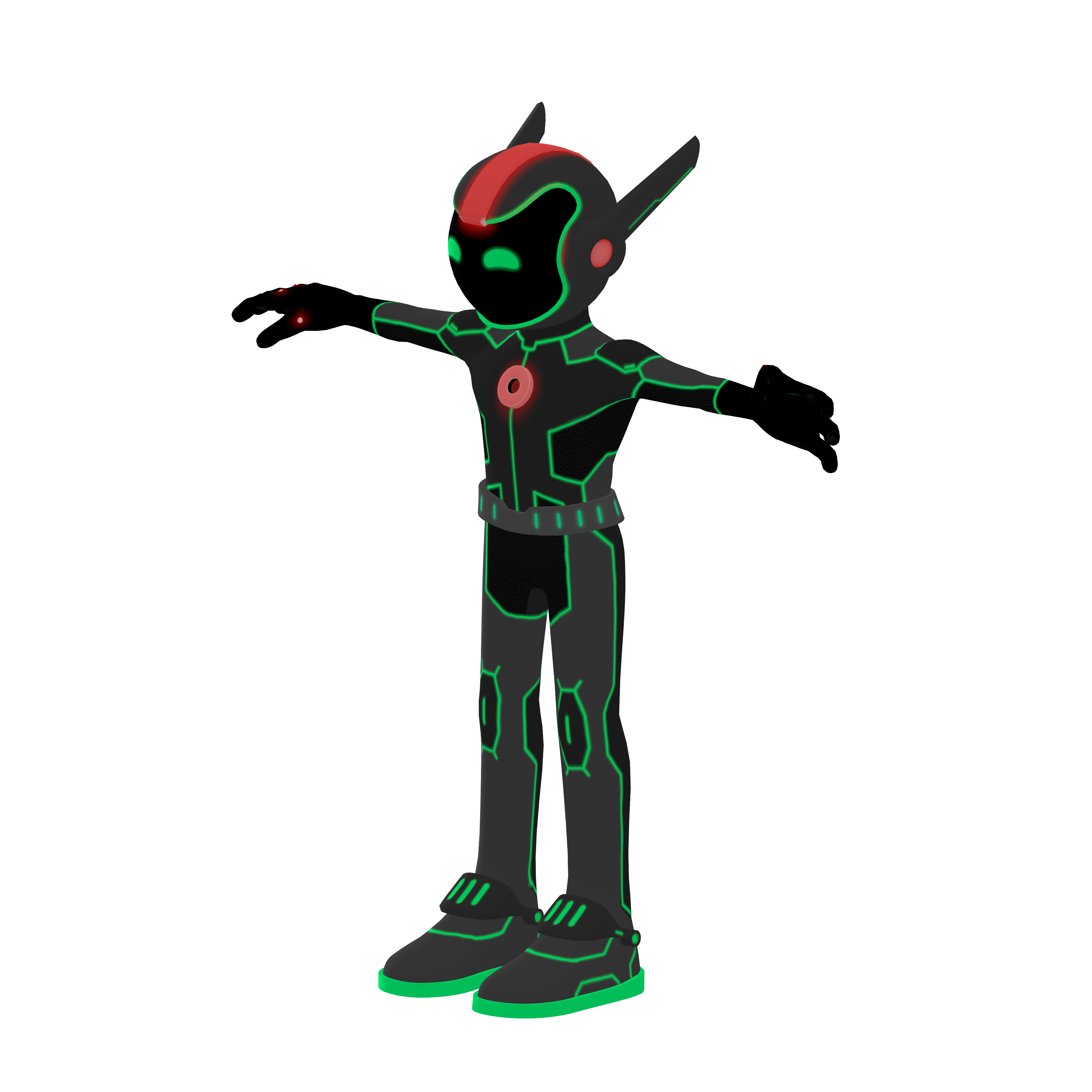
Have you met Neo


These icons are softer brand elements. made to help better communicate certain themes and audience specific content. They should be seamlessly mixed up with content in a 2D plane.
Download icons
Real Neo
The real deal, he’ll be there

Neo is the host, the face and therefore, the more real we can get and use Neo’s face on photos and comps, the better.
Since we’re revealing Neo’s new suit during ONE, using his current suit as the face of ONE is great because it will enhance the wow effect of the upgrade.
3D Neo
Animated, storyteller
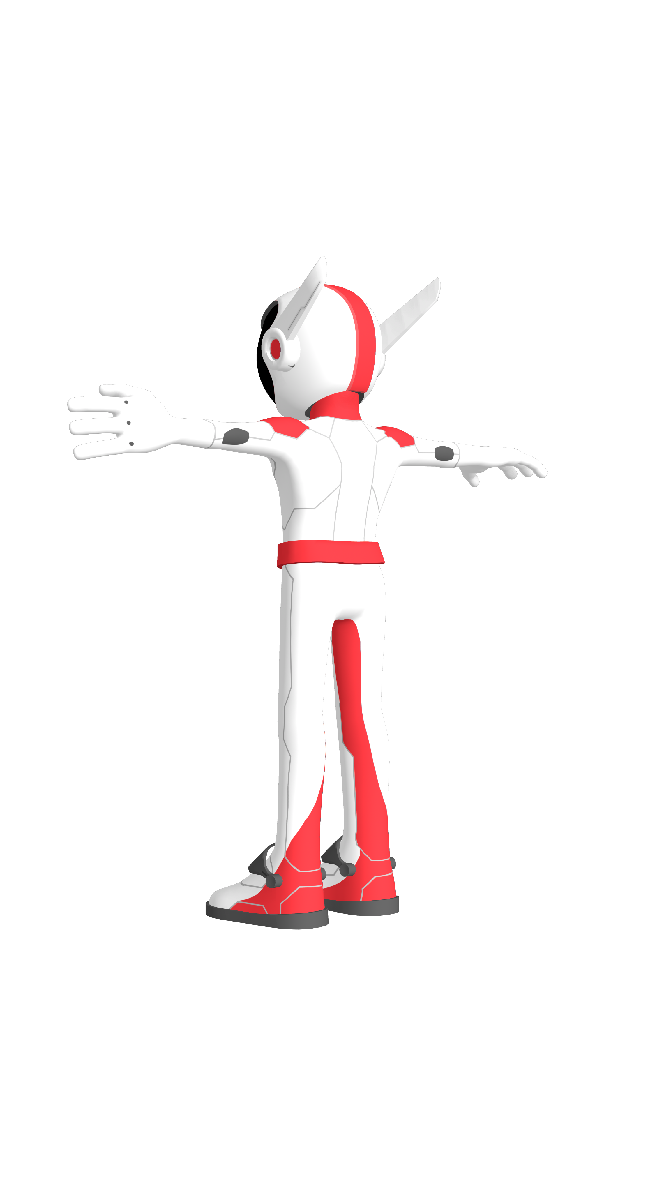
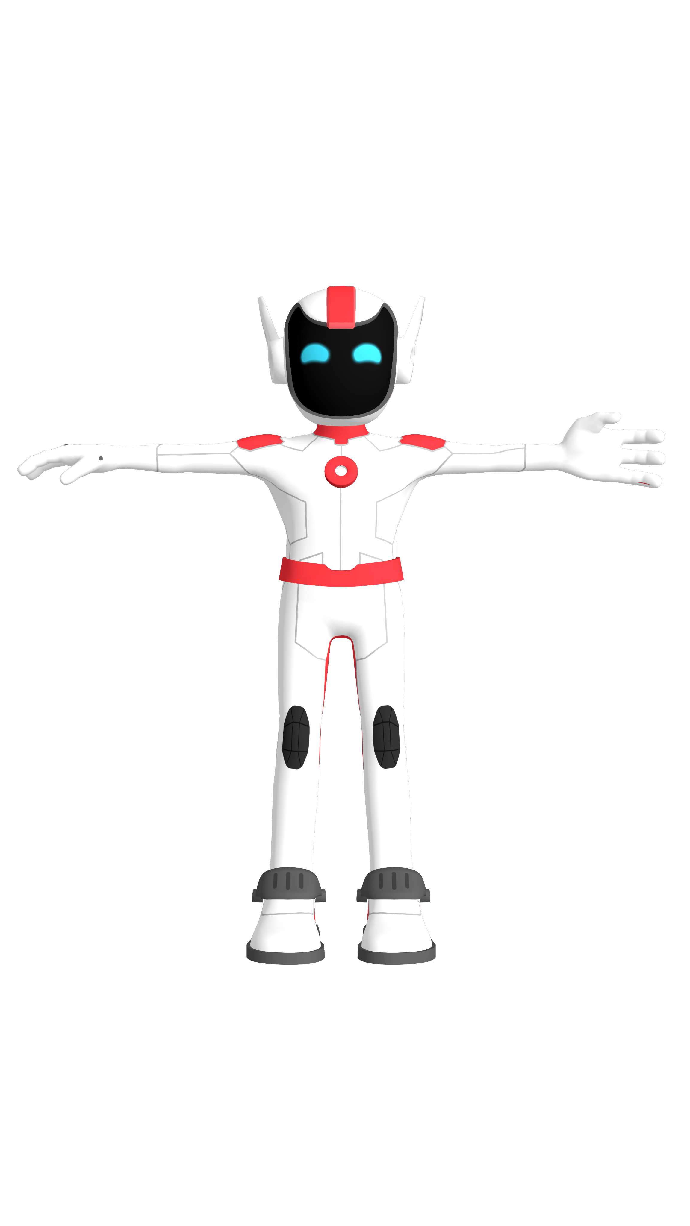
If we need Neo to talk and/or interact with our audience in any digital mean, we have our 3D and easily animated version to use. From Instagram filters to AI voice experiences, Neo can be the face of engagement.
Icon & Neomojis
Simple, note worthy


When we need Neo to be there, but not scream out loud, we can then use their icons and Neomojis to convey presence or (in the Neomojis’ case) emotion in a very simple way.
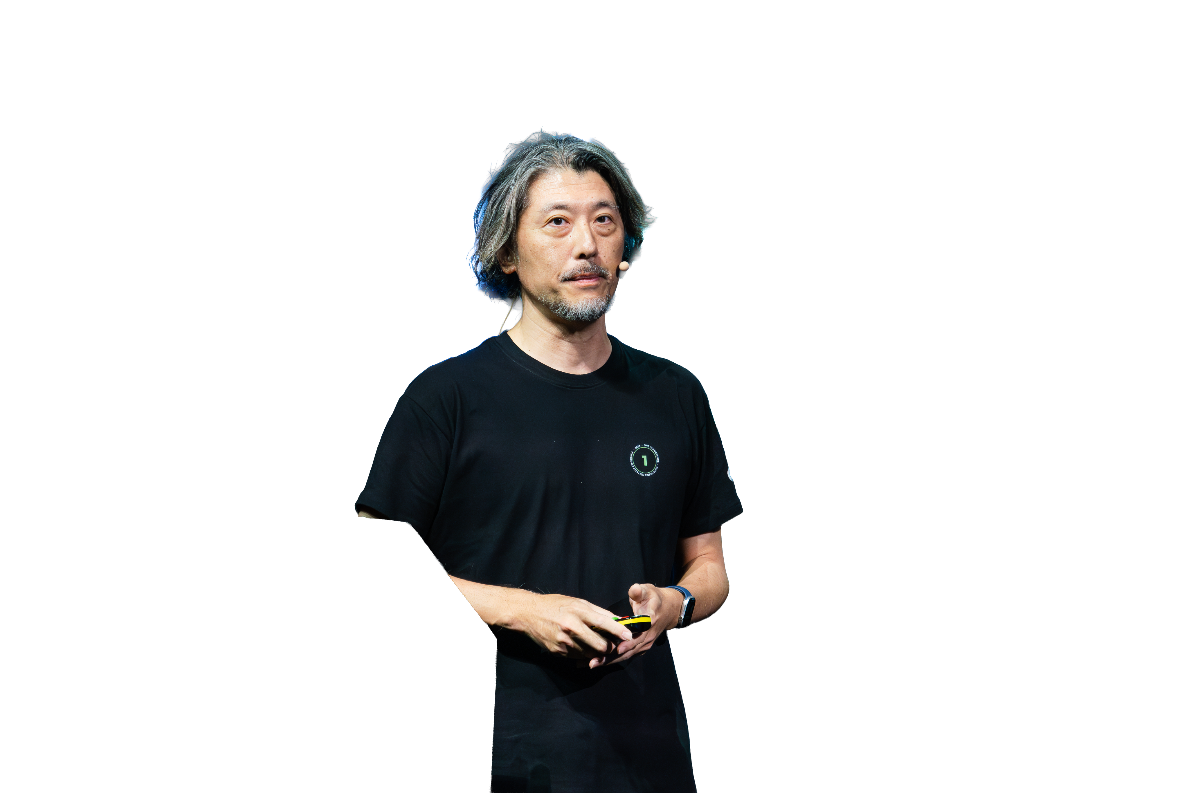
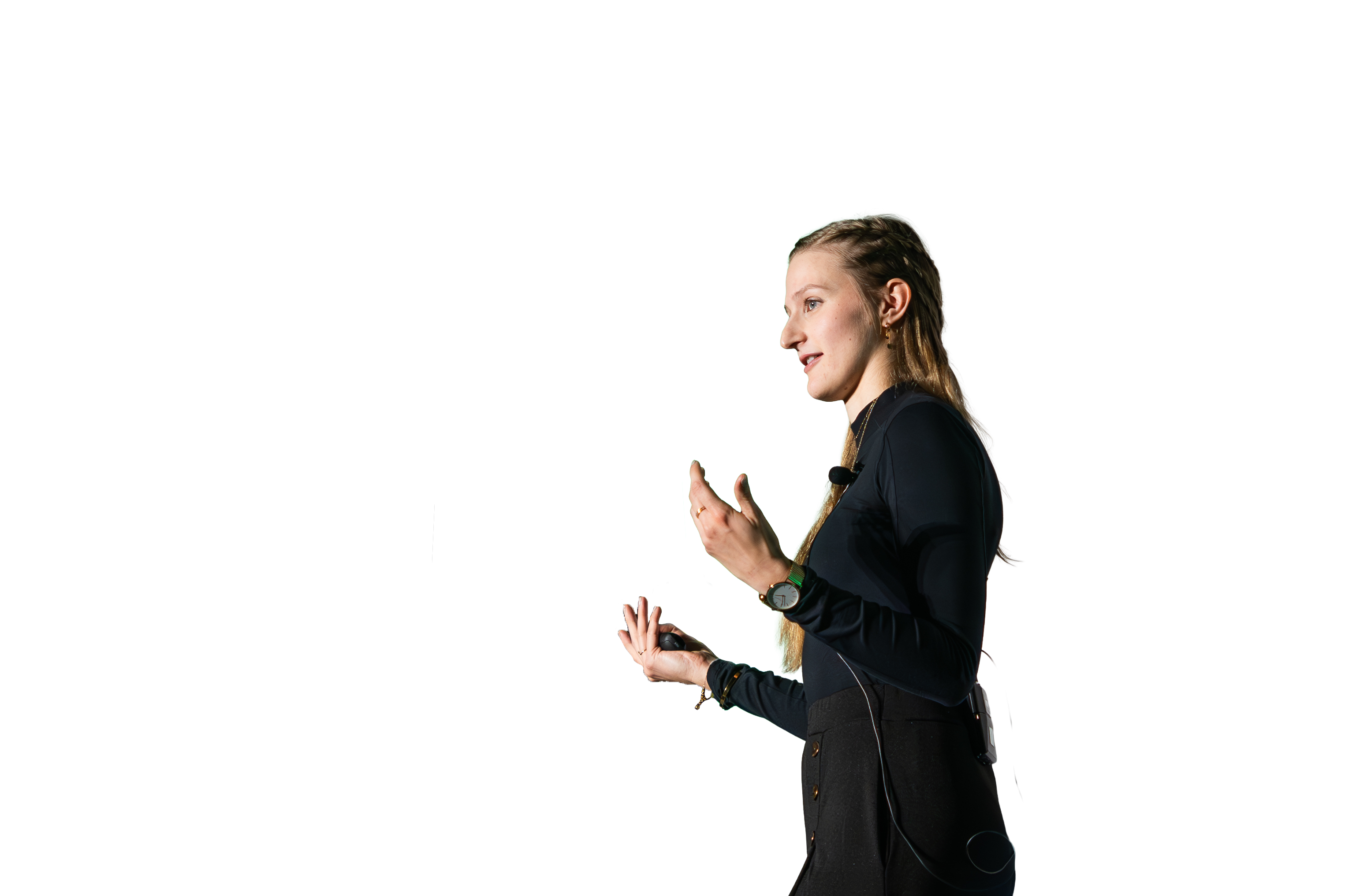
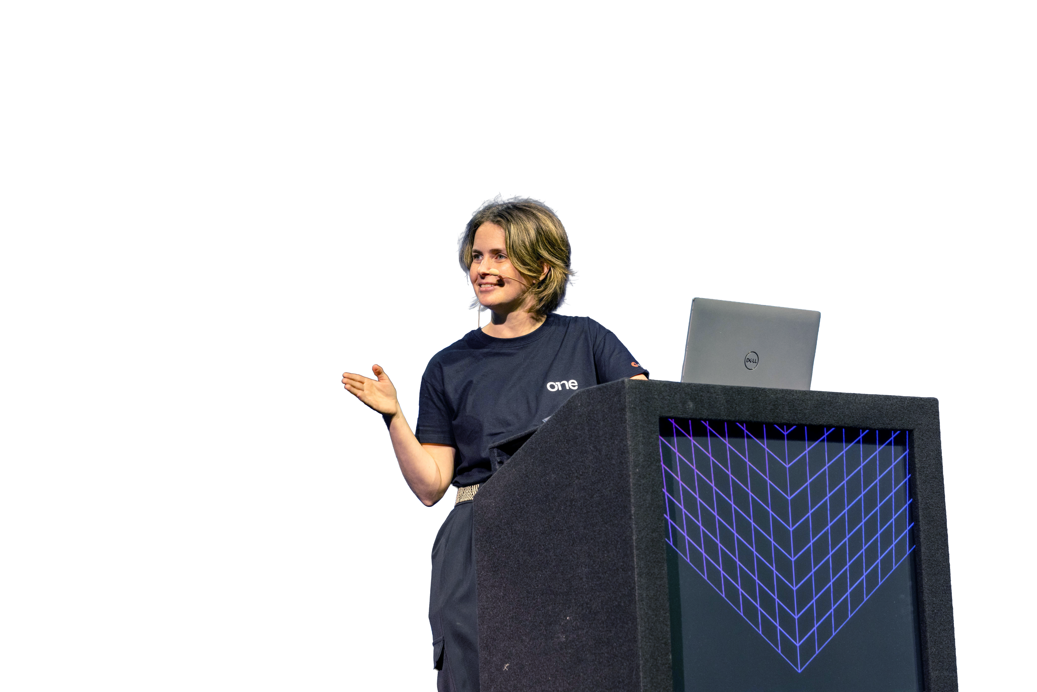
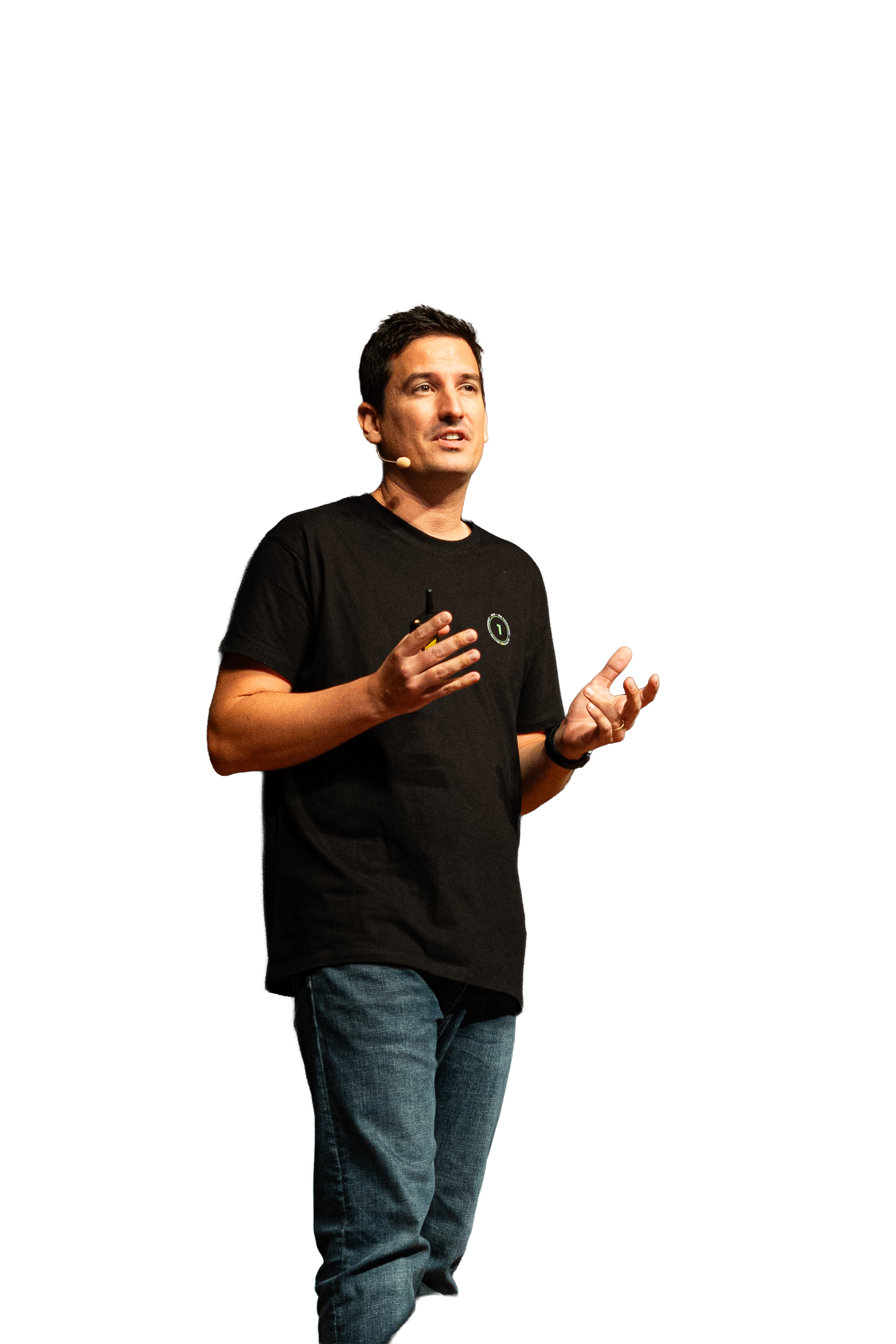
Photography
Download assets
Image types (also applied to video)
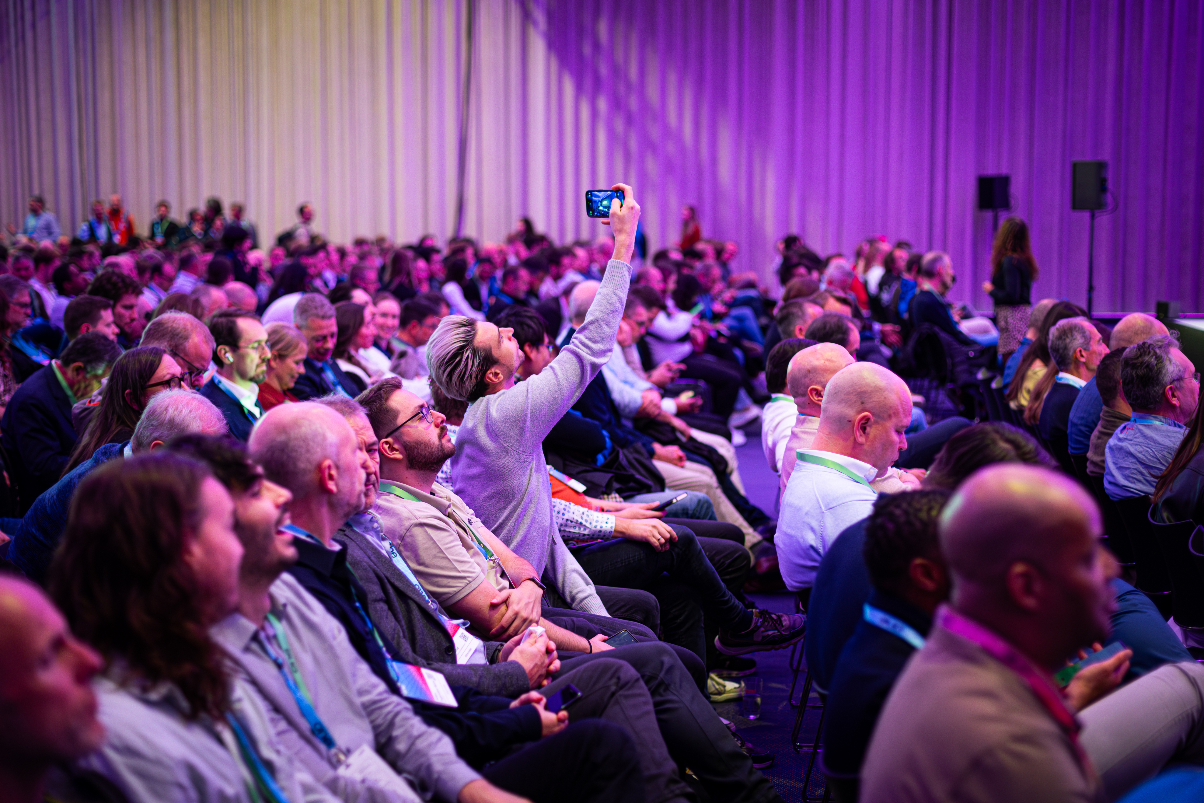
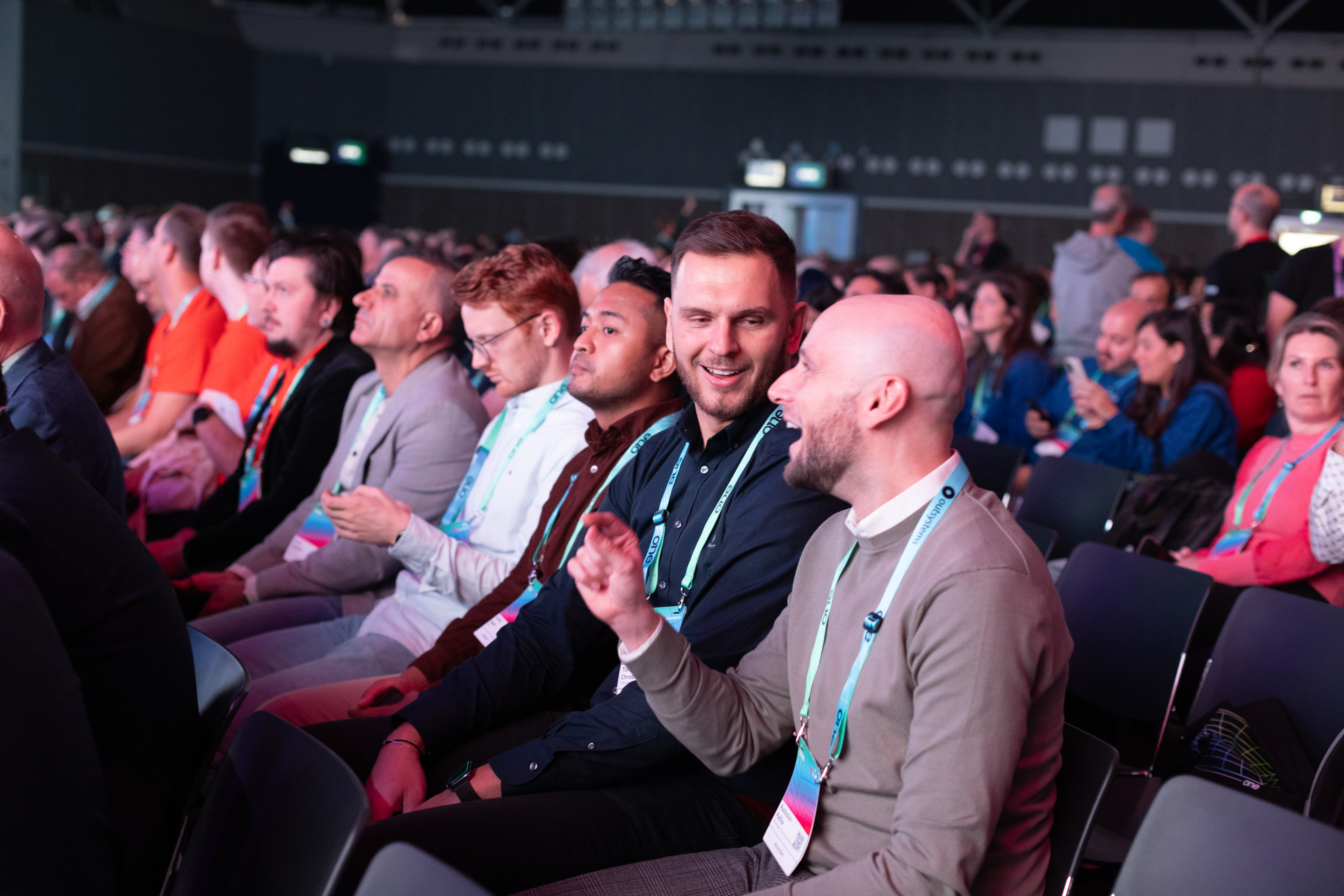
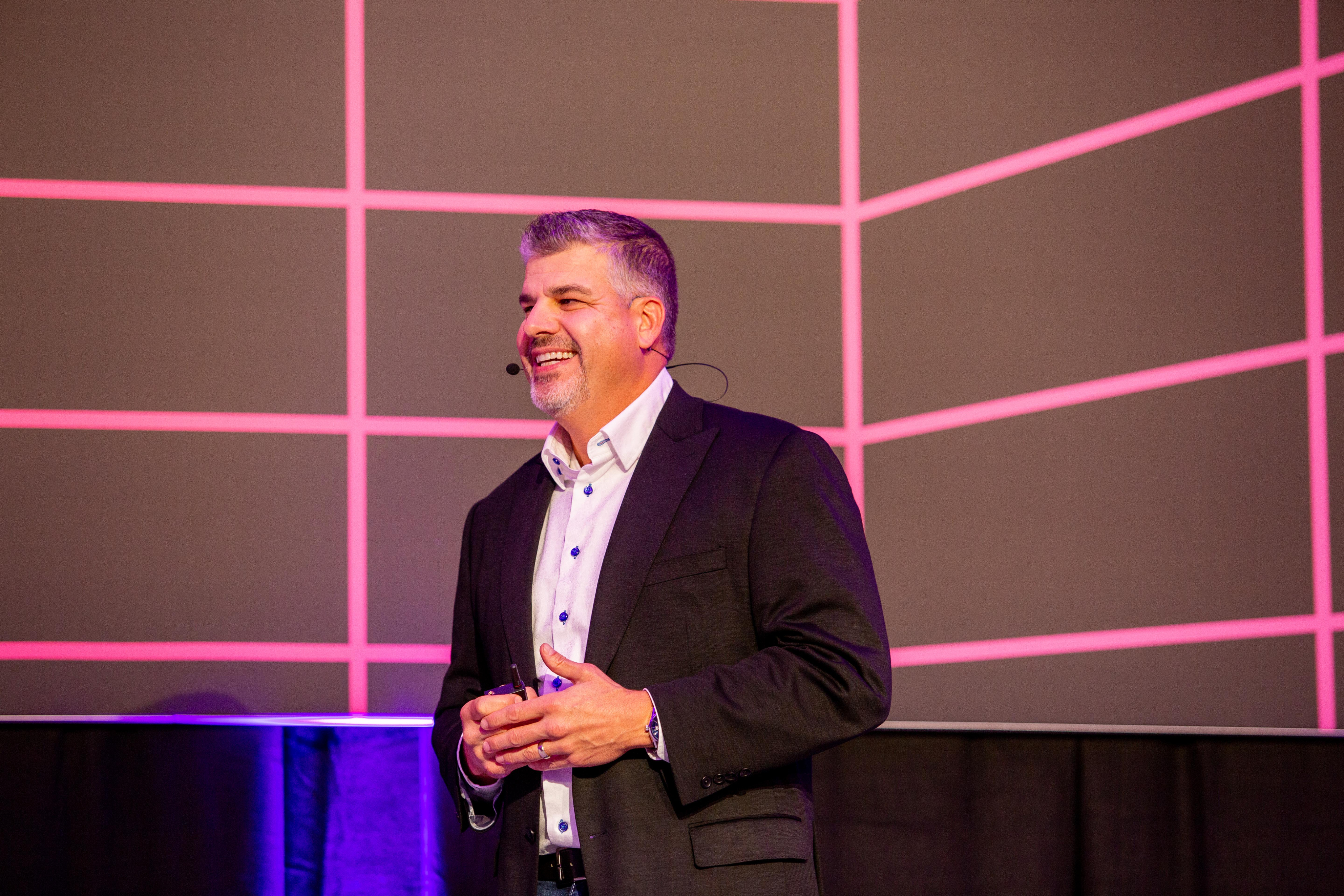
Active speakers on stage
Showcase the value
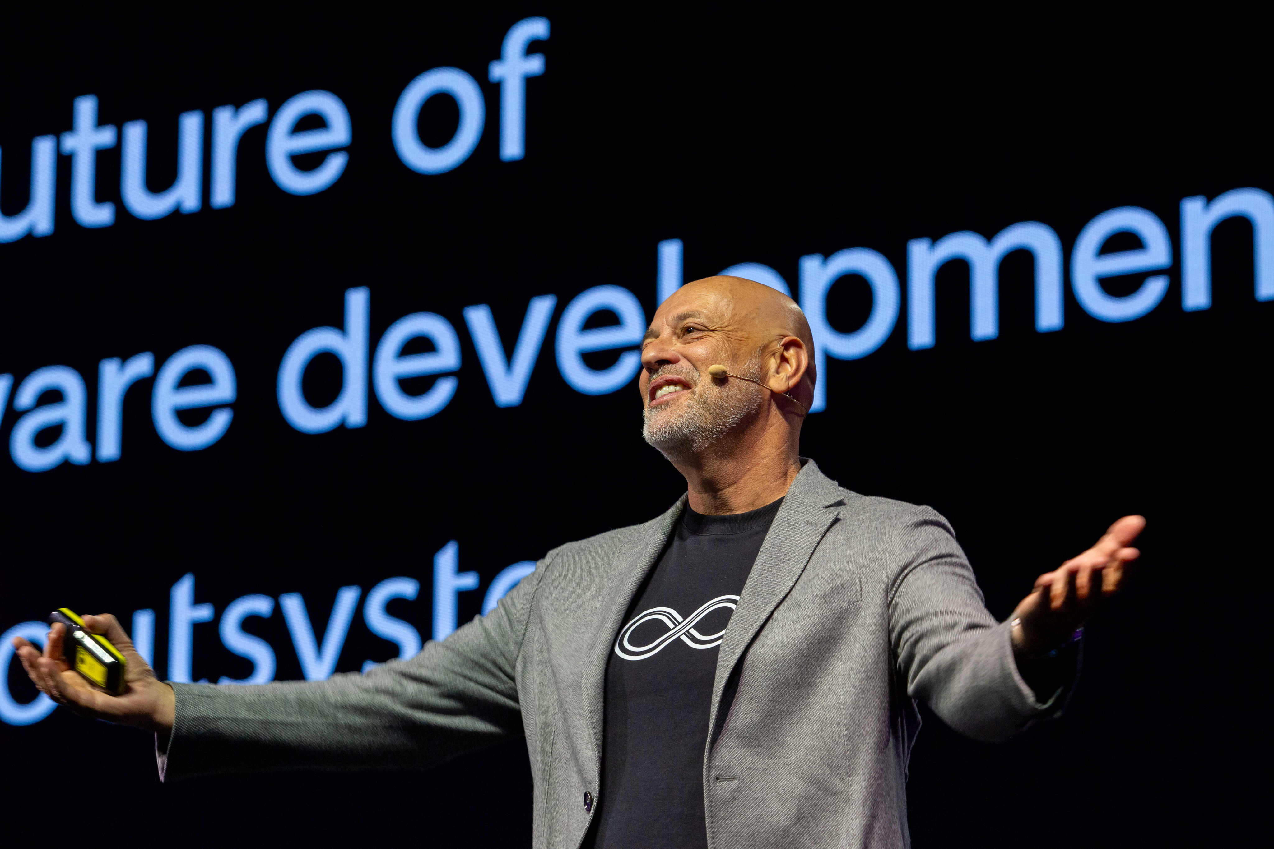
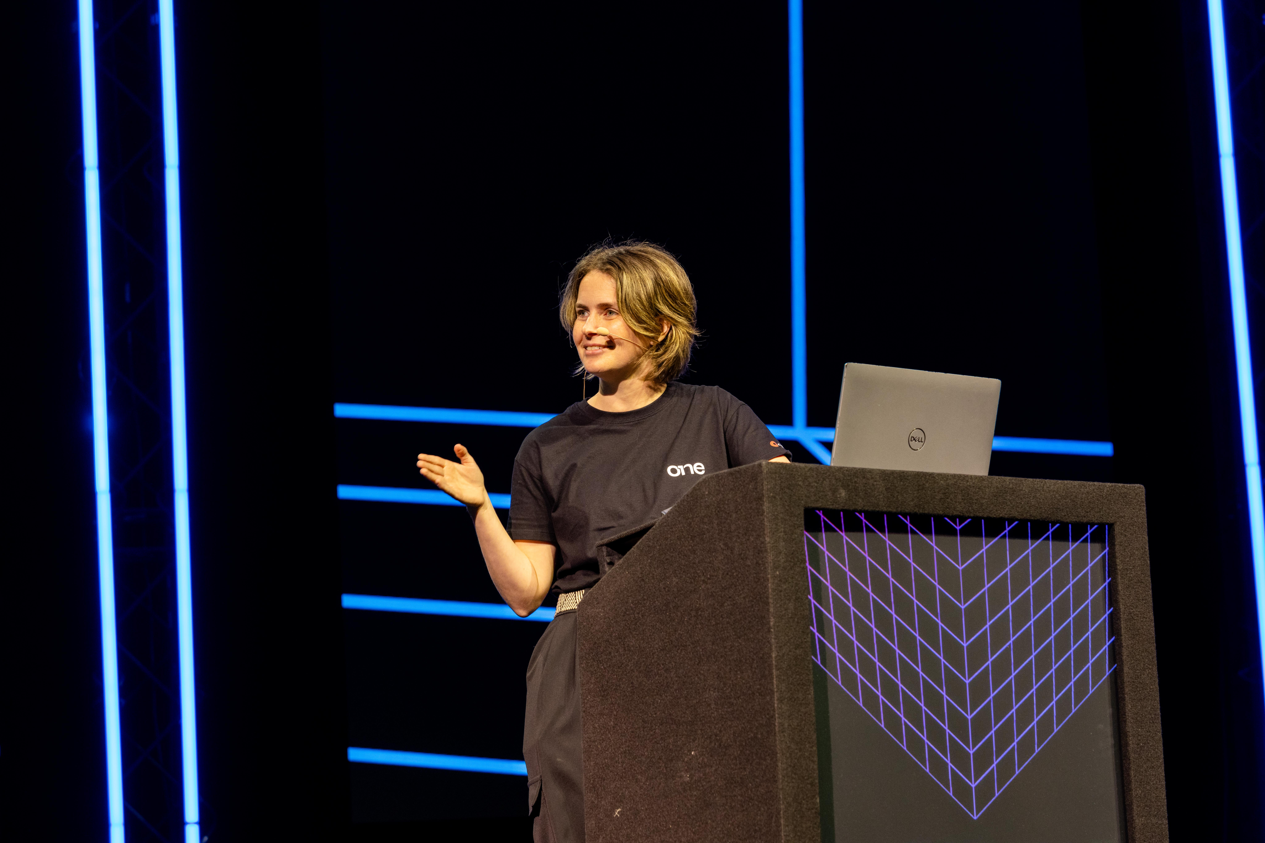
Our greatest asset is the great content, and these are the faces of that value. Our community of speakers, customers and leaders showcase what ONE had to offer, and that makes them the face of the event (side by side with Neo).
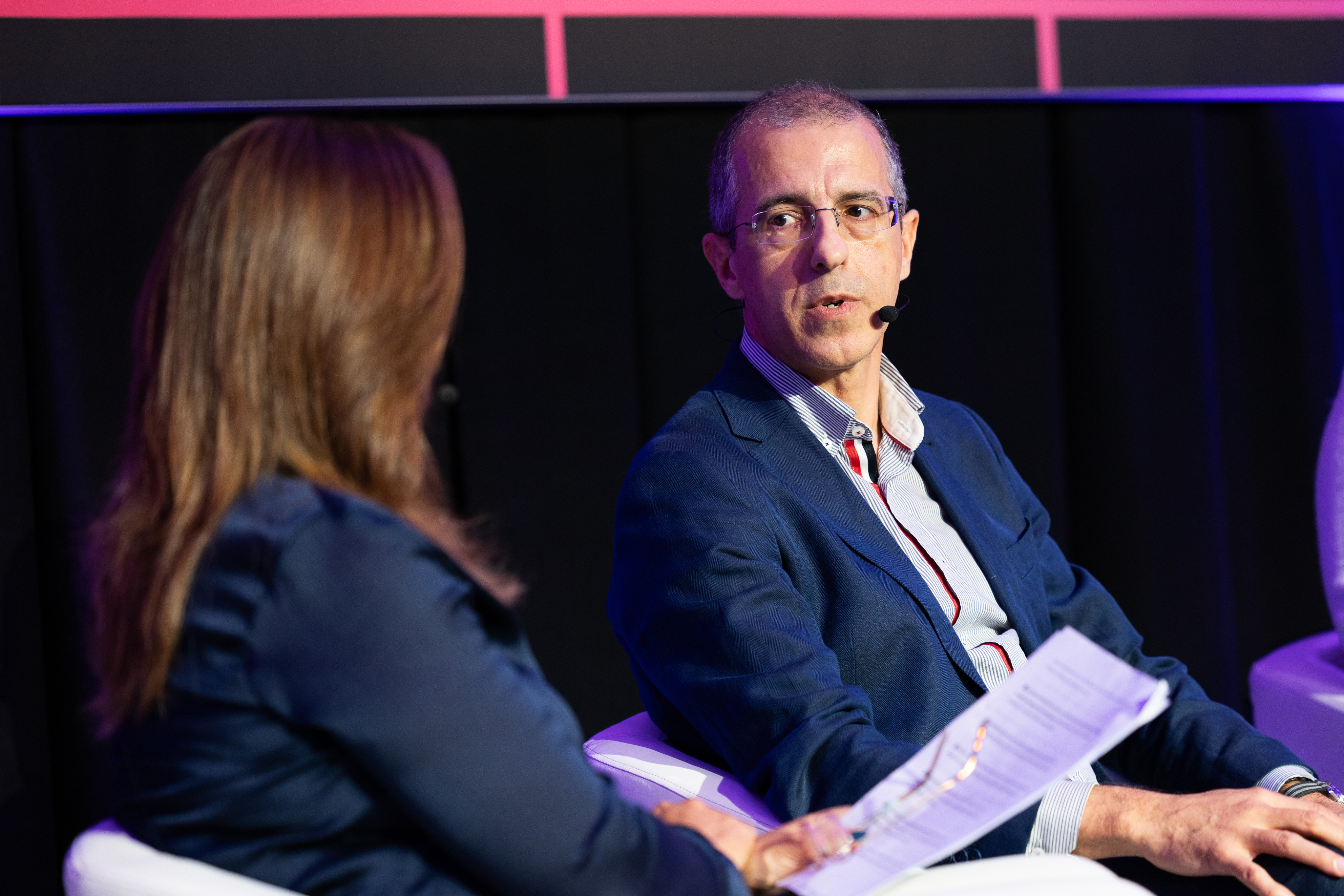
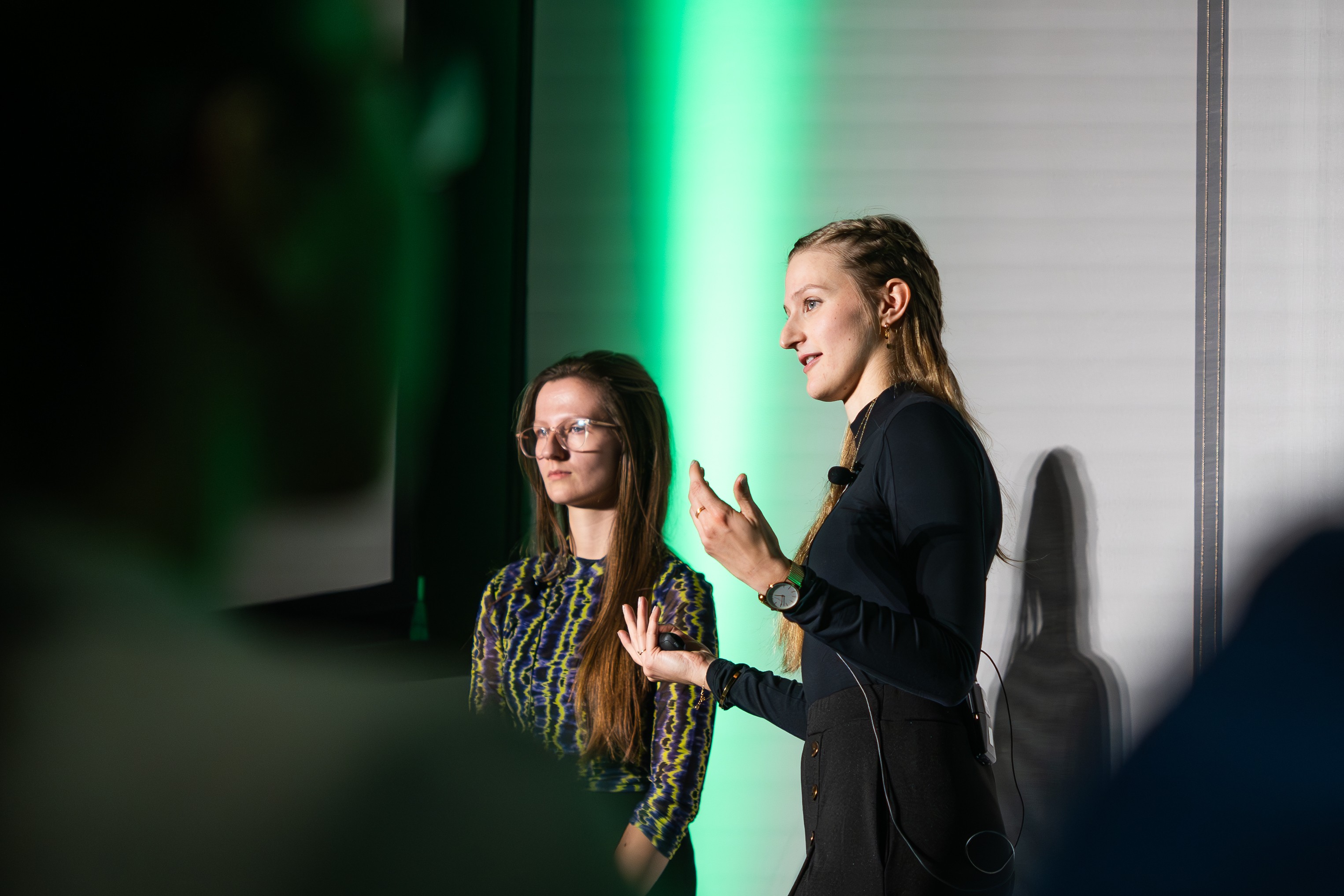
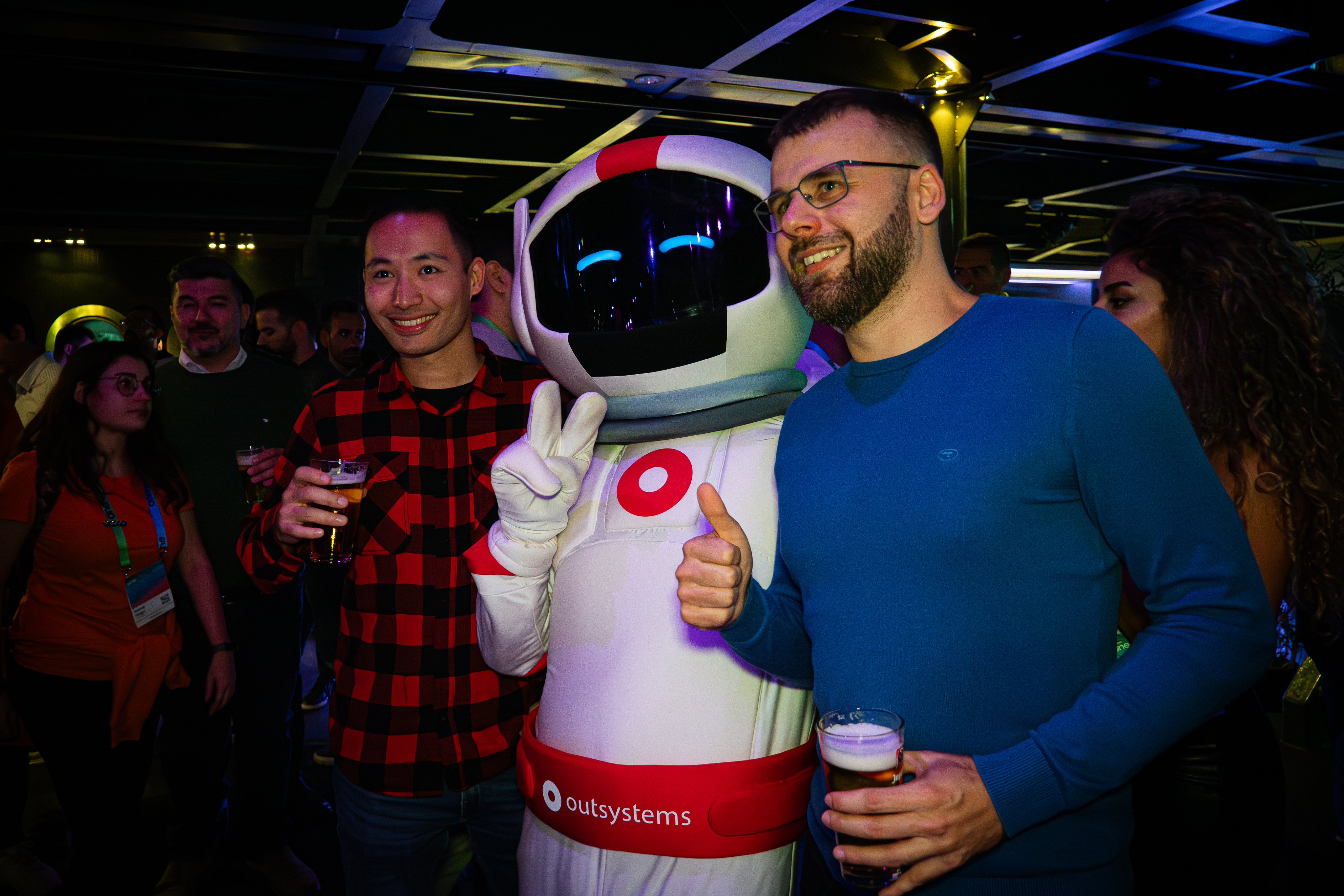
Community engaged
Help them feel the energy
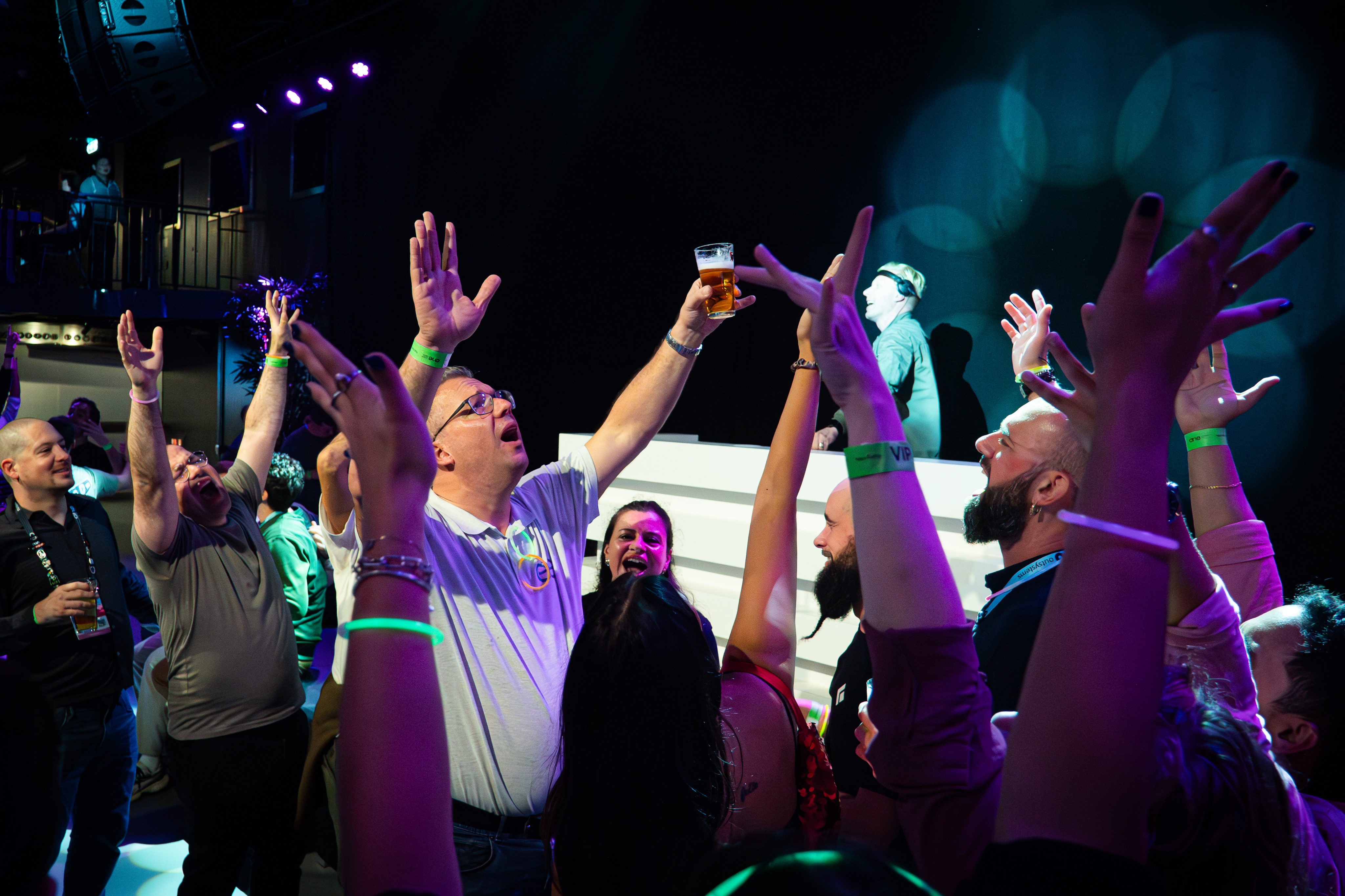
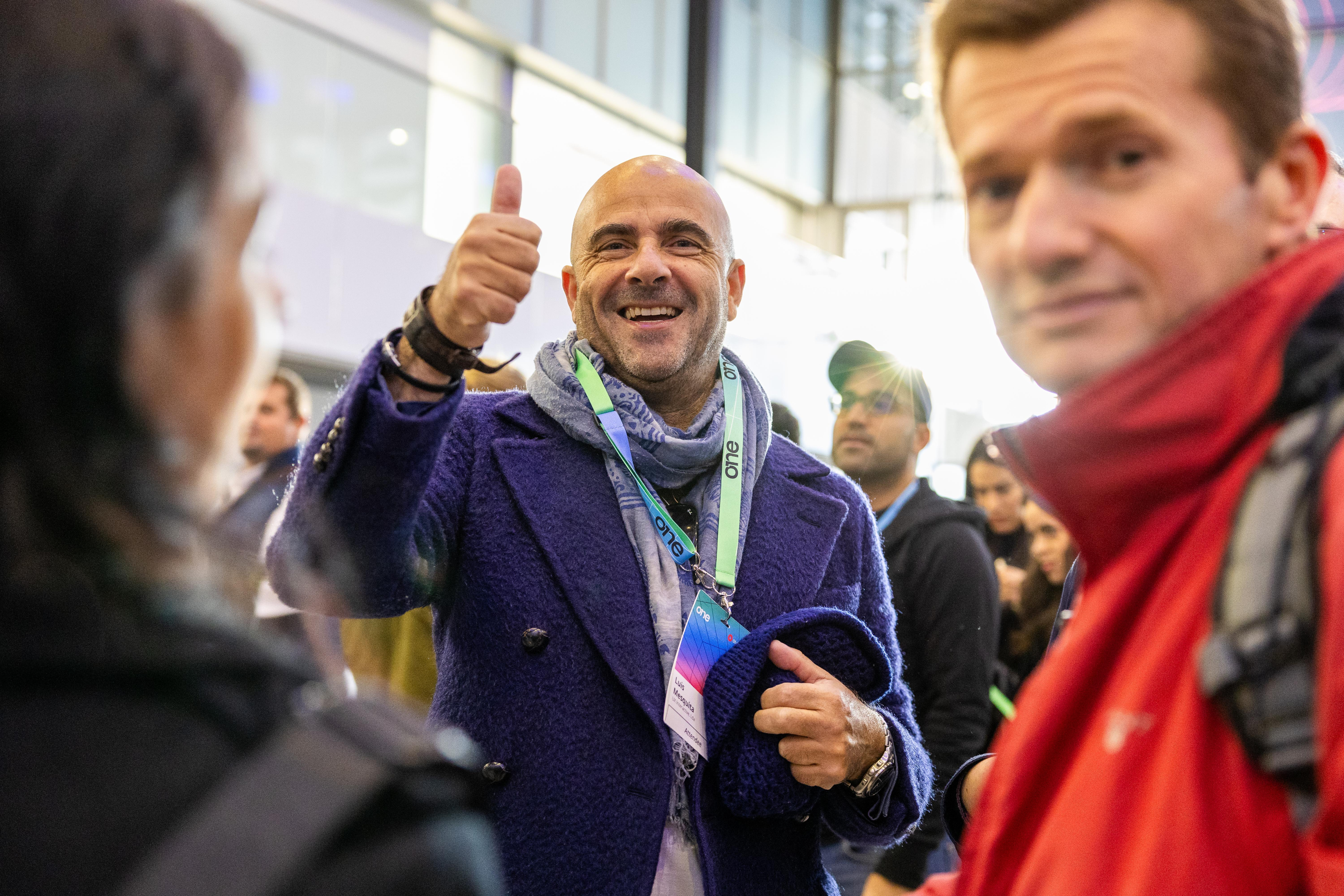
In between the talks a universe of relationship building, interesting chats and new business connections happen. Those moments make it clear we are a lively and energetic community, one that a prospect might want to join.
Venue & Experience
Guide and convince
ONE is a global conference, and we make that clear by valueing our venues and host cities, by showcasing it
Photography treatment
Cutout
Highlight the key element


Meet us
in Lisbon

Sept. 30 - Oct. 01

Lisbon
Neo is the host, the face and therefore, the more real we can get and use Neo’s face on photos and comps, the better. Since we’re revealing Neo’s new suit during ONE, using his current suit as the face of ONE is great because it will enhance the wow effect of the upgrade.
The speaker, the moment, the gesture, the item or the action. All of these are things we can make fit a composition easily with cutout treatment.
Since we’re revealing Neo’s new suit during ONE, using his current suit as the face of ONE is great because it will enhance the wow effect of the upgrade.
Contained
Give context, keep it clean
Cutouts are highlight elements, but all images deserve proper placement, hence containing visuals in rounded corner boxes is the default treatment for everything else.
Vibrant
Color that pops
Ideally we need images with vibrant colros to contrast with the dark backgrounds,
Ideally we need images with vibrant colros to contrast with the dark backgrounds,
Layouts
Information setup is key to the way we communicate as OutSystems, so we focus a lot on a clean, clear and editorial style content layout for all our assets.
There are a few different treatments we do as default and those should be treated as priority within the brand application.
In any case, ONE is an expressive brand and there’s space for exploration on layouts and structure, but this is mostly reserved to more relevant assets like stage building and promo videos.
As a brand heavily inspired by Swiss editorial type layouts, OutSystems and all sub-brands including ONE, are heavily defined by its typography.


Date
Location
Layout application
Text left, image right for most applications
For most applications


Sept. 30 - Oct. 01

Lisbon
#ONEOutSystems
Agenda
is live!
Staying inline with OutSystems brand applications, this allows for a stable brand application.
Use corners
Labels & logos as visual guides


Call for Speakers

Sept. 30 - Oct. 01

Lisbon


#ONEOutSystems
Using notes like Date, Location, website, hashtags and other complementary information, you help better frame the content.
Alignment follows medium
Let the frame define the art


Sept. 30 - Oct. 01

Lisbon
#ONEOutSystems
Hear from the analyst!

Diego Lo Giudice, VP, Principal Analyst
Even though our default is left aligned, center alignment or right alignement of elements can
Big Keywords deserve space
Message & cutout combos

Register
Now
Sept. 30 - Oct. 01
Lisbon
#ONEOutSystems
This is an optional stylistic approach, but one we encourage whenever possible. It helps empower brand application.
Single words take control
Message & cutout combos


Sept. 30 - Oct. 01
See you in Lisbon

Lisbon
#ONEOutSystems
When using single keywords or really short sentences, it can be fully centered and take over the available space.
Labels & icons for details
Simple messages improved

Sept. 30 - Oct. 01

Lisbon
#ONEOutSystems
Dates, hashtags, locations, promo codes and many more details that might need to be communicated, would be better served with a contained label treatment.

Brand Guidelines
About ONE
A conference for everyone
ONE is the single conference where we’ll be gathering all OutSystems customers, prospects and partners under a single roof, eager for product announcements, networking and future proofing their Low-Code & GenAI development strategies.
Every customer, prospect or partner should feel at home in ONE.

The acronym
A name with history, an acronym with future
ONE should always be written like an acronym. All Caps, at all times.
This way, ONE pays homage to our original customer conference, NextStep, while keeping in the front the name and brand developed for our Developer Conference starting 2024.
The full name is to be used only when extremelly necessary to create clarity.
Brand System
Logo
The ONE logo is based on a key element of our product UI, the 1 Click Publish button.
This can be noticed where we incorporated the number 1 into the N.
The logo can be applied by itself, with the word Conference or, if necessary, in its adjusted icon format for smaller applications.
Download Logos
inspiration

Publish


Ground rules
Spacing
At any point, there should be a Minimum clear space around logo:
- The same width of the stem of the 1
Size
Smallest dimensions for logo application should be:
- ONE height: 16px/ 4 mm/ 0.15”
- ONE icon height: 24px/ 6 mm/ 0.15”
Logo + Label should never be applied small.
Colors


ONE’s logo can only be used in either full white or full black
Logo versions
Main application
It’s the default option to communicate ONE. Should be used the most.

Block - vertical
Most complete & compact version. Should be the second most used.


ONE Icon
To be used as either a graphic decoration element or small icon.
Inline - horizontal
Great for application on wide banners or videos. Also good for signature.


Correct usage


Do
Apply the provided logos as they’re provided

Do
Apply logo/icon version on correct background
Do
Apply the logo w/ correct color & dimensions


Do not
Alter the logo shape or current dimensions
Do not
Apply logo/icon on low-contrast backgrounds


Do not
Apply the logo w/ edited color or dimensions
Typography
As a brand heavily inspired by Swiss editorial type layouts, OutSystems and all sub-brands including ONE, are heavily defined by its typography.
Most of our layouts and UIs are defined by typography first, creating readable documents and flowing spaces between information blocks.
To enforce simplicity and brand scalability, we use a single font from Google fonts called DM Sans. It’s modern, has variable controls, and reads well in both small and big formats.
DM Sans
Unleash innovation at ONE—where OutSystems experts, industry leaders, and customers showcase how AI-powered low-code creates extraordinary apps. Join us for 2 amazing days at the ultimate tech conference of 2025.
Get inspired
Discover fresh ideas from low-code visionaries and get up to speed on the latest AI advancements.
Type application
Innovate without limits
Unleash innovation at ONE—where OutSystems experts, industry leaders, and customers showcase how AI-powered low-code creates extraordinary apps.
Get Your Ticket
By default all type application
is aligned to the left
This way, the ONE brand works more clearly as an extension of the OutSystems brand, with the editorial styled typography application.
This is a Title
This is a SubTitle
These are section headers
This is some great content placeholder to showcase how type scales work.
These are section headers
This is some great content placeholder to showcase how type scales work
Well established hierarchy is essential for proper legibility
Clear messaging is key to properly establish & promote the benefits of our event. Nothing else should take relevance over messaging when possible.
Type scale
Default type scale for digital assets. Use it proportionally for other applications.
Color
ONE is a place for crossover, with realities that mix the most technical of tech person and the most serious of business partners.
Color application refer to just that. A rainbow of realities but a single, clear and concise product they meet around.
This means our color application should be a well distributed representation of color, balanced with our classic black backgrounds and clean, white typography.
Gradients & color significance
Executive
brand-100 // brand-500
To be applied on everything that’s more focused on executive and business content.
Developer
brand-900 // brand-500
To be applied on everything that’s more focused on developer and technical content.
Global
brand-100 // brand-900

General brand color application. Can be used for anything more broad brand promotion and general audience materials.
Color application
Most backgrounds should be black or dark


Sept. 30 - Oct. 01

Lisbon
#ONEOutSystems
Agenda
is live!

Meet Neo
in Lisbon
#ONEOutSystems
This way, the colored lines and highlights stand out more and better represent the brand.
Exceptions can be made, but the focus should be on making assets clean, impactful and readable.
Color can be used to frame
Main
Stage
Keynote
Executive Mainstage
Using negative application of colored 3D meshes & grids under dark containers we can develop a more punchy look for some of the promotional and printed materials.
Clean white text for all applications
Meet us
in Lisbon


Sept. 30 - Oct. 01
Lisbon
#ONEOutSystems


Sept. 30 - Oct. 01

Lisbon
#ONEOutSystems
Hear from the analyst!

Diego Lo Giudice, VP, Principal Analyst
Code: MAYTHEFORCE25

Deadline: May 6, 2025
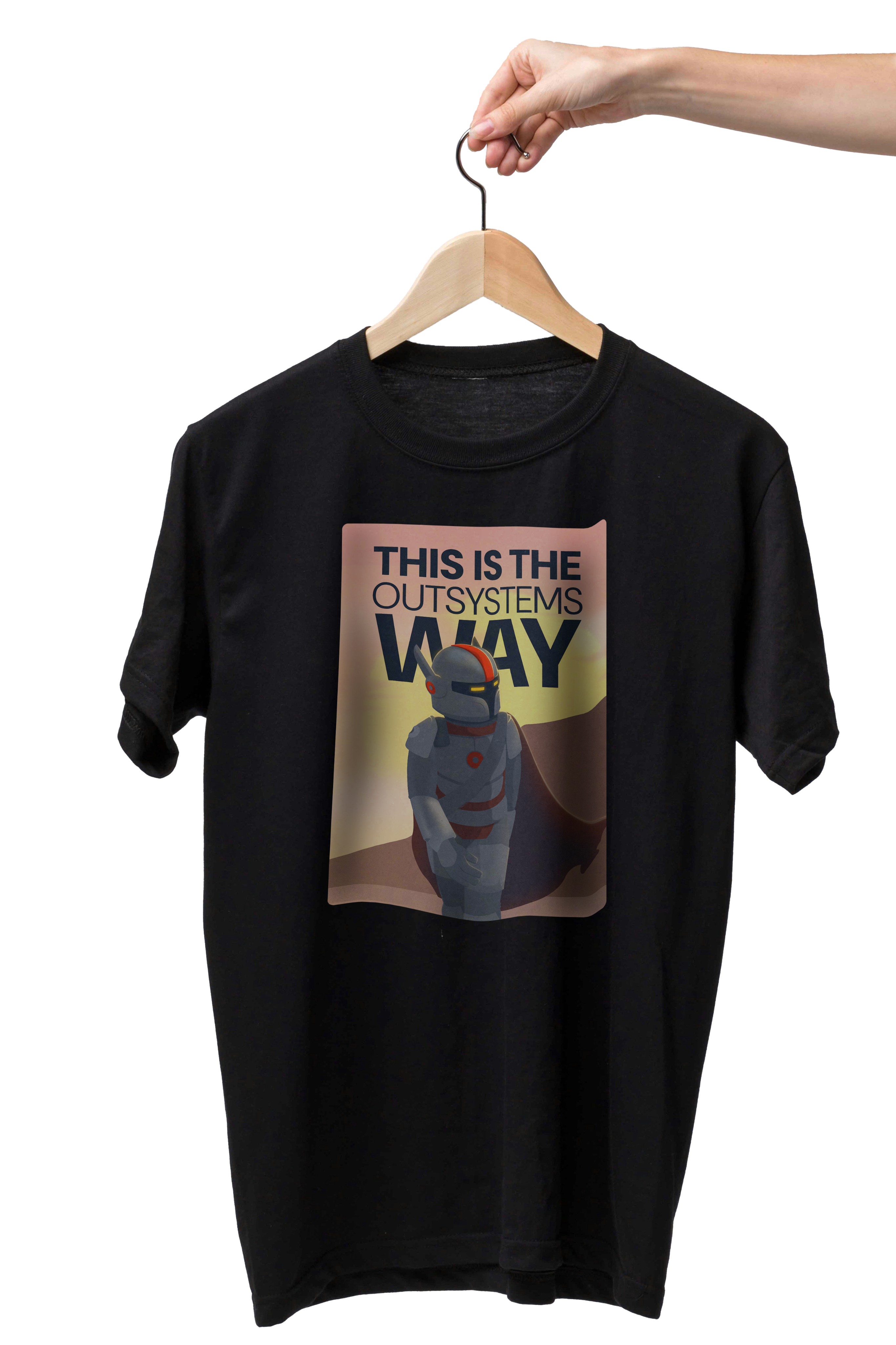
Sign up,
suit up!
Register now and
claim your exclusive
Neo t-shirt at
the event
This way, all the messaging and information stands out more than anything else on frame.
Gradients can be smooth or step-based
Smooth gradients on line work is the easiest way of brand application, but using a sequence of solid colors for certain print or visual elements can create a similar effect.
Color distribution


65%
neutrals
A majority of the elements should be black or dark background, with white or light-grey text on top.
20%
gradients
Gradients should be used mostly on the outline of visual elements and containers. We can occasionally be used as background for important text or CTA highlight.
15%
brand
Solid colors can be used for tags, navigation and printed signage, with bigger presence of the OutSystems red as teh default brand color on most elements if needed.
Colors codes
Brand-Colors
token-name
brand-300
hex
#DC45ED
rgb
220
069
237
cmyk
029
069
000
000
pantone
252 C
Neutral Tones
token-name
neutral-300
hex
#4D4D4D
rgb
077
077
077
cmyk
000
000
000
085
pantone
Black 85%
Key visuals & image treatment
A set of key visuals & standard image treatment is essential to connect the visual language application across board.
In the case of ONE. we use a set of 3D meshes, grids and icons intertwined with stage, audience and location photography to build an immersive digital but human universe, and then our photos and key visuals stand on top of it, contrasting with the dark and glowy artwork.
Our photos and key visuals stand on top of everything, contrasting with the dark background and glowy 3d line artwork.
Download assets

Available graphic assets
Gradient 3D meshes
Main visual element

This is the main key visual for ONE. These can be applied in most of the assets and are easy to use for both static and motion assets.
Download meshes
Gradient 3D grids
Complementary visual element

This is the complementary key visual for ONE. These can be applied in a variety of assets, ideally in motion as a starting point to our 3d meshes/waves.
Download grids
Isometric iconography
Detail/bullet visual element
Have you met Neo
These icons are softer brand elements. made to help better communicate certain themes and audience specific content. They should be seamlessly mixed up with content in a 2D plane.
Download icons
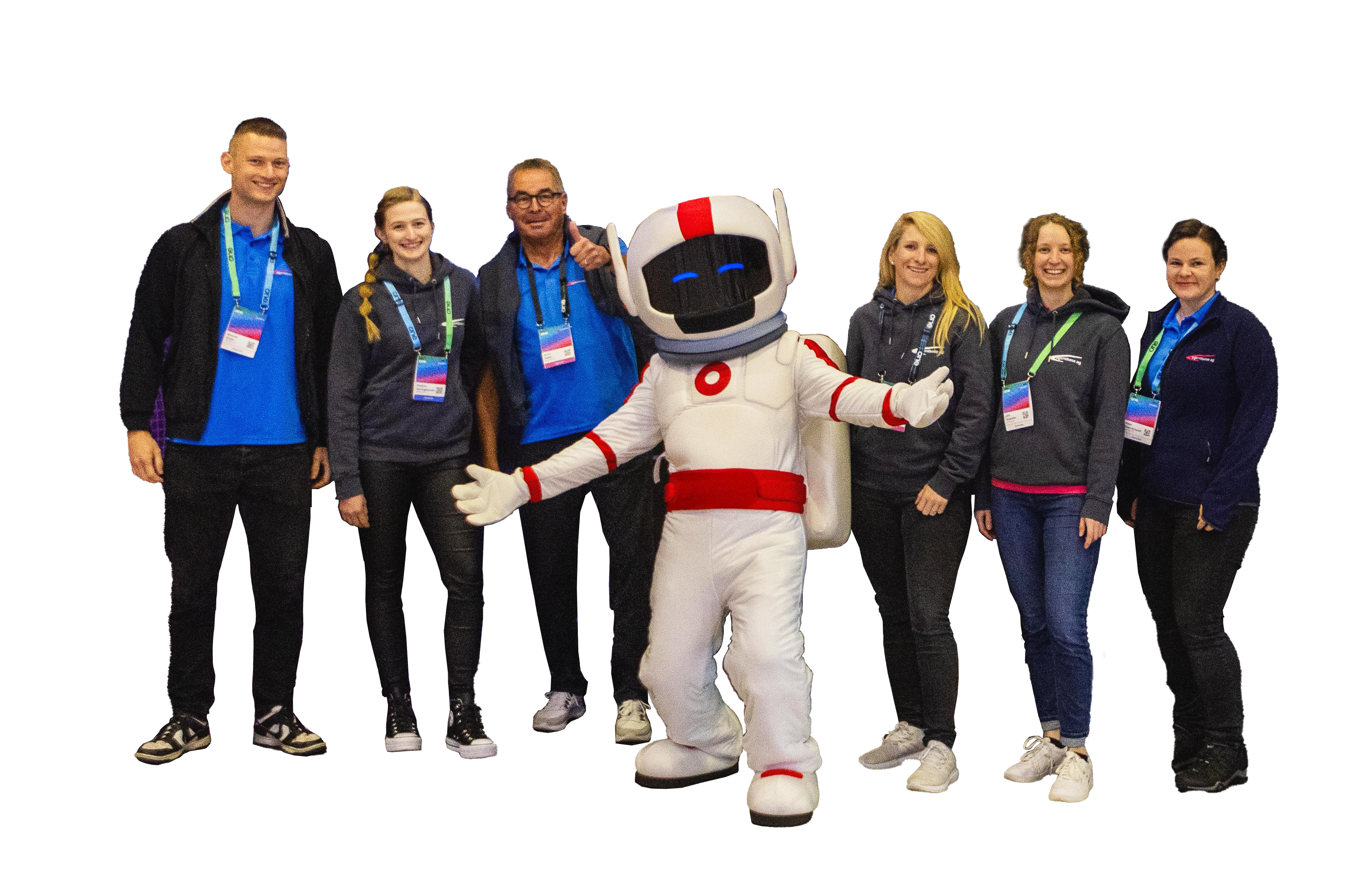
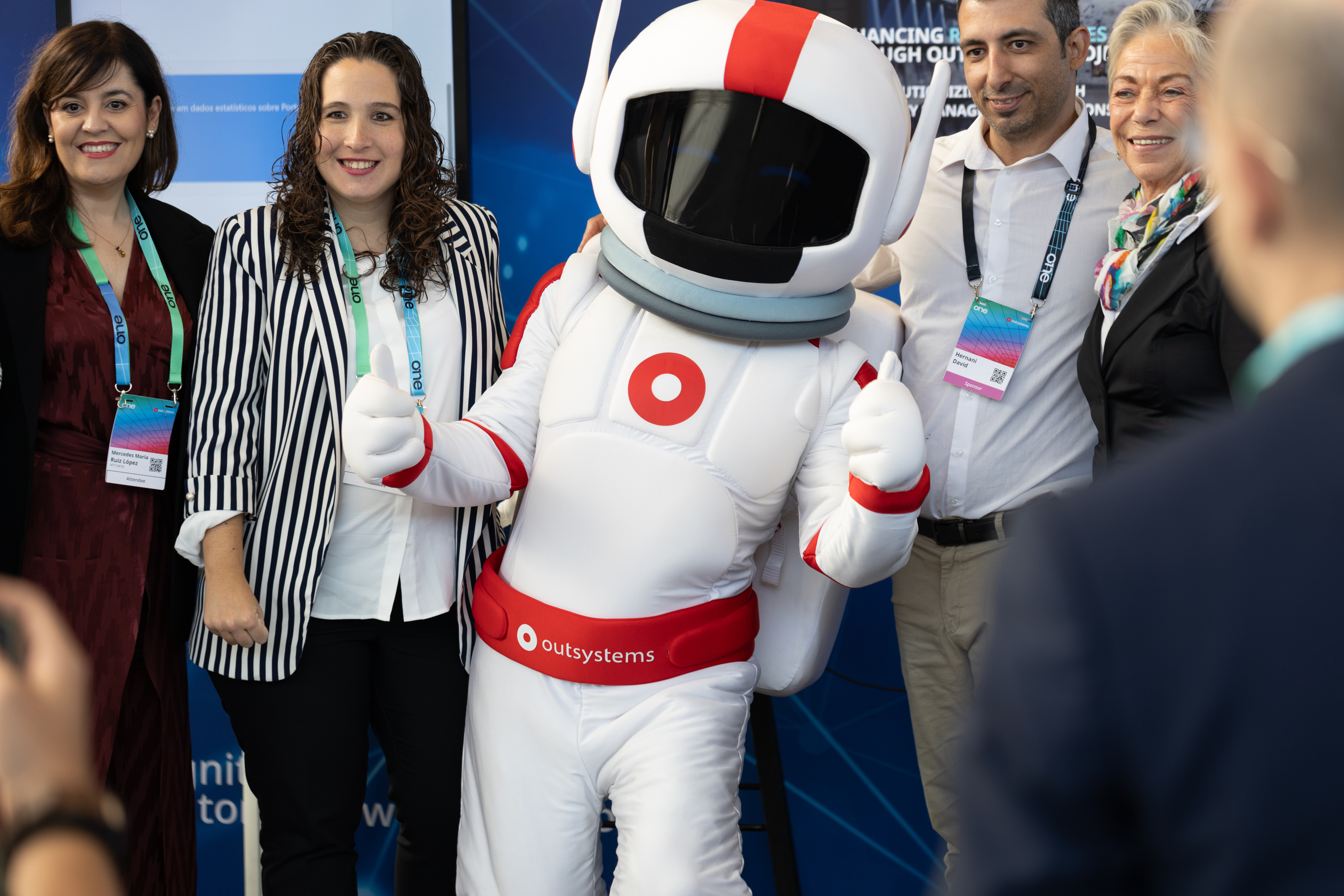
Real Neo
The real deal, he’ll be there
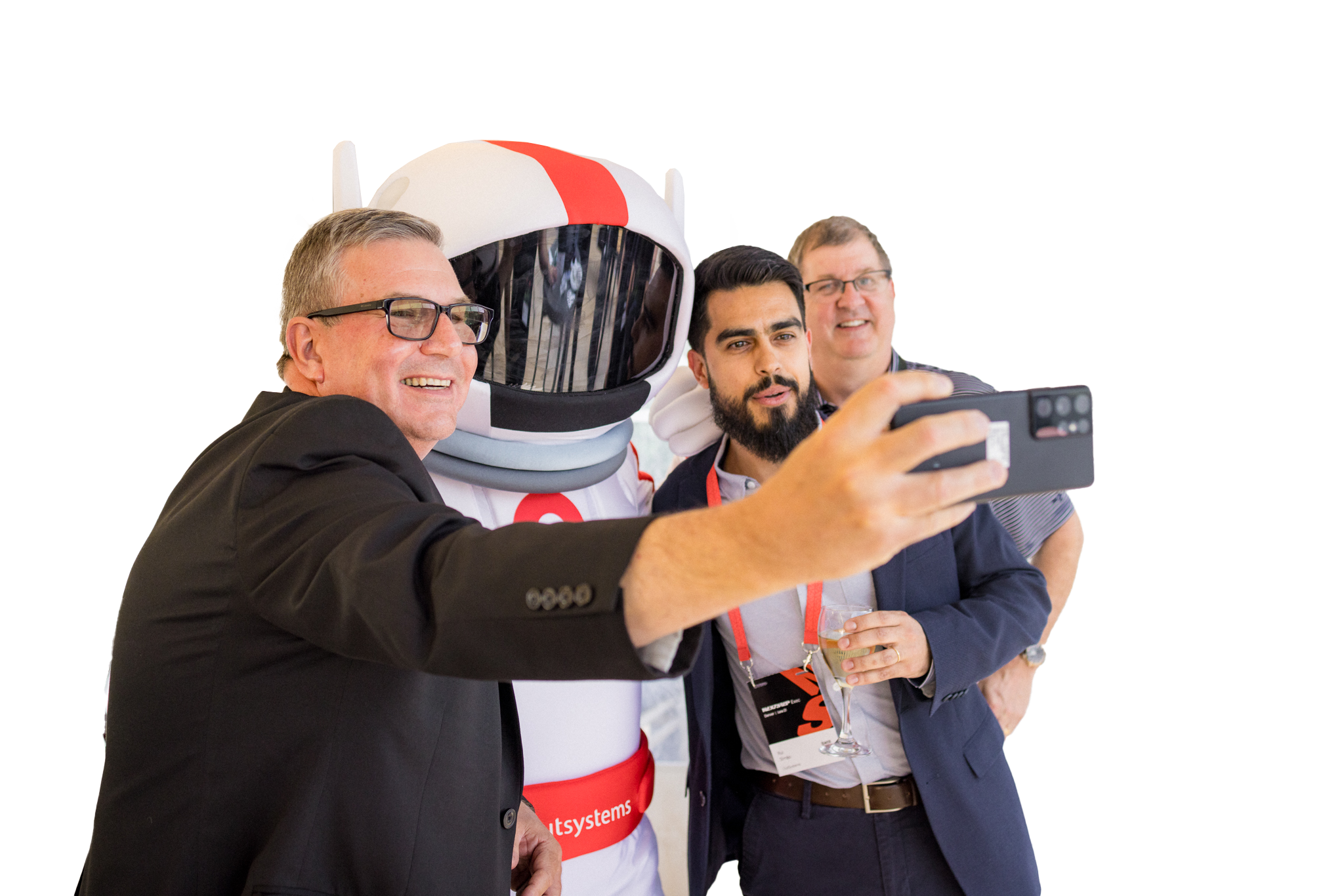
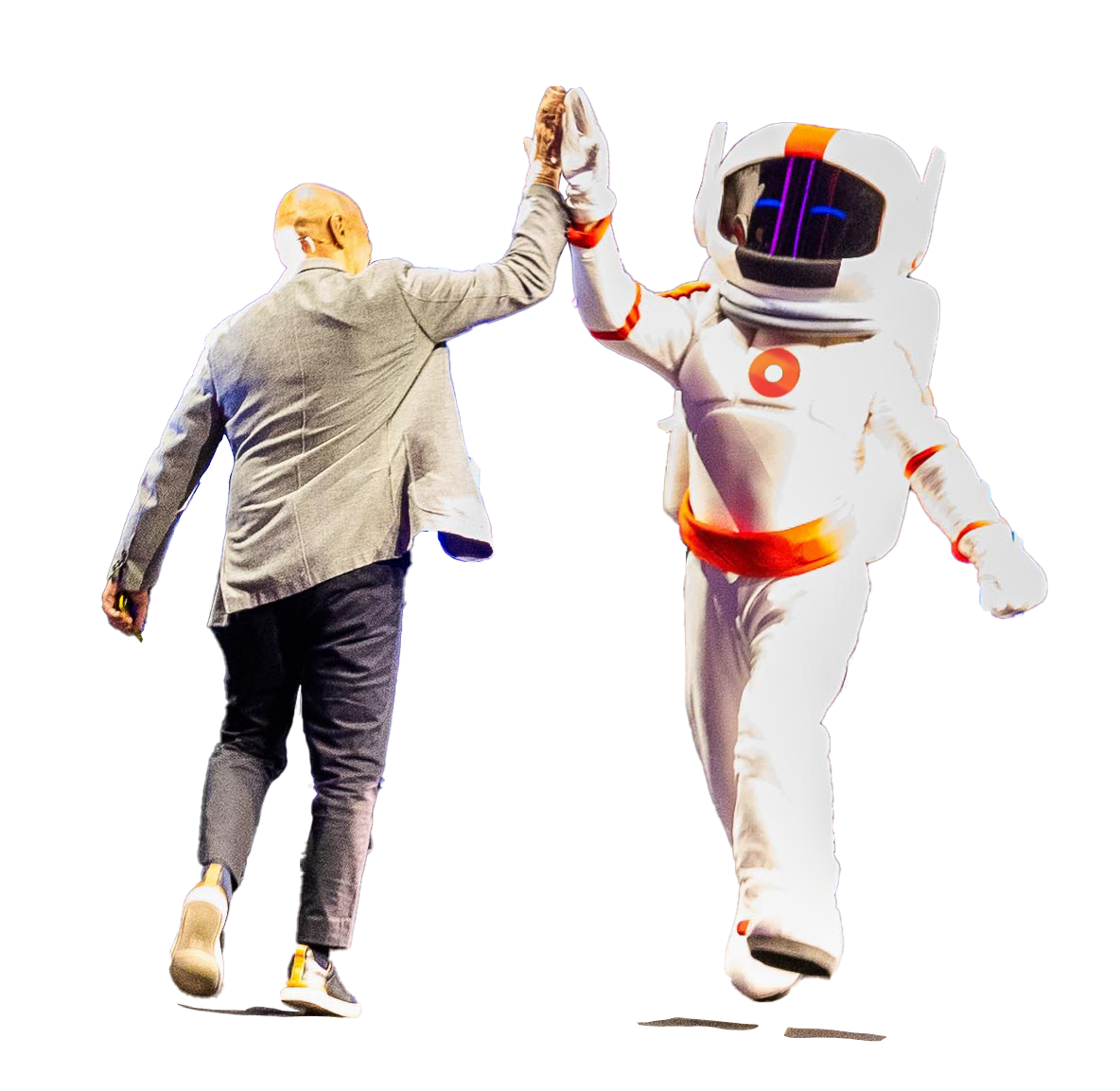
Neo is the host, the face and therefore, the more real we can get and use Neo’s face on photos and comps, the better.
Since we’re revealing Neo’s new suit during ONE, using his current suit as the face of ONE is great because it will enhance the wow effect of the upgrade.
3D Neo
Animated, storyteller
If we need Neo to talk and/or interact with our audience in any digital mean, we have our 3D and easily animated version to use. From Instagram filters to AI voice experiences, Neo can be the face of engagement.
Icon & Neomojis
Simple, note worthy


When we need Neo to be there, but not scream out loud, we can then use their icons and Neomojis to convey presence or (in the Neomojis’ case) emotion in a very simple way.
Photography
Download assets
Image types (also applied to video)
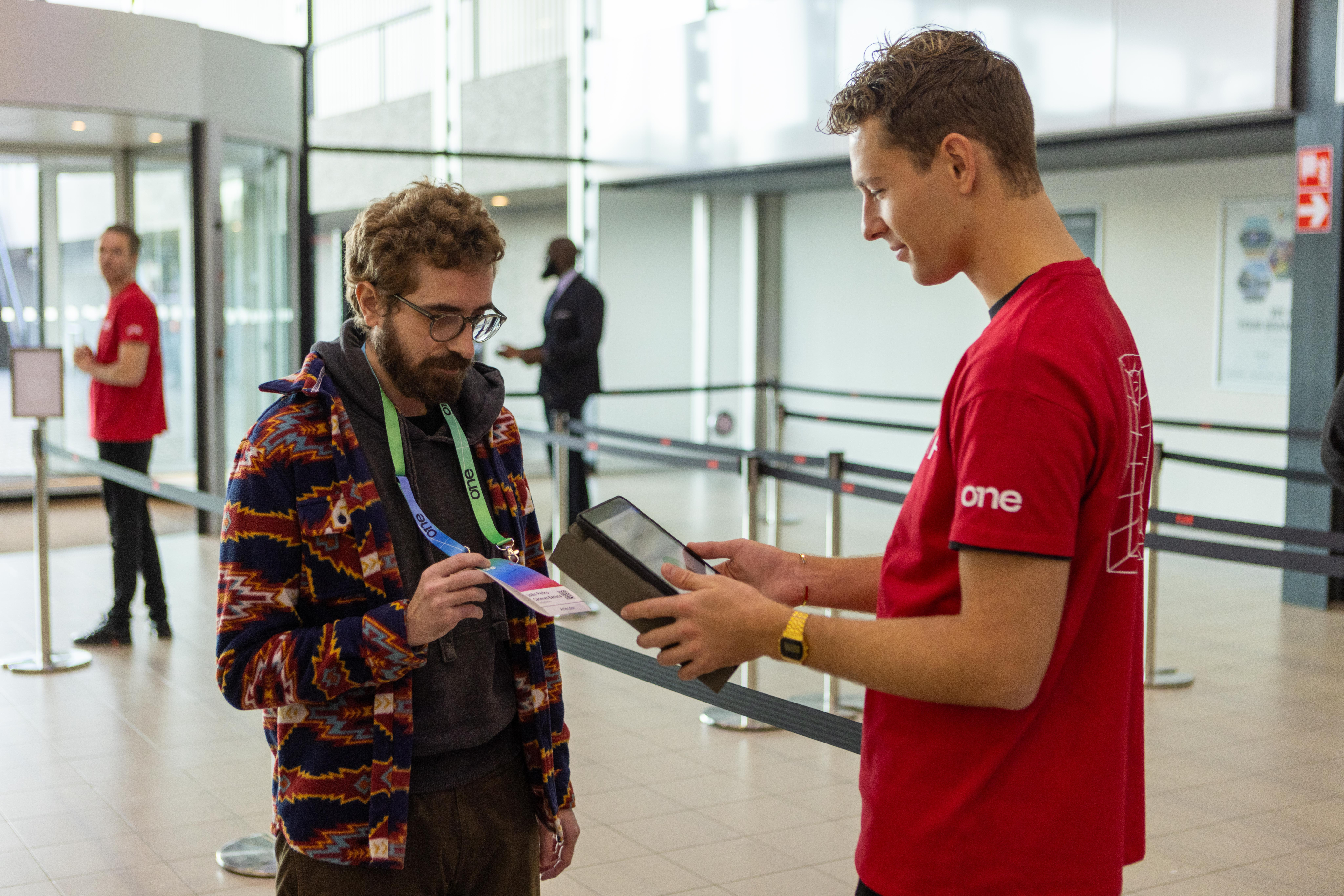
Active speakers on stage
Showcase the value
Our greatest asset is the great content, and these are the faces of that value. Our community of speakers, customers and leaders showcase what ONE had to offer, and that makes them the face of the event (side by side with Neo).
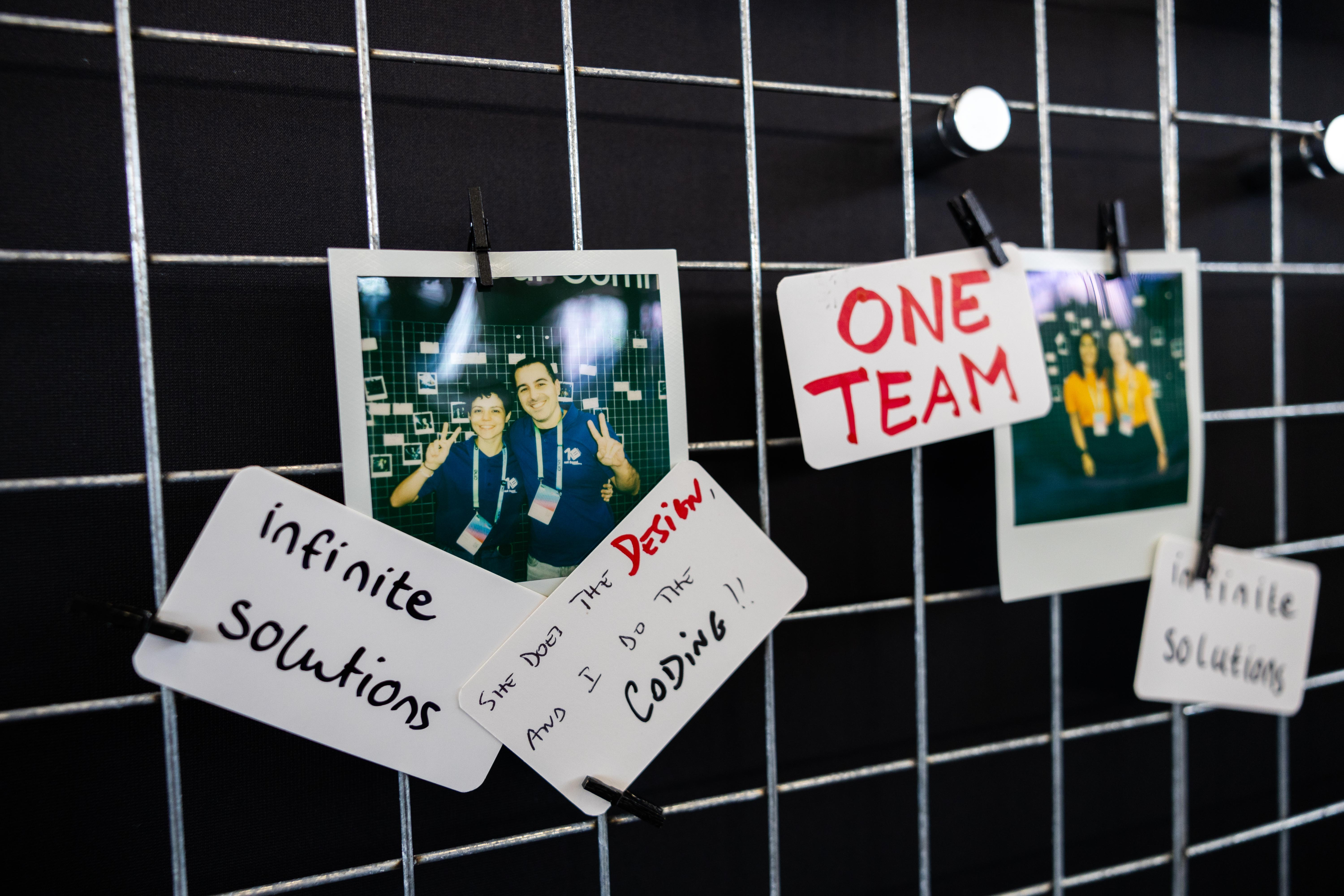
Community engaged
Help them feel the energy
In between the talks a universe of relationship building, interesting chats and new business connections happen. Those moments make it clear we are a lively and energetic community, one that a prospect might want to join.
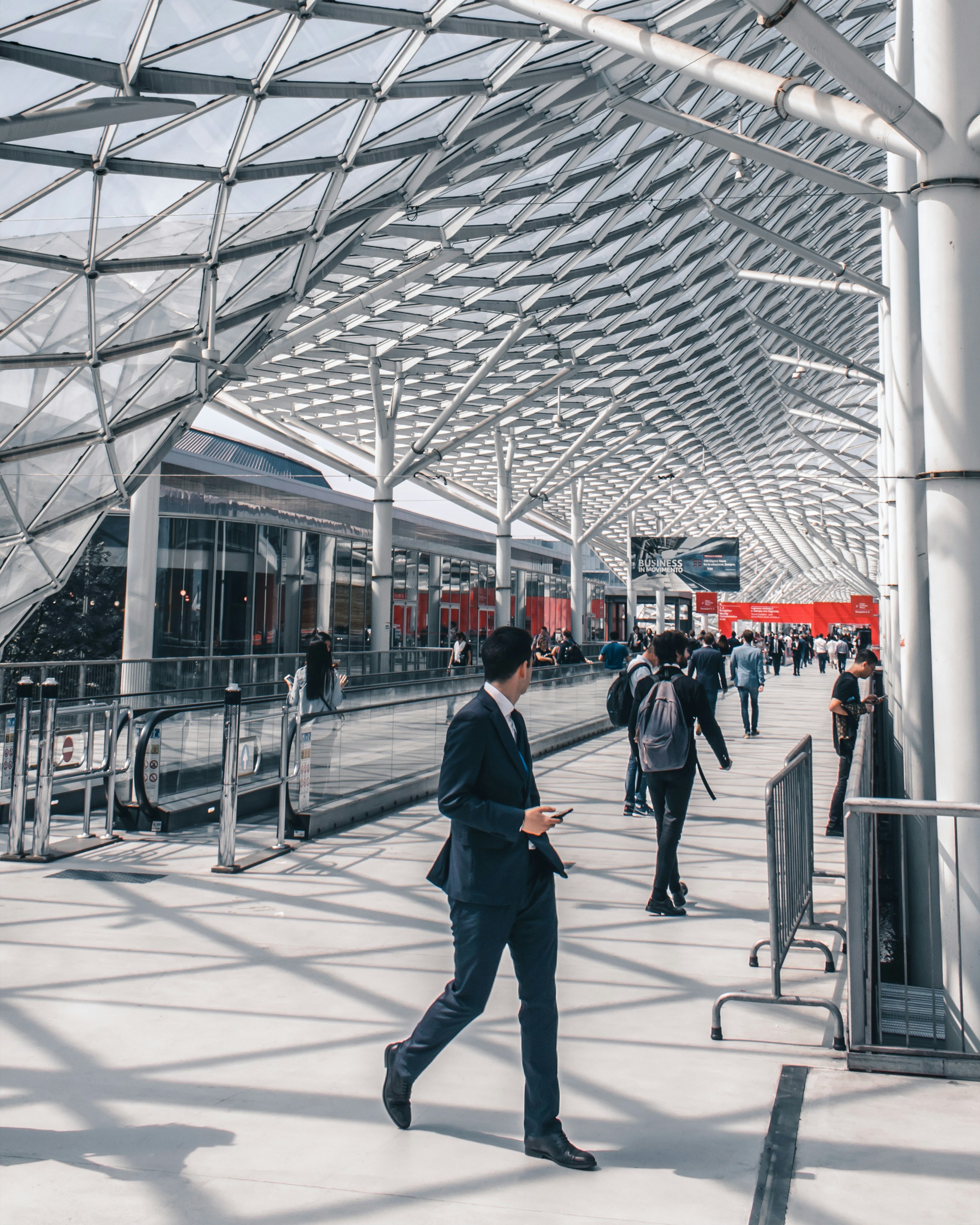
Venue & Experience
Guide and convince
ONE is a global conference, and we make that clear by valueing our venues and host cities, by showcasing it
Photography treatment
Cutout
Highlight the key element

Meet us
in Lisbon

Sept. 30 - Oct. 01

Lisbon
The speaker, the moment, the gesture, the item or the action. All of these are things we can make fit a composition easily with cutout treatment.
Since we’re revealing Neo’s new suit during ONE, using his current suit as the face of ONE is great because it will enhance the wow effect of the upgrade.
Contained
Give context, keep it clean
Cutouts are highlight elements, but all images deserve proper placement, hence containing visuals in rounded corner boxes is the default treatment for everything else.
Vibrant
Color that pops
Ideally we need images with vibrant colros to contrast with the dark backgrounds,
Ideally we need images with vibrant colros to contrast with the dark backgrounds,
Layouts
Information setup is key to the way we communicate as OutSystems, so we focus a lot on a clean, clear and editorial style content layout for all our assets.
There are a few different treatments we do as default and those should be treated as priority within the brand application.
In any case, ONE is an expressive brand and there’s space for exploration on layouts and structure, but this is mostly reserved to more relevant assets like stage building and promo videos.
Date
Location
Layout application
Text left, image right for most applications
For most applications

Sept. 30 - Oct. 01
Lisbon
#ONEOutSystems
Agenda
is live!
Staying inline with OutSystems brand applications, this allows for a stable brand application.
Use corners
Labels & logos as visual guides

Call for Speakers
Sept. 30 - Oct. 01
Lisbon
#ONEOutSystems
Using notes like Date, Location, website, hashtags and other complementary information, you help better frame the content.
Alignment follows medium
Let the frame define the art


Sept. 30 - Oct. 01
Lisbon
#ONEOutSystems
Hear from the analyst!
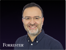
Diego Lo Giudice, VP, Principal Analyst
Even though our default is left aligned, center alignment or right alignement of elements can
Big Keywords deserve space
Message & cutout combos

Register
Now

Sept. 30 - Oct. 01
Lisbon
#ONEOutSystems
This is an optional stylistic approach, but one we encourage whenever possible. It helps empower brand application.
Single words take control
Message & cutout combos


Sept. 30 - Oct. 01
See you in Lisbon
Lisbon
#ONEOutSystems
When using single keywords or really short sentences, it can be fully centered and take over the available space.
Labels & icons for details
Simple messages improved

Sept. 30 - Oct. 01
Lisbon
#ONEOutSystems
Dates, hashtags, locations, promo codes and many more details that might need to be communicated, would be better served with a contained label treatment.

Brand Guidelines
About ONE
A conference for everyone
ONE is the single conference where we’ll be gathering all OutSystems customers, prospects and partners under a single roof, eager for product announcements, networking and future proofing their Low-Code & GenAI development strategies.
Every customer, prospect or partner should feel at home in ONE.
The acronym
A name with history, an acronym with future
ONE should always be written like an acronym. All Caps, at all times.
This way, ONE pays homage to our original customer conference, NextStep, while keeping in the front the name and brand developed for our Developer Conference starting 2024.
The full name is to be used only when extremelly necessary to create clarity.
Brand System
Logo
The ONE logo is based on a key element of our product UI, the 1 Click Publish button.
This can be noticed where we incorporated the number 1 into the N.
The logo can be applied by itself, with the word Conference or, if necessary, in its adjusted icon format for smaller applications.
Download Logos
inspiration

Publish


Ground rules
Spacing
At any point, there should be a Minimum clear space around logo:
- The same width of the stem of the 1
Size

Smallest dimensions for logo application should be:
- ONE height: 16px/ 4 mm/ 0.15”
- ONE icon height: 24px/ 6 mm/ 0.15”
Logo + Label should never be applied small.
Colors


ONE’s logo can only be used in either full white or full black
Logo versions
Main application
It’s the default option to communicate ONE. Should be used the most.

Block - vertical
Most complete & compact version. Should be the second most used.


ONE Icon
To be used as either a graphic decoration element or small icon.


Inline - horizontal
Great for application on wide banners or videos. Also good for signature.


Correct usage


Do
Apply the provided logos as they’re provided
Do
Apply logo/icon version on correct background

Do
Apply the logo w/ correct color & dimensions


Do not
Alter the logo shape or current dimensions
Do not
Apply logo/icon on low-contrast backgrounds


Do not
Apply the logo w/ edited color or dimensions
Typography
As a brand heavily inspired by Swiss editorial type layouts, OutSystems and all sub-brands including ONE, are heavily defined by its typography.
Most of our layouts and UIs are defined by typography first, creating readable documents and flowing spaces between information blocks.
To enforce simplicity and brand scalability, we use a single font from Google fonts called DM Sans. It’s modern, has variable controls, and reads well in both small and big formats.
DM Sans
Unleash innovation at ONE—where OutSystems experts, industry leaders, and customers showcase how AI-powered low-code creates extraordinary apps. Join us for 2 amazing days at the ultimate tech conference of 2025.
Get inspired
Discover fresh ideas from low-code visionaries and get up to speed on the latest AI advancements.
Type application
Innovate without limits
Unleash innovation at ONE—where OutSystems experts, industry leaders, and customers showcase how AI-powered low-code creates extraordinary apps.
Get Your Ticket
By default all type application
is aligned to the left
This way, the ONE brand works more clearly as an extension of the OutSystems brand, with the editorial styled typography application.
This is a Title
This is a SubTitle
These are section headers
This is some great content placeholder to showcase how type scales work.
These are section headers
This is some great content placeholder to showcase how type scales work
Well established hierarchy is essential for proper legibility
Clear messaging is key to properly establish & promote the benefits of our event. Nothing else should take relevance over messaging when possible.
Type scale
Default type scale for digital assets. Use it proportionally for other applications.
Color
ONE is a place for crossover, with realities that mix the most technical of tech person and the most serious of business partners.
Color application refer to just that. A rainbow of realities but a single, clear and concise product they meet around.
This means our color application should be a well distributed representation of color, balanced with our classic black backgrounds and clean, white typography.
Gradients & color significance
Executive
brand-100 // brand-500
To be applied on everything that’s more focused on executive and business content.
Developer
brand-900 // brand-500
To be applied on everything that’s more focused on developer and technical content.
Global
brand-100 // brand-900
General brand color application. Can be used for anything more broad brand promotion and general audience materials.
Color application
Most backgrounds should be black or dark


Sept. 30 - Oct. 01

Lisbon
#ONEOutSystems
Agenda
is live!

Meet Neo
in Lisbon
#ONEOutSystems
This way, the colored lines and highlights stand out more and better represent the brand.
Exceptions can be made, but the focus should be on making assets clean, impactful and readable.
Color can be used to frame
Main
Stage
Keynote
Executive Mainstage
Using negative application of colored 3D meshes & grids under dark containers we can develop a more punchy look for some of the promotional and printed materials.
Clean white text for all applications
Meet us
in Lisbon


Sept. 30 - Oct. 01

Lisbon
#ONEOutSystems


Sept. 30 - Oct. 01

Lisbon
#ONEOutSystems
Hear from the analyst!

Diego Lo Giudice, VP, Principal Analyst

Code: MAYTHEFORCE25

Deadline: May 6, 2025
Sign up,
suit up!
Register now and
claim your exclusive
Neo t-shirt at
the event
This way, all the messaging and information stands out more than anything else on frame.
Gradients can be smooth or step-based
Smooth gradients on line work is the easiest way of brand application, but using a sequence of solid colors for certain print or visual elements can create a similar effect.
Color distribution


65%
neutrals
A majority of the elements should be black or dark background, with white or light-grey text on top.
20%
gradients
Gradients should be used mostly on the outline of visual elements and containers. We can occasionally be used as background for important text or CTA highlight.
15%
brand
Solid colors can be used for tags, navigation and printed signage, with bigger presence of the OutSystems red as teh default brand color on most elements if needed.
Colors codes
Brand-Colors
token-name
brand-100
hex
#F32D35
rgb
243
045
053
cmyk
010
097
093
002
pantone
1795 C
token-name
brand-200
hex
#F03AA1
rgb
240
058
161
cmyk
007
085
000
000
pantone
232 C
token-name
brand-300
hex
#DC45ED
rgb
220
069
237
cmyk
029
069
000
000
pantone
252 C
token-name
brand-400
hex
#8A52EB
rgb
138
082
235
cmyk
060
071
000
000
pantone
2088 C
token-name
brand-500
hex
#898989
rgb
092
115
231
cmyk
072
054
000
000
pantone
2130 C
token-name
brand-600
hex
#5C73E7
rgb
071
154
237
cmyk
068
025
000
000
pantone
2171 C
token-name
brand-700
hex
#30D5F2
rgb
048
213
242
cmyk
059
000
006
000
pantone
305 C
token-name
brand-800
hex
#19F7CF
rgb
025
247
207
cmyk
063
000
035
000
pantone
333 C
token-name
brand-900
hex
#00FF75
rgb
000
255
117
cmyk
070
000
070
000
pantone
7479 C
Neutral Tones
token-name
neutral-000
hex
#000000
rgb
000
000
000
cmyk
060
040
040
100
pantone
Black
token-name
neutral-100
hex
#1D1D1D
rgb
029
029
029
cmyk
000
000
000
097
pantone
Black 97%
token-name
neutral-200
hex
#313131
rgb
049
049
049
cmyk
000
000
000
092
pantone
Black 92%
token-name
neutral-300
hex
#4D4D4D
rgb
077
077
077
cmyk
000
000
000
085
pantone
Black 85%
token-name
neutral-400
hex
#676767
rgb
103
103
103
cmyk
000
000
000
075
pantone
Black 75%
token-name
neutral-500
hex
#898989
rgb
137
137
137
cmyk
000
000
000
060
pantone
Black 60%
token-name
neutral-600
hex
#A5A5A5
rgb
165
165
165
cmyk
000
000
000
045
pantone
Black 45%
token-name
neutral-700
hex
#C6C6C6
rgb
198
198
198
cmyk
000
000
000
030
pantone
Black 30%
token-name
neutral-800
hex
#A5A5A5
rgb
219
219
219
cmyk
000
000
000
015
pantone
Black 15%
token-name
neutral-900
hex
#EFEFEF
rgb
239
239
239
cmyk
000
000
000
003
pantone
Black 3%
token-name
neutral-1000
hex
#FFFFFF
rgb
256
256
256
cmyk
000
000
000
000
pantone
White
Key visuals & image treatment
A set of key visuals & standard image treatment is essential to connect the visual language application across board.
In the case of ONE. we use a set of 3D meshes, grids and icons intertwined with stage, audience and location photography to build an immersive digital but human universe, and then our photos and key visuals stand on top of it, contrasting with the dark and glowy artwork.
Our photos and key visuals stand on top of everything, contrasting with the dark background and glowy 3d line artwork.
Download assets
Available graphic assets
Gradient 3D meshes
Main visual element
This is the main key visual for ONE. These can be applied in most of the assets and are easy to use for both static and motion assets.
Download meshes
Gradient 3D grids
Complementary visual element


This is the complementary key visual for ONE. These can be applied in a variety of assets, ideally in motion as a starting point to our 3d meshes/waves.
Download grids
Isometric iconography
Detail/bullet visual element
Have you met Neo
These icons are softer brand elements. made to help better communicate certain themes and audience specific content. They should be seamlessly mixed up with content in a 2D plane.
Download icons
Real Neo
The real deal, he’ll be there

Neo is the host, the face and therefore, the more real we can get and use Neo’s face on photos and comps, the better.
Since we’re revealing Neo’s new suit during ONE, using his current suit as the face of ONE is great because it will enhance the wow effect of the upgrade.
3D Neo
Animated, storyteller
If we need Neo to talk and/or interact with our audience in any digital mean, we have our 3D and easily animated version to use. From Instagram filters to AI voice experiences, Neo can be the face of engagement.
Icon & Neomojis
Simple, note worthy


When we need Neo to be there, but not scream out loud, we can then use their icons and Neomojis to convey presence or (in the Neomojis’ case) emotion in a very simple way.
Photography
Download assets
Image types (also applied to video)
Active speakers on stage
Showcase the value
Our greatest asset is the great content, and these are the faces of that value. Our community of speakers, customers and leaders showcase what ONE had to offer, and that makes them the face of the event (side by side with Neo).
Community engaged
Help them feel the energy
In between the talks a universe of relationship building, interesting chats and new business connections happen. Those moments make it clear we are a lively and energetic community, one that a prospect might want to join.
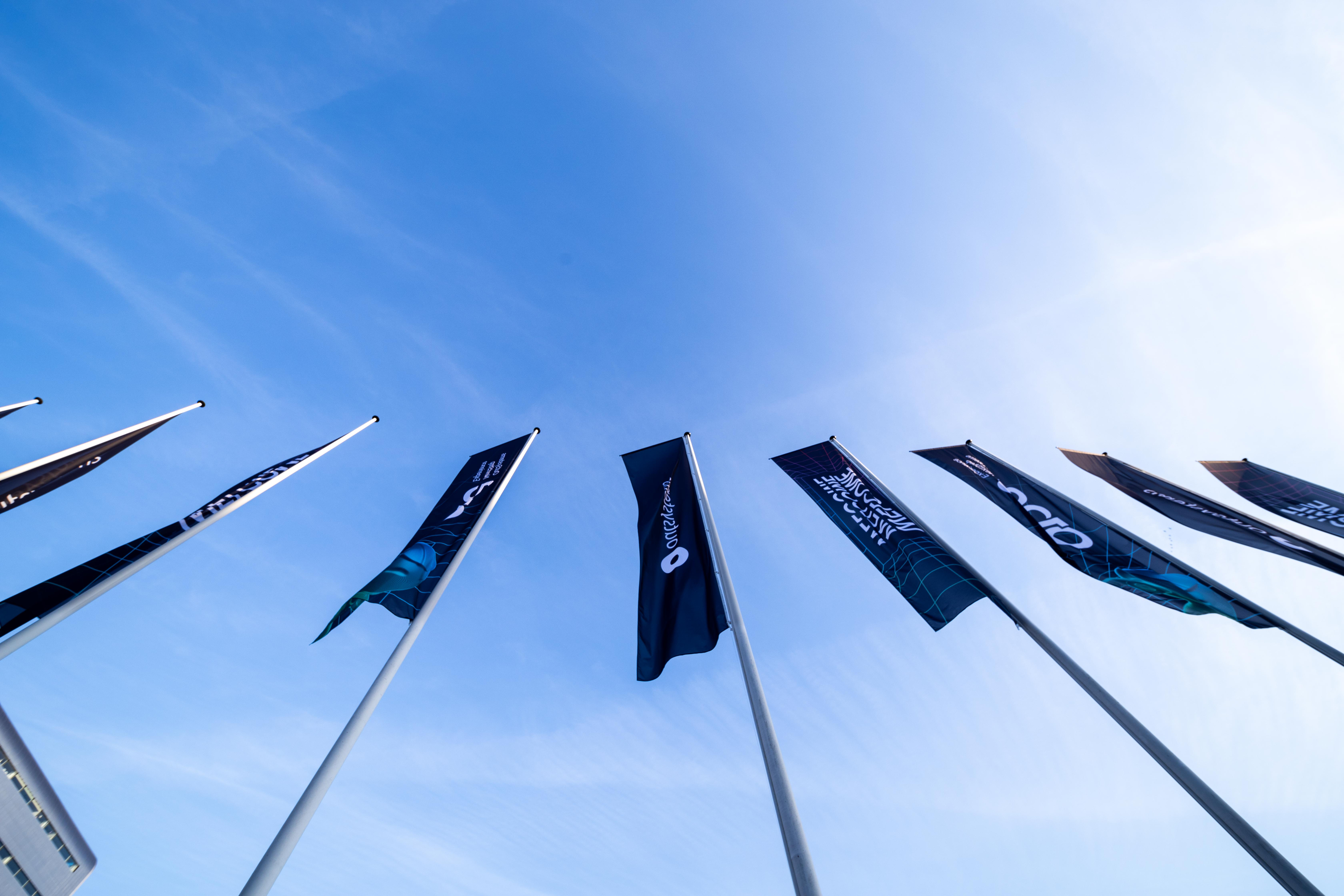
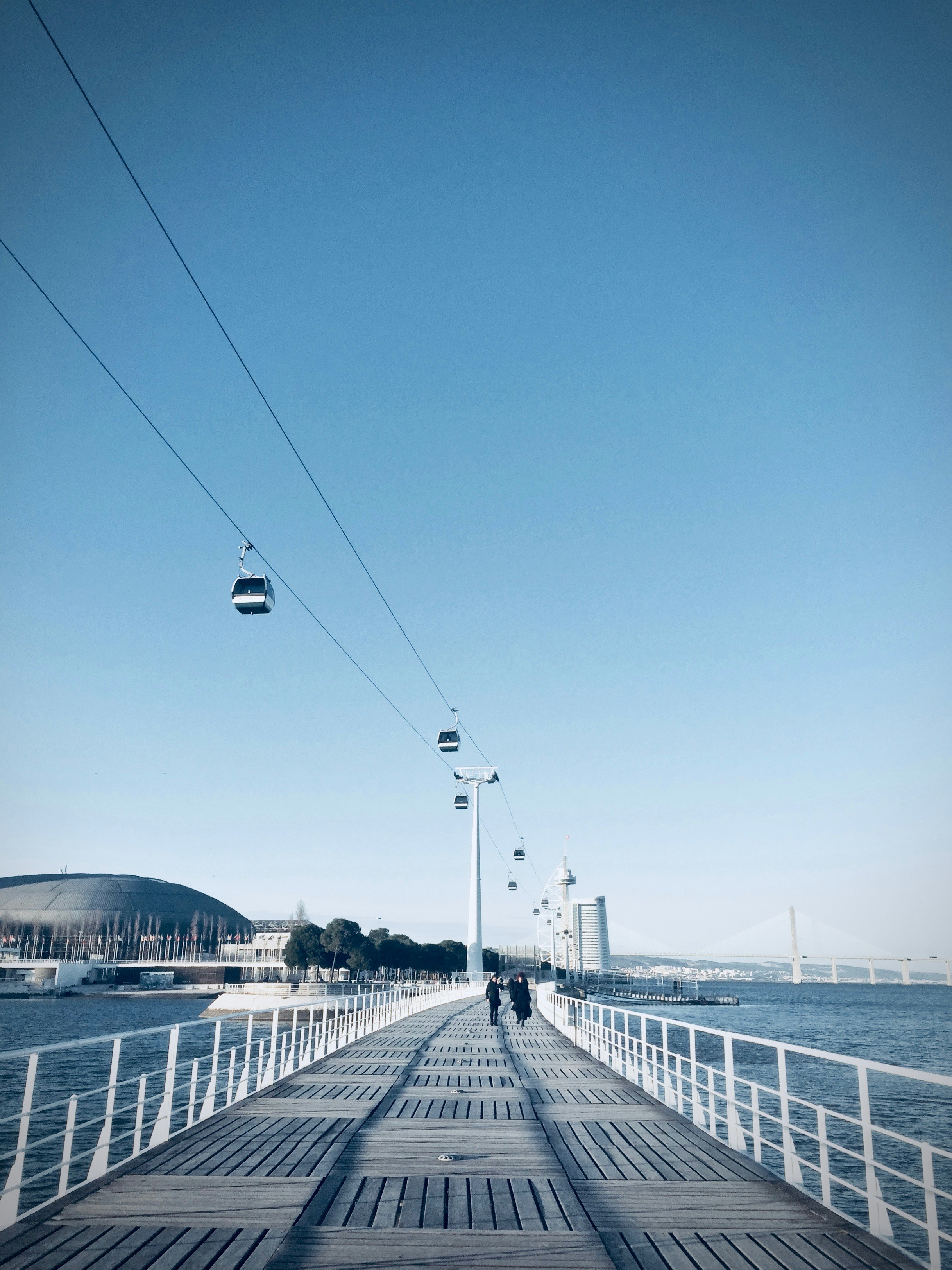
Venue & Experience
Guide and convince
ONE is a global conference, and we make that clear by valuing our venues and host cities throw showcase. Iconic spots, great venue photography, key experience moments, and good architectural photography make these perfectly blend with the ONE brand.
Photography treatment
Cutout
Highlight the key element


Meet us
in Lisbon

Sept. 30 - Oct. 01

Lisbon
The speaker, the moment, the gesture, the item or the action. All of these are things we can make fit a composition easily with cutout treatment.
Just grab your image, drop on top of the branded background and that’s it.
Contained
Give context, keep it clean
Cutouts are highlight elements, but all images deserve proper placement, hence containing visuals in rounded corner boxes is the default treatment for everything else.
Vibrant
Color that pops
Ideally we need images with vibrant colors to contrast with the dark backgrounds. Venue lighting, SWAG, a branded shirt, Neo, and many more elements can be used or simply the photo editing should help colors pop.
Not saturation. Vibrancy.
Layouts
Information setup is key to the way we communicate as OutSystems, so we focus a lot on a clean, clear and editorial style content layout for all our assets.
There are a few different treatments we do as default and those should be treated as priority within the brand application.
In any case, ONE is an expressive brand and there’s space for exploration on layouts and structure, but this is mostly reserved to more relevant assets like stage building and promo videos.
Date
Location
Layout application
Text left, image right
For most applications

Sept. 30 - Oct. 01
Lisbon
#ONEOutSystems
Agenda
is live!
Staying inline with OutSystems brand applications, this allows for a stable brand application.
Use corners
Labels & logos as visual guides

Call for Speakers
Sept. 30 - Oct. 01
Lisbon
#ONEOutSystems
Using notes like Date, Location, website, hashtags and other complementary information, you help better frame the content.
Alignment follows medium
Let the frame define the art


Sept. 30 - Oct. 01

Lisbon
#ONEOutSystems
Hear from the analyst!

Diego Lo Giudice, VP, Principal Analyst
Even though our default is left aligned, center alignment or right alignment of elements can be applied if it better serves the layout. Like how social posts and stories deserve different treatment.
Big Keywords deserve space
Message & cutout combos

Register
Now


Sept. 30 - Oct. 01

Lisbon
#ONEOutSystems
This is an optional stylistic approach, but one we encourage whenever possible. It helps empower brand application.
Single words take control
Message & cutout combos


Sept. 30 - Oct. 01
See you in Lisbon

Lisbon
#ONEOutSystems
When using single keywords or really short sentences, it can be fully centered and take over the available space.
Labels & icons for details
Simple messages improved

Sept. 30 - Oct. 01

Lisbon
#ONEOutSystems
Dates, hashtags, locations, promo codes and many more details that might need to be communicated, would be better served with a contained label treatment.